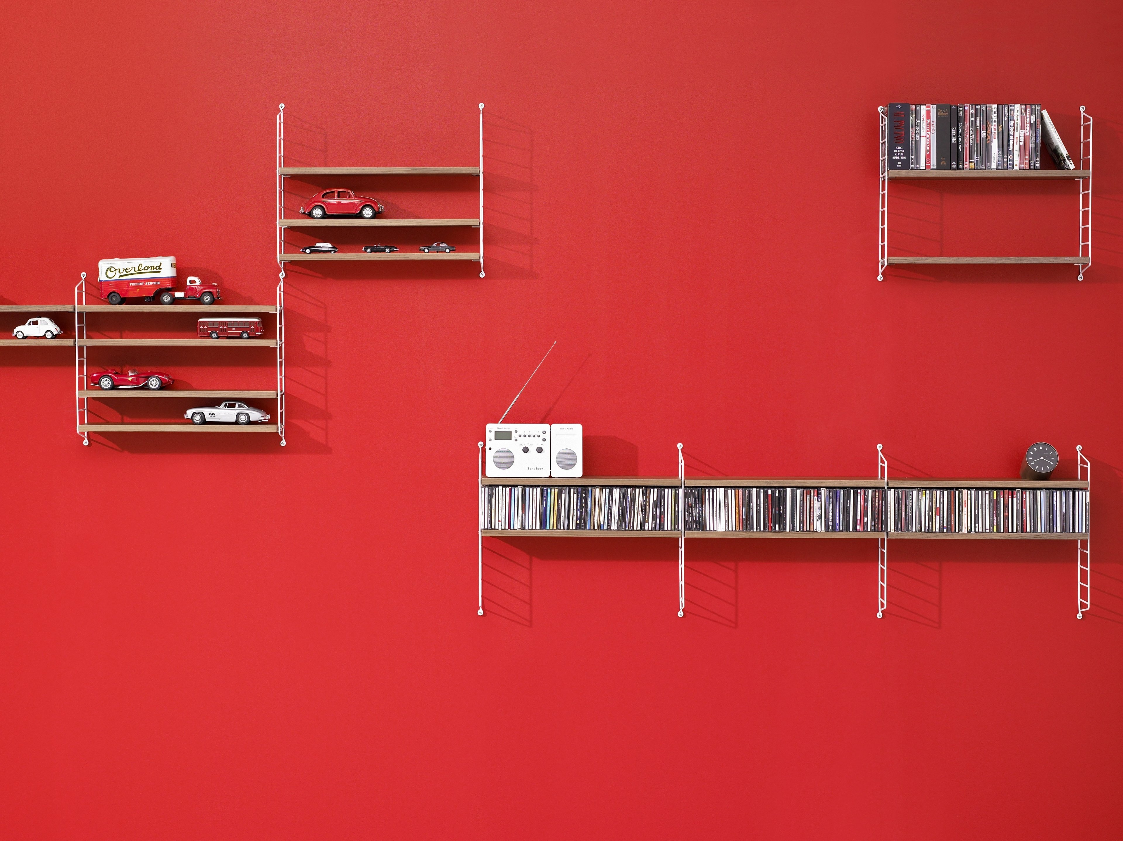
About 70 % of all human sensory perception is visual. Around 137 million photoreceptors in our eyes ensure that most of the information we receive in the course of our lives is absorbed through the eyes; consequently, it is only logical that colours and their effects have long fascinated us. The influence of colours also makes them enormously important when it comes to furnishing, because whether at home or in the office, colours make a contribution not only on the look and style of a room, but also on the well-being of those within. Colour can give a room its own personality, create a sense of well-being and atmosphere, influence the effect of daylight, make rooms appear bigger or more comfortable, stimulate, soothe and so, so much more. Colour is a comparatively simple means by which the feeling of a room can be quickly changed - especially when the room itself is small, dark or unfavourably positioned. If the ceiling is brighter than the walls, a lower room feels somewhat higher, while a particularly elongated room appears more compact if its front is painted in a stronger colour. Small rooms are visually enlarged if the floor covering is of a uniform colour and material, thus full carpeting in a small room may be more useful than just a small rug. It is important that the floor is darker than the walls, whereby a well considered shade of grey is useful in carpets as grey is not only very easy to combine, but it also hides dirt. It is also worthwhile to consider painting doors, radiators and/or window frames – with the aim of making a room quieter, tidier and more visually appealing.

All the colours we perceive in the course of our lives have a lasting effect on us and should not be underestimated. Especially the colour scheme in your own four walls, colours which can contribute much to our well-being. The so-called colour theory deals with the effect of colour on mood and the well-being and helps to use colour purposefully in our room designs. Take our colour tips as a creative suggestion – while understanding that in the end it is your own taste that is decisive. Ask yourself which colours you particularly like, which colours suit you, which colours you used to feel comfortable with in which room in the past. Also crucial is the role a room should perform! How big is it? How much light is there? How much time is spent in the room? Each colour has its own effect on well-being and is aesthetically perceived subjectively. Nevertheless, colours often evoke the same associations that are triggered by their intensity or their presence in nature.
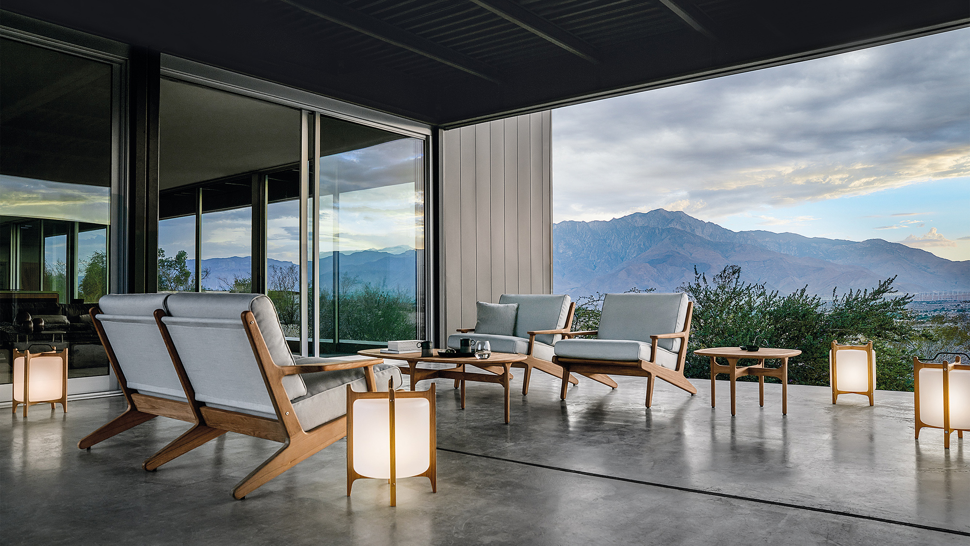
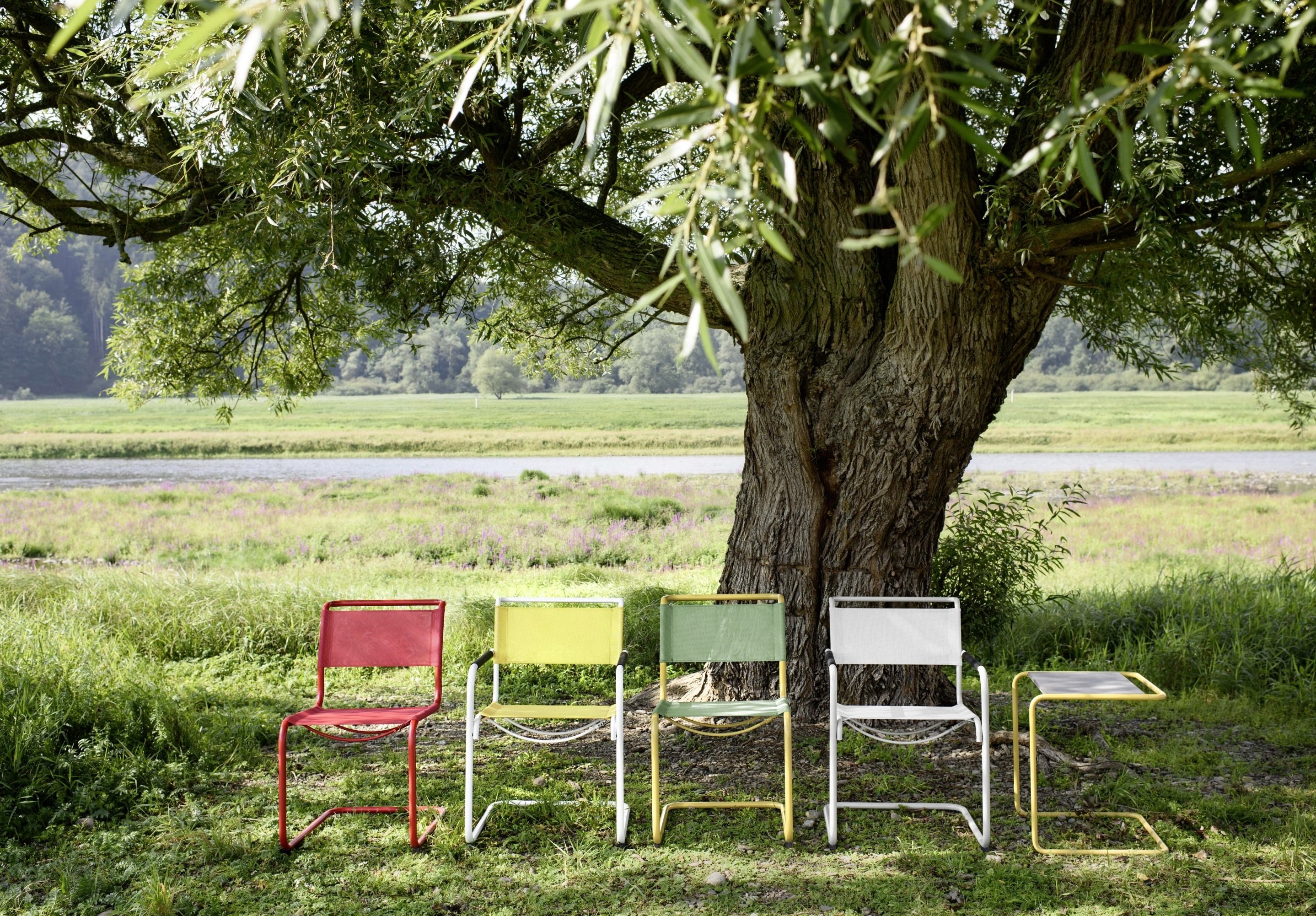
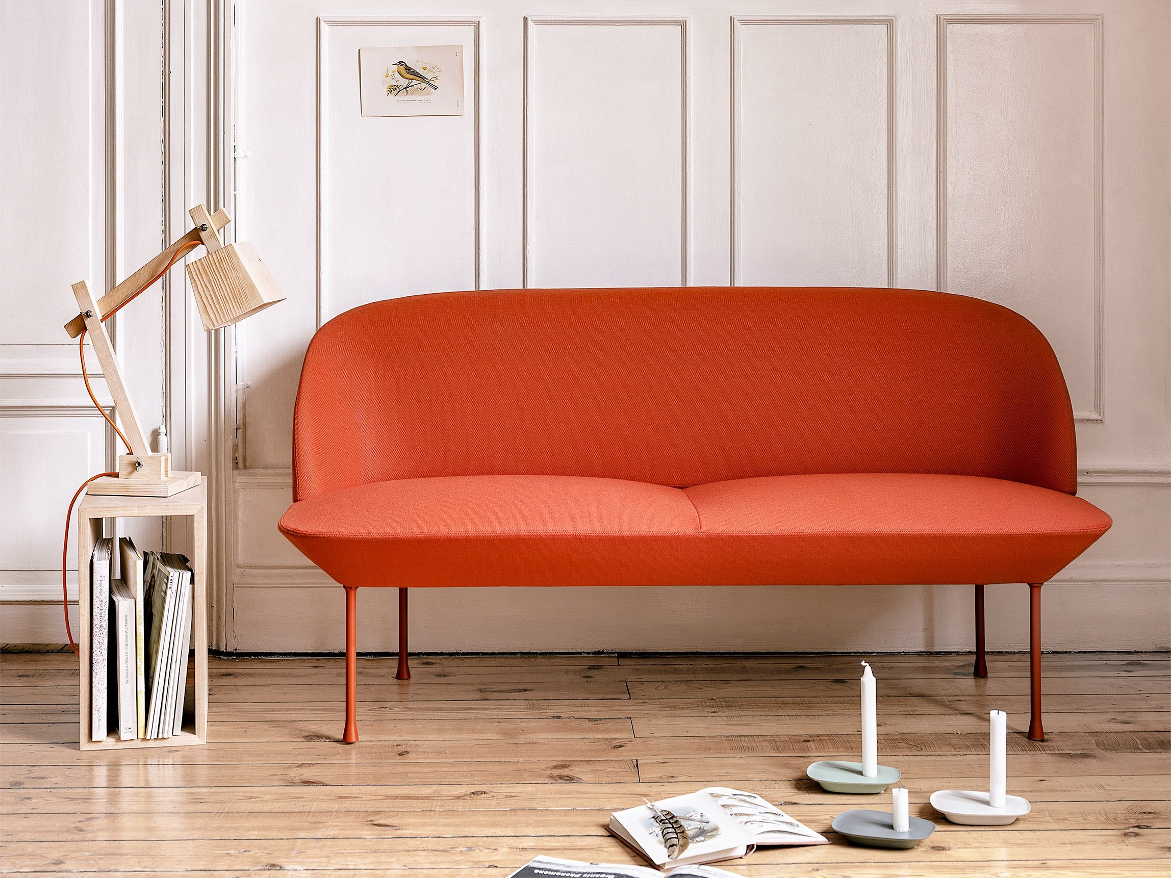
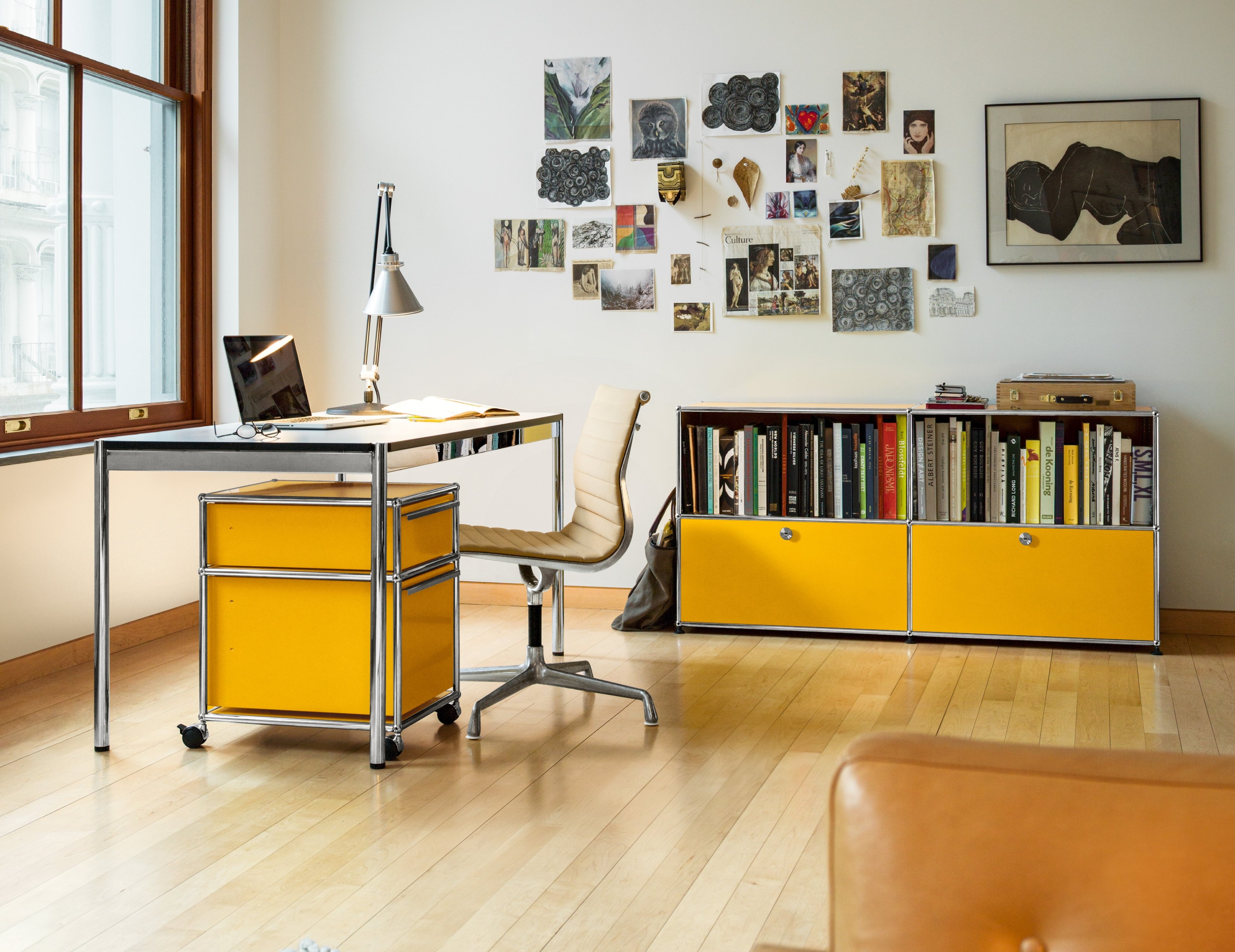
Colours shine on us as soon as we enter the room. The information that our optic nerves perceive instantly unleashes various associations in our brains. When it comes to yellow, for example, we quickly think of the sun, warmth, joie de vivre. When we see blue, memories of the sea come to life, and red reminds us of fire and passion. If a room is designed in colours that radiate peace, we feel relaxed. Therefore, the use of such colours, for example in the living room or bedroom, is particularly useful. While bright, bluish tones look wide, airy and cool, orange and red tones have a warm and stimulating look. Dark colours can be useful in small rooms where they cause room contours to become unclear and thus the narrow boundaries of a room are no longer so easy to capture for the eye.

If you are unsure about a new colour, we recommend a small test before committing: the colour you are interested in should be applied to a large sheet of paper and then hung on the wall. Through viewing it at different times of day and under different lighting conditions, you will receive an impression of whether the colour is right and proper for the space.
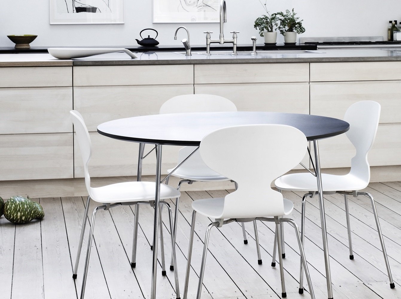
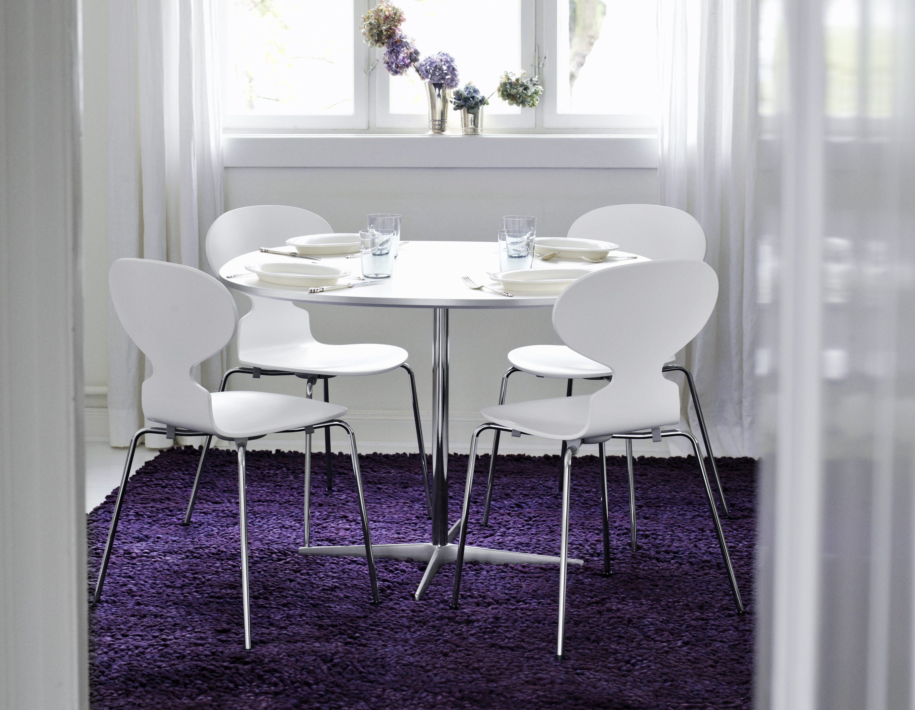
A colour that never goes out of fashion and whose spatial effect should never be underestimated is white. White stands for purity, innocence and light. It gives rooms a sense of freshness, space and clarity and can be easily combined with every imaginable colour and style. Depending on how it is combined and in which nuance it comes, white can be both restrained and support other colours, or radiate noble and powerful in its own right. White looks more neutral and timeless than black or grey: yet white is anything but monotonous and possesses a multitude of nuances. These can - depending on the environment - vary greatly in their effect. For example, creamy white, eggshell and ivory white have a subtle touch of yellow, which makes them particularly suitable for setting up in vintage or country-house style. Old white has a touch of brown, which gives the colour a very homely character. Such warm white tones are particularly effective in rooms which do not get much daylight, as they provide the room a bit more warmth. More challenging are white tones with a cool tint, as they are quickly sterile and uncomfortable. In such cases furniture and accessories made of wood or in warmer colours can skilfully balance this out.

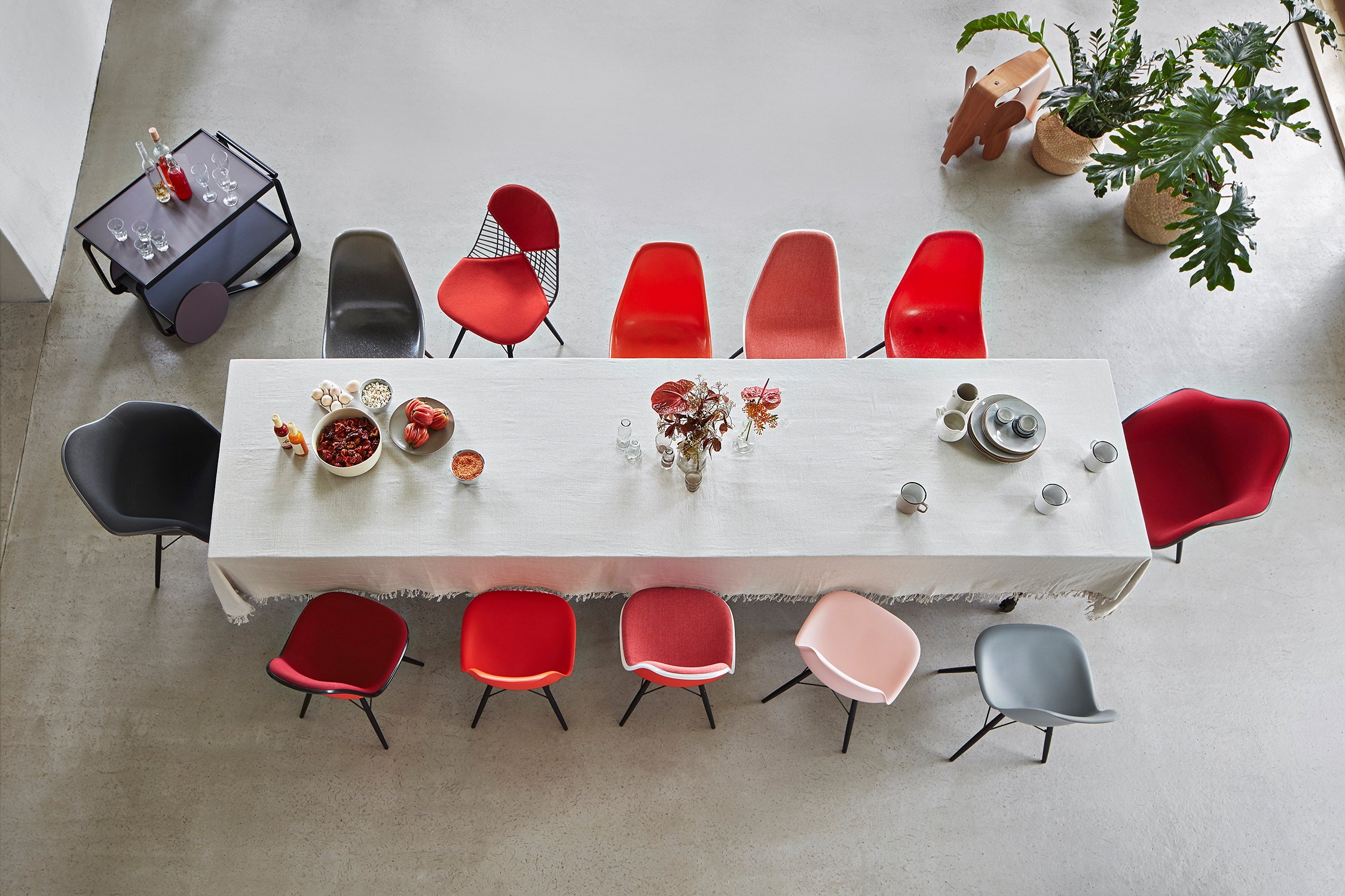
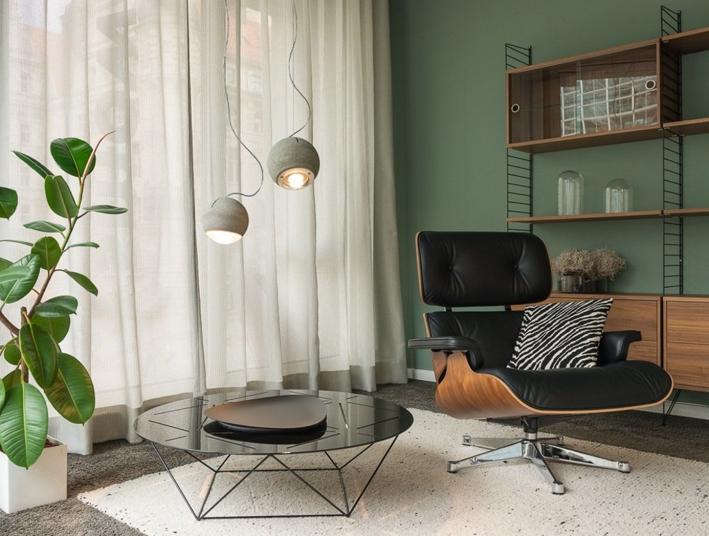
White ensures a good mood in any room. In order to avoid a sense of monotony, patches of colour in the form of accessories, pictures or furniture help - depending of course on your taste. One can safely combine white tones with bright colours like red, yellow or green: on the one hand, they always look happy and alive next to white, and on the other hand, whites also help to soften intense colours, so that they fit in well in the room without appearing too dominating or obtrusive. As a rule, white tones or bright natural colours radiate peace and serenity; however, if you combine them with dark caramel or brown tones and black, they become more elegant and luxurious. White always combines well with wood and harmonises with dark walnut as well as with light maple or oak woods. In addition, white spaces can be relaxed with the use of natural fibre rugs. It can also be attractive when the majority of the walls are white, but one wall coloured. Alternatively, a single architectural element, such as a pillar, a bay window, or a niche, can be accentuated with colour, thus contrasting the otherwise predominant white.
If you combine several colours with each other, there are different colour concepts that can be used to allow the different colours to unfold their natural properties. If you would like to use more than one colour in a room, it is absolutely necessary to use a structured colour concept to achieve an appealing and harmonious result: not least because how a single colour works depends not only on the lighting, but also on the tones in their environment. Thus, colours can reinforce each other depending on the combination, reduce the effect or draw attention to a specific detail. Colour combinations work well if they manage to bring harmony into the room without being boring. These concepts do not have to be complicated ...
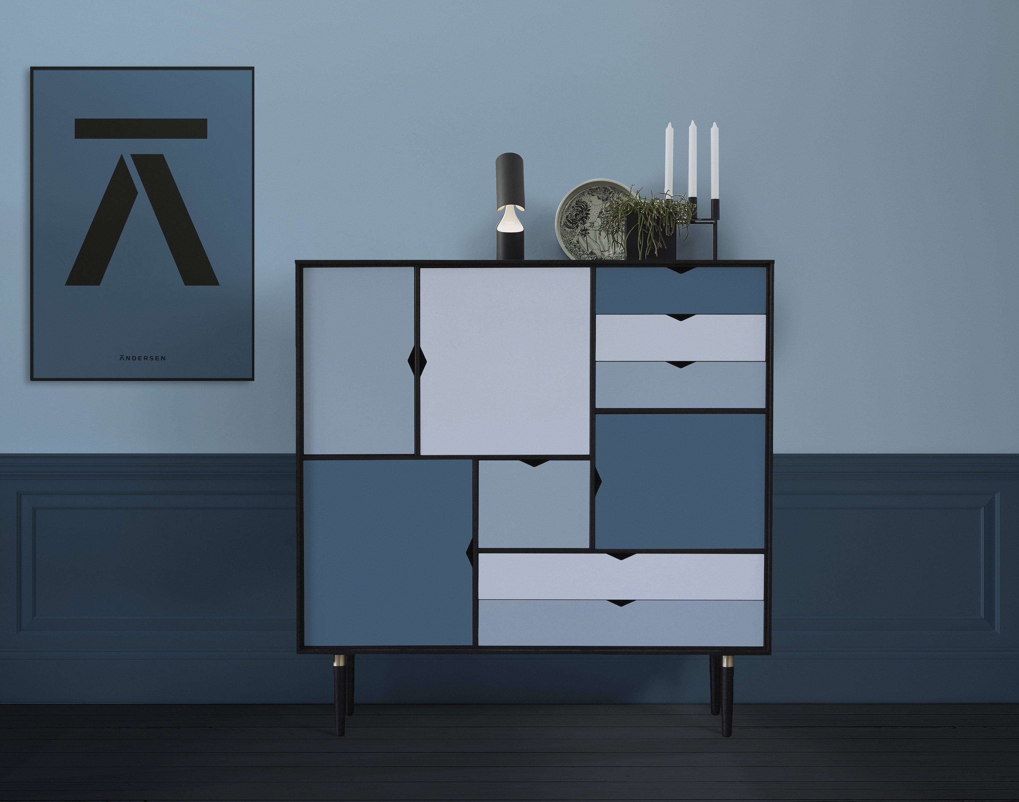
The concept tone-in-tone combines a colour in different gradations. Here, intensive tones differ in the proportion of their colour particles from light pastel shades. Cold colours in turn have a higher blue content than warm colours. As a rule, cold colours increase space, because they visually recede and are less dominant. The effect is harmonious and at the same time exciting, if the tones change slightly during the day with the light.
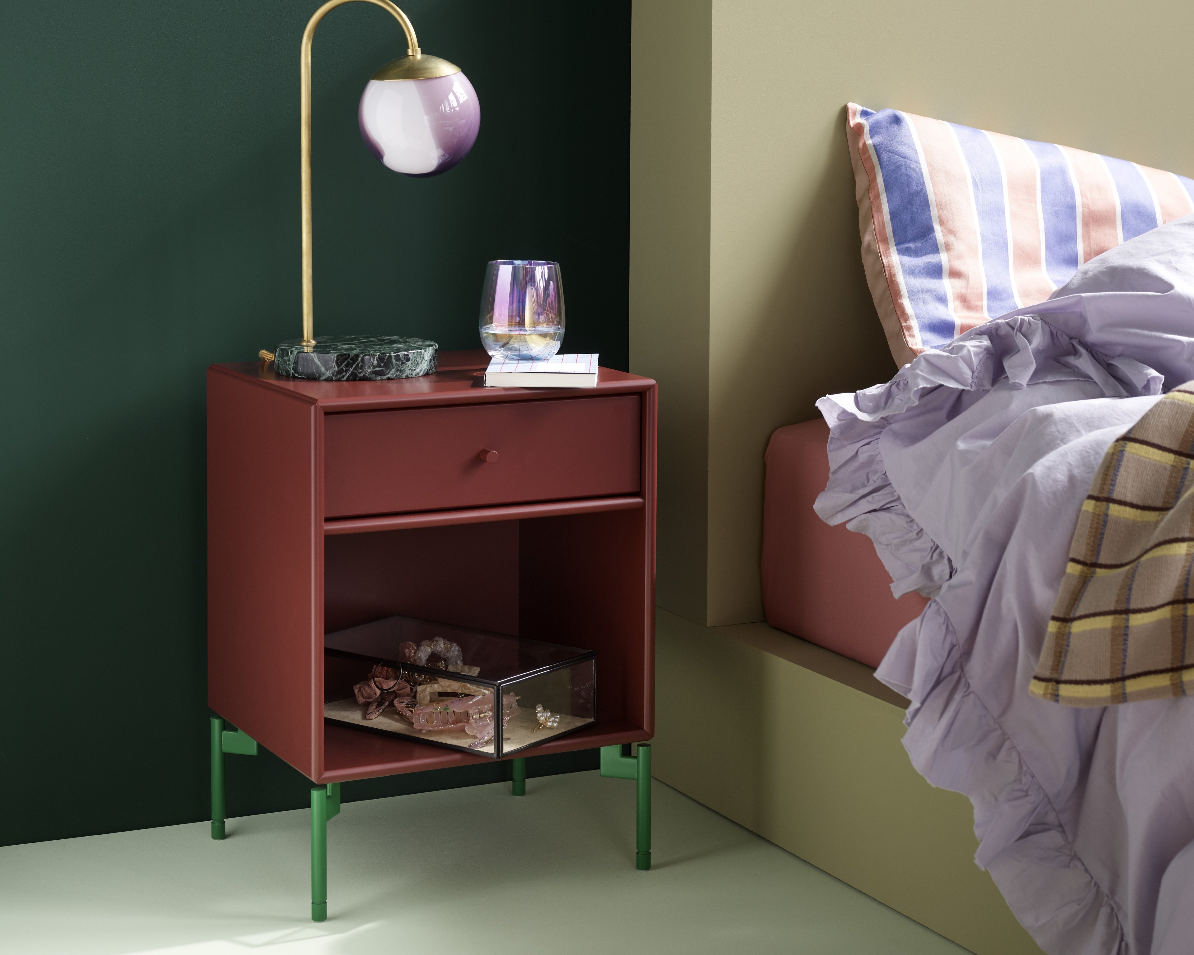
Rooms are brighter and more intense when you work with contrasts. Purple, aubergine and blue or orange, yellow and green - tones juxtaposed in the traditional colour circle - achieve balanced colour composition. Greater contrasts arise when using colours that face each other in the colour wheel. These are the so-called complementary colours. Although they are so different, they create a harmonious, comfortable feeling in the viewer, because they reconcile active and passive sensations.
If you want to paint all the walls in colour, it is advisable to choose a light, unobtrusive base tone, such as cream or light grey, and to paint this consistently in all rooms, as a connection between the rooms. Afterwards you can set individual accents in the different rooms with different colours.