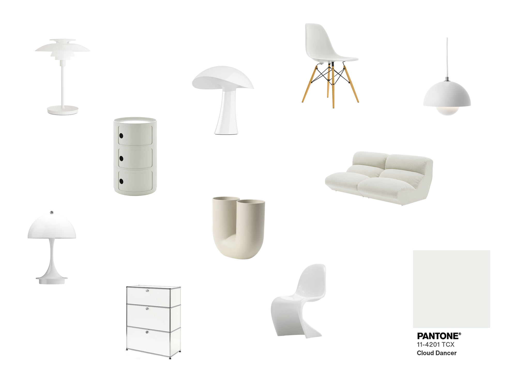
All in white... here comes Pantone Colour 2026. Cloud Dancer is a white that lets rooms breathe, captures light and, at the same time, sparks discussion. Many in the interior design bubble are rejoicing: finally, a shade that serves as the perfect backdrop for furniture, art and accessories. But there are also many critical voices calling for Pantone and the Pantone Institute to take a stand with their respective colour of the year in times of global crisis.

At first glance, Cloud Dancer appears innocent, almost airy. But its elegance lies in its versatility. Wood, linen, wool – this shade of white gives everything depth and space. Minimalist lofts, light-flooded flats, opulent living spaces: Cloud Dancer lets rooms breathe and creates a subtle elegance that is never obtrusive.
Cloud Dancer also plays to its strengths in the fashion world: monochrome looks, layering, elegant basics – the shade of white is neutral, yet still makes an impact. In graphic and product design, it serves as a backdrop for other colours, creating clarity, professionalism and a sophisticated restraint that draws the eye to the essentials.


White symbolises purity, new beginnings, light and peace. But in times of right-wing extremism, war and social polarisation, it can also mean neutrality – or a lack of stance. A tone that radiates nothing but calm in these turbulent times almost seems like an aesthetic retreat.
Perhaps a clear, inclusive colour would have better expressed what the Pantone Institute stands for in 2026. The rainbow flag provides a fitting example: each colour has meaning – red for life, orange for healing, yellow for sunshine, green for nature, blue for harmony, purple for spirit and diversity. Together, they make a clear statement for diversity, inclusion and acceptance – a message that would be particularly relevant right now. Of course, no one expects a Pantone colour to suddenly exist as a rainbow, let alone be implemented, but a statement would have been appropriate, especially in these difficult times.
smow begrüßt Cloud Dancer als Ausdruck von Ruhe, Licht und Weltfrieden. Gleichzeitig wünschen wir uns, dass Farbe mehr ist als reine Ästhetik: Sie kann Haltung zeigen. Wir hätten zu einem Lila-Ton tendiert, als klare Haltung für Vielfalt, Diversität und ein klares Statement gegen den Rechtsruck.. Ein helles Flieder hätte sogar das Thema Weiß für Frieden und Violett für Vielfalt vereint.

Cloud Dancer will brighten up rooms, inspire and invite tranquillity. May it also be seen as an invitation to reflect on peace, tolerance and solidarity. Colour is more than just decoration – it can and should also be a statement.
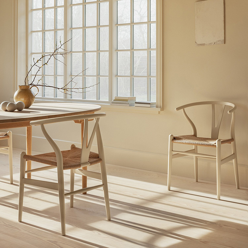
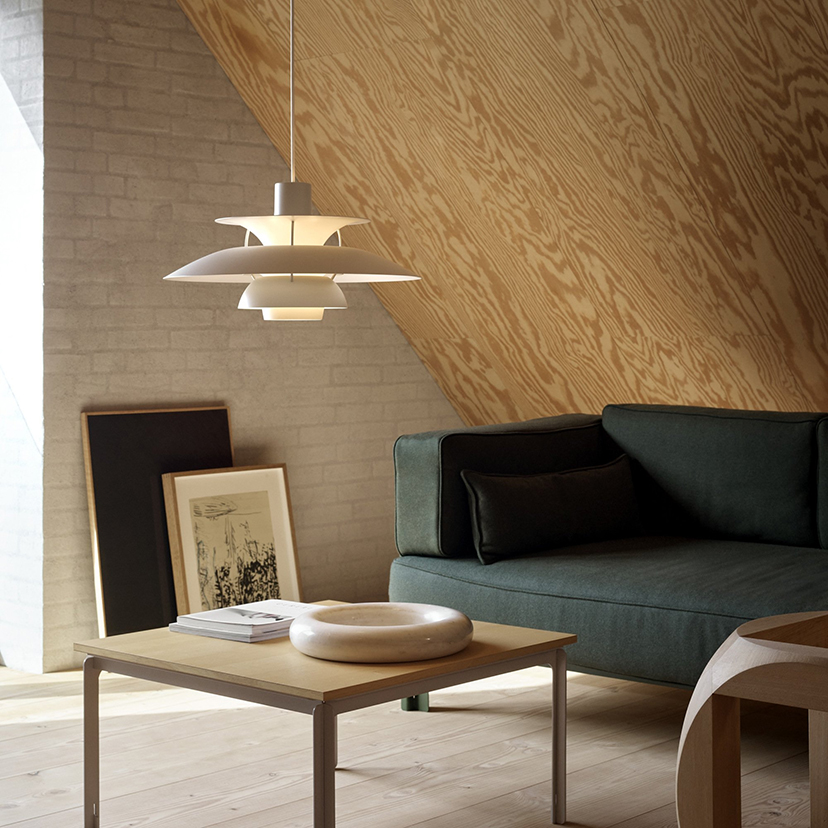
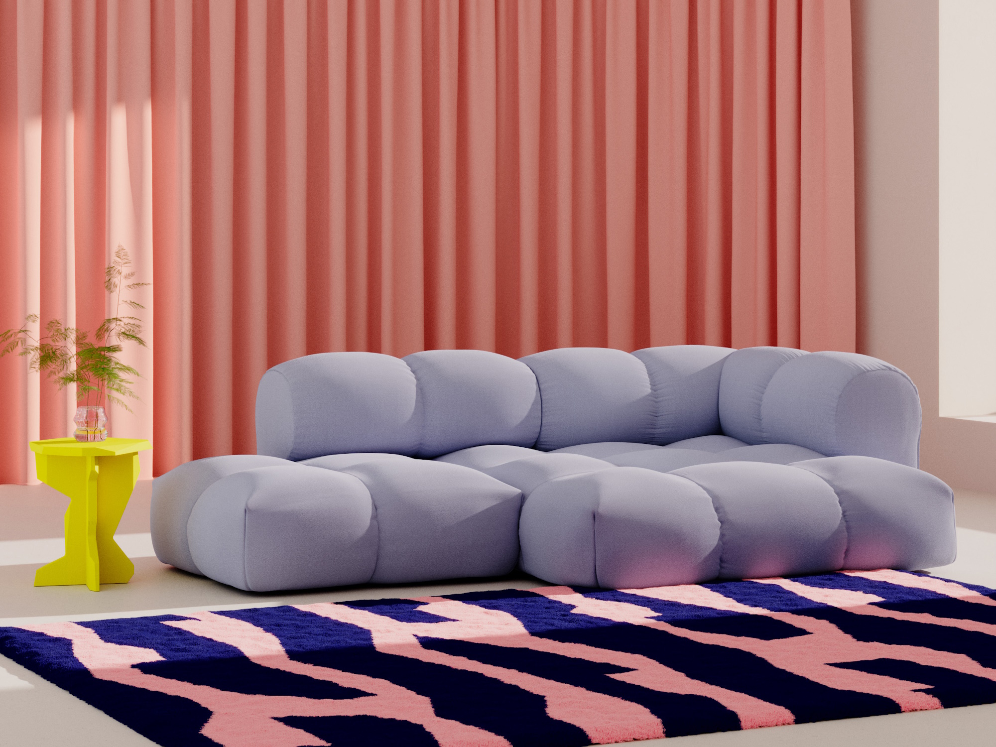
Cloud Dancer unfolds its full effect in combination with natural materials such as wood, linen or wool. Strong blue or green tones are ideal for creating exciting accents, while warm beige and cream tones gently round off the white.
