As the title of Hella Jongerius's 2016 book I don't have a favourite colour succinctly explains, Hella Jongerius doesn't have a favourite colour.
Not that Hella Jongerius is indifferent about colours.
Far from it.
And in explaining why colours are important to her, and why she doesn't have a favourite colour, Hella Jongerius helps one approach a better understanding not only of colours, nor only of our relationships with and to colours, but also helps one approach a better understanding of the functionalities of colour.......
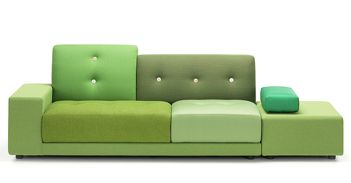
Born in De Meern, The Netherlands, on May 30th 1963 Hella Jongerius initially undertook a carpentry apprenticeship before studying at the Design Academy Eindhoven and subsequently establishing her own studio, Jongeriuslab, in 1993, and via which she has realised projects for, and in cooperation with, clients as varied as, and amongst many, many others, Droog Design, Royal Tichelaar Makkum, Galerie Kreo, Maharam, KLM and Vitra. The cooperation with the later achieving a first popular public expression in 2005 with the Polder Sofa, a work which in many regards is also the starting point of I don't have a favourite colour: as a work the Polder Sofa is defined, as Jongerius formulates it, by a, "collage of different textile structures and various tones of a single colour"1, is a work wholly reliant on materials and colours, and a work in the course of whose development, as Eckart Maise, Vitra's, then, Chief Design Officer recalls, Jongerius "complained about our fabric ranges being too technical and limited in options". Complaints Vitra didn't take personally but rather understood as an opportunity and consequently asked Hella Jongerius if she could, would, help them improve their colours and materials, help them make better use of colours and materials across their portfolio.
Hella Jongerius said yes, and in 2007 was appointed Art Director of Vitra.
And which brings us to the book's full title: I don't have a favourite colour. Creating the Vitra colour & material library, a title which underscores the context in which the work arose. And while, yes, we would much, much, prefer to discuss Hella Jongerius and colour through the catalogue to the exhibition Breathing Colour, that is a book which doesn't exist.
Or which rather does exist. Unofficially. Under the title I don't have a favourite colour. Creating the Vitra colour & material library, a work which contains many of the positions and arguments expressed in Breathing Colour; or perhaps better put, a work which contains not only discussions on the theoretical and experimental processes which led to many of the positions, understandings and arguments expressed in Breathing Colour, but also introduces many of the projects and objects presented in Breathing Colour, and thus allows I don't have a favourite colour to be considered, approached as, the official unofficial Breathing Colour catalogue.
Even if we'd argue that as an exhibition, as a discourse, Breathing Colour is very deserving of a catalogue in its own right.
"Colours have been researched, categorised throughout the ages, and countless colour schemes have seen the light of day", notes Hella Jongerius, some, she continues, based on rational research, others on more personal, subjective approaches. "In my approach the personal reigns" she confides, "I base my insights on intuition and personal sensation, as it's my conviction that only thus can we take a meaningful step forward in creating new colours, and recreating the colours we lost in the process of industrial production"; lost not only to the vagaries and constraints of industrial production but to the standardisation and optimisation on which industry relies, and which means that "today, there is no place for seclusion or questioning in the objective, all-encompassing RAL, Pantone or NCS colour systems. Millions of colours are categorised, structured and sorted for us. How can we ever intimately relate to colours in this scenario?" Hella Jongerius asks.
Largely rhetorically. Because for Hella Jongerius we can't. We can however change the scenario. Or as Hella Jongerius argues, we should, must, change the scenario.
And thus, much as we disapprove of, distrust, the contemporary easy, indifferent, use of the word manifesto; I don't have a favourite colour can, should, be read as a manifesto. Much as Breathing Colour should be viewed as one.
Manifestos which demand active resistance. Active resistance on the part of designers, that designers of all ilks don't passively accept the colour and material options offered to them in the course of a project but rather argue for, demand, that which they understand as the correct, meaningful, option for the project in question; and also active resistance on the part of us all, that we all, individually and collectively, don't passively accept the colour and material options global industry offers us, be that in consumer goods or in our own purchasing, application, utilisation of colour and materials, but that we all develop more nuanced and informed understandings of and approaches to colours and materials.
The first demand being something, if one so will, Hella Jongerius practised while developing the Polder Sofa, and thereby demonstrating that resistance can be meaningful, assuming the manufacturer listens. And if they don't? We'd argue, should you be working with them?
The latter demand being something that I don't have a favourite colour can help us all approach.
Starting with considerations on colour systems, those most tangible results of the centuries of research and categorisation of colours, whereby Hella Jongerius focusses to a lesser degree on the popularly quoted systems of a Newton, a Goethe or an Itten, and rather focuses on the rarely quoted system of Arthur Schopenhauer. Only briefly. Don't worry. There is no in-depth analysis on Schopenhauer's philosophy and theories, although that is something we should all undertake more often than we all do; rather, Arthur Schopenhauer is used by Hella Jongerius as a springboard into reflections on perceptions and receptions of colours, on the subjectivity and variability of our perceptions and receptions of colour, and from there onto the colour schemes of Le Corbusier, Gerrit T. Rietveld, Alexander Girard, Verner Panton. And Hella Jongerius.
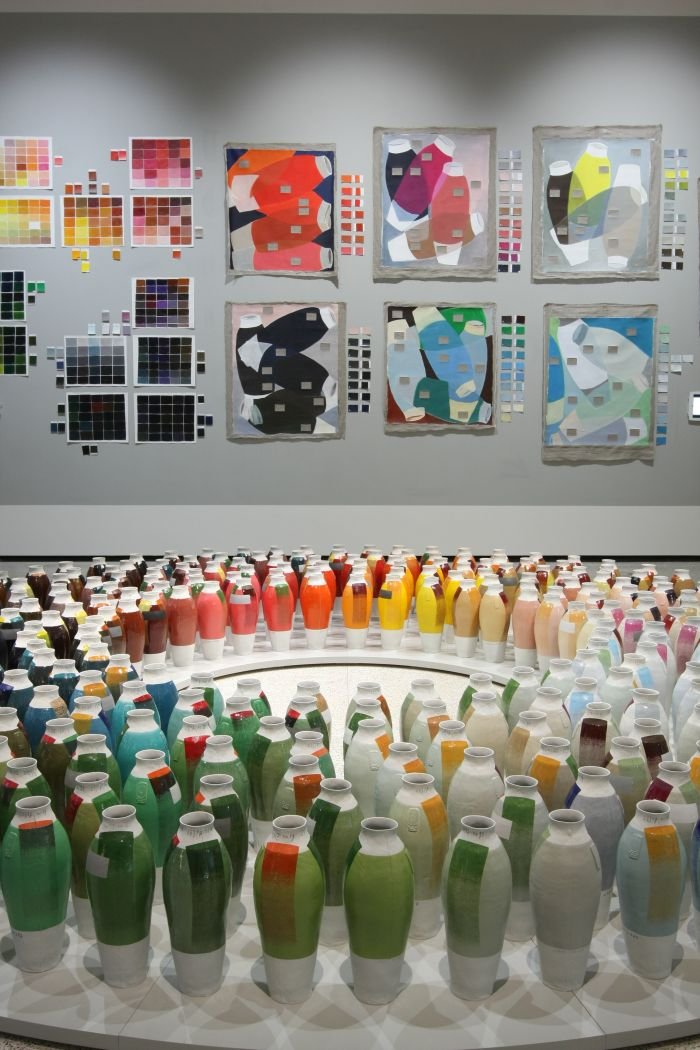
"When creating colour systems, I do not have the desire to systematise or arrange colours according to some strict set of rules", she tells us, not least because "the colour field is far too complex and large to fully grasp. I cherish the process of experimenting, truly working with colour". A process of experimentation Hella Jongerius helps elucidate through brief discussions on research projects such as, and amongst others, the Daylight Wheel and the Coloured Vases: the latter employing 100 traditional mineral recipes and 100 contemporary industrial colour transfers as the basis for some 300 new hues, and which was the third in a series of three similar projects in which Jongerius used her 1997 Red White Vase as the basis for further research. The former seeing Jongerius chart how colours alter their tone and character in the course of a day, how the same colour appears different depending on the time of day it is viewed, and thus a demonstration of the inherent vitality of colour, the inherent variability of colour and the invariable subjectivity with which we view colours, which, as we all recall, is/was an important component of Breathing Colour; and a natural vitality, an intrinsic property, of colour rarely found in contemporary industrial colours with their enforced chemical stability, sterility, that which Hella Jongerius refers to as "colour flatness", and which she abhors. The subjectivity and variability of colour perceptions and receptions depending on the context in which they are viewed, the importance and relevance of metamerism in our perception and reception of colour, being further explored by Hella Jongerius through research on interactions of colour on and with "volumes, shapes, hard or soft edges, smooth or tactile surfaces, shadows". A myriad varied projects of which Jongerius states "are only the beginning of my colour journey".
A journey which also takes Hella Jongerius from the theoretical to the practical.
To works such as the aforementioned Polder Sofa, and work informed not only by the varying colours and textures of the polders of The Netherlands but, as we learn in I don't have a favourite colour, by Josef Albers' assertion that "it is impossible to reproduce a colour from memory" and Hella Jongerius's continuation of that argument to a position that as we are unable to accurately describe the existing colours of our homes (many of which will in any case fluctuate), why seek a (perceived) perfect colour match when adding a new object. The Polder Sofa embraces such a position and thereby "offers a discourse about keeping options open".
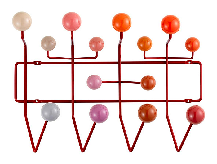
To works such as the Eames' Hang it All, or more specifically how Hella Jongerius employed the aforementioned Daylight Wheel as the basis for new Hang it All colours, how she, if one so will, laid the Hang it All on the Daylight Wheel and selected those colours which corresponded to the order of the balls, and in doing so enabled a natural flow of hues and thereby brought a readily comprehensible colour composition to the object.
To works such as the Eames plastic shells in white. Or rather whites. Hella Jongerius overseeing the introduction of the Eames plastic shells in three shades of white; three shades which were subsequently withdrawn, not least because the subtle differences between the shades were, for the vast majority, too subtle. A situation of which Jongerius notes "constituted an important learning curve: customers cannot be expected to have 'trained eyes'. I should not walk too far ahead of the orchestra".
While, and in a similar vein, reading I don't have a favourite colour five years after its publication one's attention is invariably drawn to the numerous colour and material options Jongerius introduced which are no longer to be found within the Vitra portfolio, a state of affairs which tends to confirm that colours and materials, as with forms, need to justify their place in a commercial portfolio through sales rather than through concept and theory. And also tending to confirm the shortness of time products are given to justify that place. A situation which also raises questions of us consumers, and for all in how far convention and conditioning inform our decisions on colour; that as consumers we do have "trained eyes", as in eyes trained to see according to fixed, definitive, objective rules, and that what we need are learning eyes, sapient eyes, perceptive eyes, interpreting eyes, that we need to untrain our eyes and start afresh.
And, arguably, someone walking ahead of us may be very well placed to help us achieve just such.
Having taken the reader on a tour through her research and reflections in context of creating the Vitra colour and material library, including discussions on the role of Colour Wheels and the four Colour Worlds in the development of that library, Hella Jongerius moves on to more specific considerations on the use of colour in furniture design, and for all lets other designers have a say; both designers who are no longer amongst us, including Charles and Ray Eames, Maarten van Severen or Jean Prouvé and also contemporary designers such as, and amongst others, Barber Osgerby, Jasper Morrison or Konstantin Grcic. And so, yes, all Vitra designers, and, yes, all in context of objects developed for, with and/or produced by Vitra; but, I don't have a favourite colour is a book about Creating the Vitra colour & material library and so ¯\_(ツ)_/¯
And while the input, the perspectives, the ideas from designers other than Hella Jongerius is interesting, and important, in context of I don't have a favourite colour, allows differentiated perspectives on Jongerius's positions and understandings, and also provides insights into how the Vitra colour & material library integrates into the product development processes at Vitra, we'll skip over them here, as we will be returning to one or the other in their own right at a later date, and spring sprightly on to the final chapter: The Colour Recipes.
"Let's start the colour cooking" announces Hella Jongerius, and just as you're getting your apron on and letting out a joyously loud Hurrah!!! at the thought of getting down and messy in the home colour kitchen, you realise the recipes are, in fact, eight lessons, eight wisdoms, learned by Hella Jongerius through her development of the Vitra colour & material library, and which are presented in I don't have a favourite colour as eight take-homes for us all:
Colours are personal, and thus "there are no mistakes in choosing colours"
Colours are powerful organisers in a space, "they can make spaces, walls and furniture look more vibrant, distant, static or dynamic"
Warm and cold greys cover a wide range of tones, and "are a colour palette's foundation"
Instability is a quality, "instead of denying or diminishing the changeability of things, emphasise it. You can see colour's core qualities in nature: it is multi-layered, polychromatic, vibrant and never stable"
Upholstery textiles add a signature, "most people have a sense for the specific qualities of the textiles they wear. Use the same intuition when choosing an upholstery fabric"
Material makes a colour, "whether the surface of the beholder is shiny or matte, large or small determines how loudly something shouts or how softly it whispers"
One colour is no colour, "only when colours are seen alongside each other does the real quality of each colour surface become visible"
The size of a colour patch or colour field is important, "the smaller an object, the more accentuated the colour can be"
Not that the eight should be considered as definitives, not least because, and as we all (should) understand by the time we reach the colour recipes, for Hella Jongerius colour is subjective, transient, personal and thus developing "a set of rules for how to use colour or make quick conclusions is not only difficult, but would also make no sense". Much more the eight should be understood as aids to your individual considerations on colour, as individual ingredients for your own colour recipe, as a store of provisions for your own journey through colour, a journey for which there is no fixed route, far less a destination.
A journey which, and as with all the most rewarding journeys, is "a never-ending process".
For all that I don't have a favourite colour originated in context of Hella Jongerius's work with Vitra, and features an awful lot of Vitra furniture, it isn't a book about Vitra. It's a book about Hella Jongerius and her considerations on and understandings of colours and materials, about journeys theoretical and practical Hella Jongerius has made through colours and materials. Just in context of a commission from Vitra and which thus, logically, and, one presumes, not disagreeably for anyone involved, makes regular mention of Vitra and Vitra furniture. But it's not a Vitra book. It's a Hella Jongerius book. A Hella Jongerius manifesto.
A Hella Jongerius manifesto on materials as much as on colours. We've focussed here on colour, but a central, a key, component of I don't have a favourite colour is and are the discussions on materials, for all woven textiles, which one assumes, not least from the nature of those discussions, are Hella Jongerius' favourite material, and of which Jongerius opines are "a tactile, flexible piece of colour". If one which, as with colours themselves, suffer under the unyielding yokes of industrial production and commercial pressure.
Yokes Hella Jongerius hopes to free them from. I don't have a favourite colour helping one understand why that is important for Hella Jongerius. And why it should be important for us all. Why we should all consider colour more carefully, and for all why we should consider colour not only as tones and hues, but rather as the cultural goods and as the commercial, industrial products they are. And the myriad compromises and incongruities the therein inherent contradictions lead to.
Or put another way. For us one of the more interesting statements from Hella Jongerius is the assertion that, "colour binds together a range of important topics in life: the aesthetic value in art, the scientific research into our human perception, the philosophical questions on the words we use to address colours, the social and cultural relevance of colour in our society", and in doing so reminds that contemporary colours are in many regards no different from the many other contemporary commodities that once came from nature but now come from industry, the many other commodities that we once had direct, sensuous, relationships with but now barely consider; commodities such as, and amongst others, clothing, food or our utensils of daily life. Commodities in which we all understand that quality suffers through industrial production, not only the quality of the products themselves but the quality of the environments in which we exist; that standardisation and optimisation brings not only advantages, but also makes our world less varied, less vital. And although in terms of utensils, food or clothing we all understand that there are alternatives and that the decisions we make or don't make in our consumption and use impact on the whole, in terms of colours we all tend to passively, unquestioningly, accept the existing scenario.
Tend to view the worlds in which we exist through our conditioned, trained eyes rather than through the subjective, intuitive eyes of an Arthur Schopenhauer.
"The fact that there is no objectivity in colour is a blessing to me", asserts Hella Jongerius, "it's a visual expertise, not a scientific one", and an expertise that, as with all others, needs to be learned to be mastered, needs to be understood from its fundamentals to be meaningfully employed.
I don't have a favourite colour can help with that education, that retraining.
And thus all the more sadly a work that is out of print.2
For through helping one approach colour not as a verifiable, systematisable, fact but as an unstable, variable, entity which exists only in the ephemeral interplay between the context of the situation in which we view it and the physical and neurological realities of our optical systems, I don't have a favourite colour helps one approach a better understanding of colours as functional components of our environments: technical functional as signals and signposts which help us gauge and delineate space; and emotional functional, colours reflecting not just light but the physical and metaphysical context in which we view them, and thereby actively contributing to our perception and reception of the worlds around us, and that, when the colours are allowed to, in ever new vocabularies.
And thus I don't have a favourite colour helps you move towards the understanding that while one can have a favourite colour, your world can be a much more stimulating, invigorating and rewarding place when you are open to letting that favourite colour fluctuate as regularly and as naturally as colour itself fluctuates; and for all how much more stimulating, invigorating and rewarding our world could be if all our colours were allowed to freely express themselves, if they were allowed to truly breathe for, as Hella Jongerius proclaims, "the beauty of colours resides in their main property - instability - and this deserves to be experienced as such".
Which yes, does sound like a metaphor......
1and all further quotes from Hella Jongerius, I don't have a favourite colour. Creating the Vitra colour & material library, Gestalten, Berlin, 2016
2whereas I don't have a favourite colour is out of print, Breathing Colour is still on show. At the time of writing (April 2021) at the Gewerbemuseum Winterthur. And it is to be hoped that its tour continues.

