Red and yellow and pink and green, purple and orange and blue.....
Life is so simple as a child.
Yet whereas in almost all other respects the progression to adulthood is one of simplicity to complexity, in terms of our understanding of colour we never lose our inner child.
With the exhibition Breathing Colour at the Design Museum London the Dutch designer Hella Jongerius encourages us to sing a rainbow, sing a rainbow, sing a rainbow new.
"Colour is something that surrounds us constantly, and not just in waking moments, most of us dream in colour, but we never really stop to take time for colour, and to appreciate how complex colour can be", explains the Design Museum's Senior Curator Alex Newson the background to the exhibition, "we understand colour as something immutable, something fixed, but that's not the case, you can't rigorously define colour, it changes, either through the context in which it is placed, or through the course of the day, and this exhibition is about embracing those fluxes"
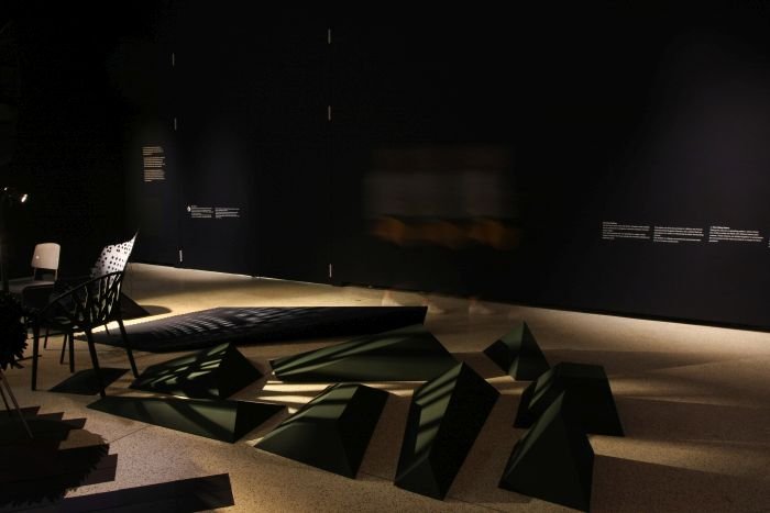
To this end Breathing Colour presents a journey through a day in the life of colour, from the translucent, yet clear-cut, flush of morning over its potent midday intensity and on to the flatness of evening as darker tones exert their influence in the gloaming. A fourth section compliments this fundamental exploration of colour through a presentation explaining the nature and process of Hella Jongerius's colour research.
Research which poses the obvious questions of the role of colour for Hella Jongerius and her motivations for the exhibition, "for me colour is a material, and colour is also a very powerful tool in design, a tool to design objects which have many layers", she replies, "and I decided to dive into for this exhibition, because I want people to think more carefully about colour"
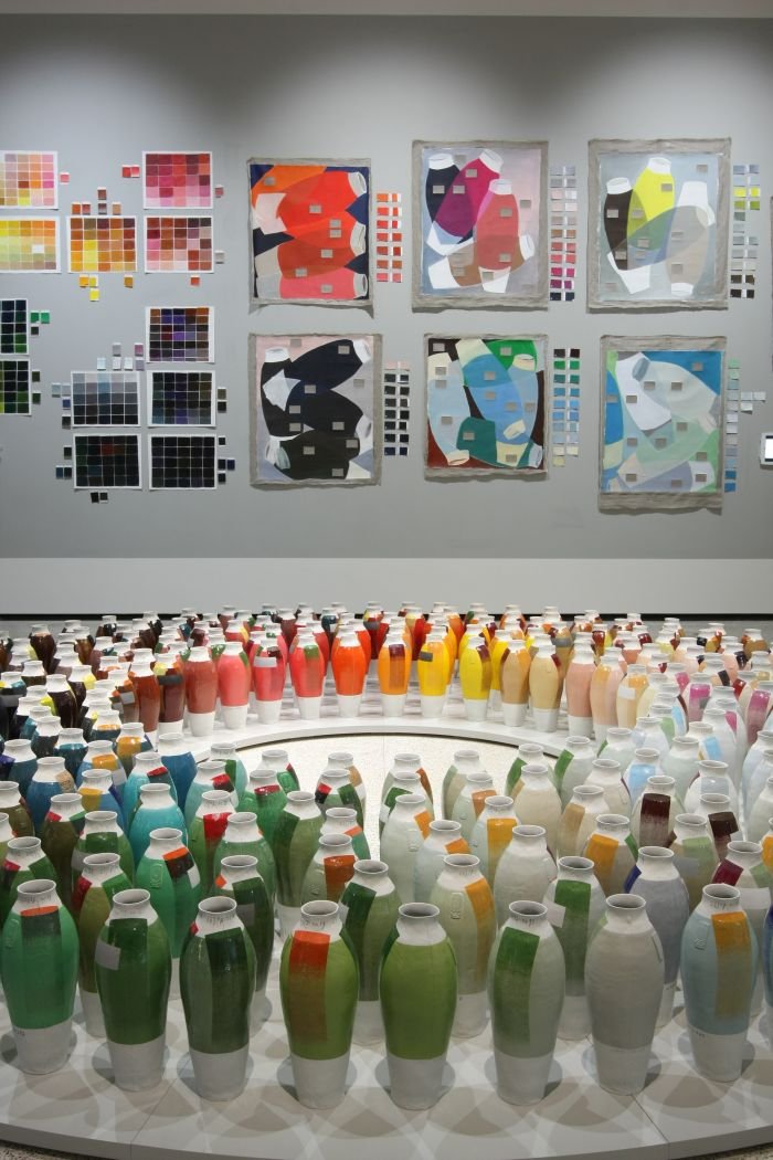
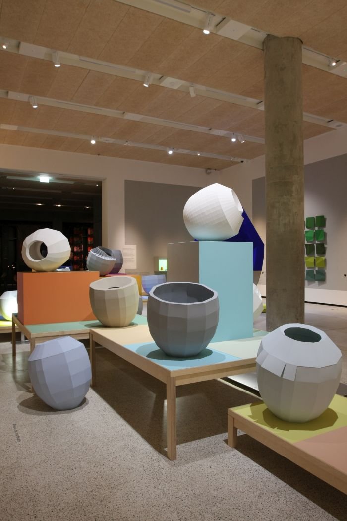
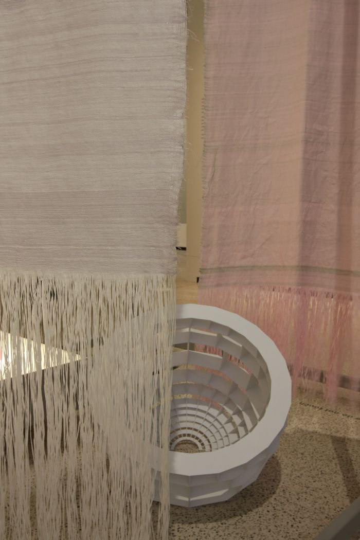
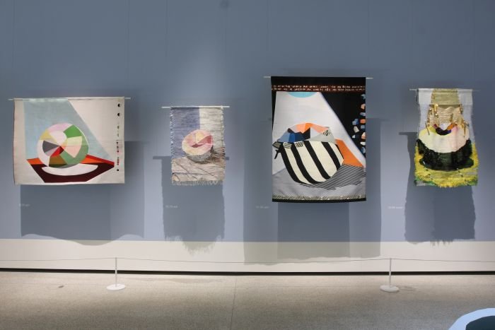
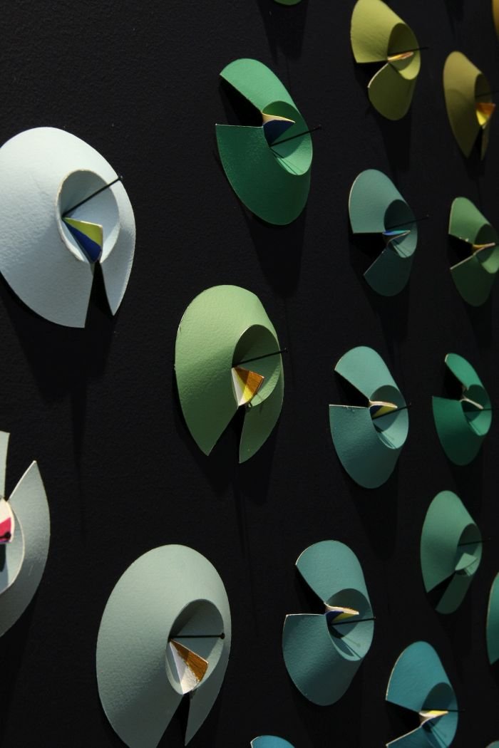
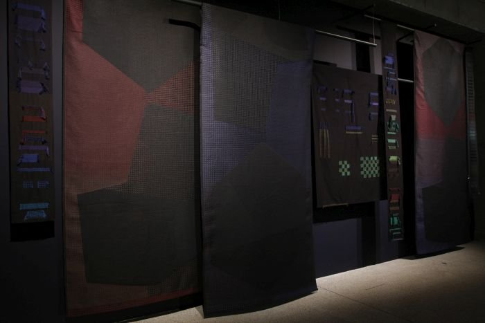
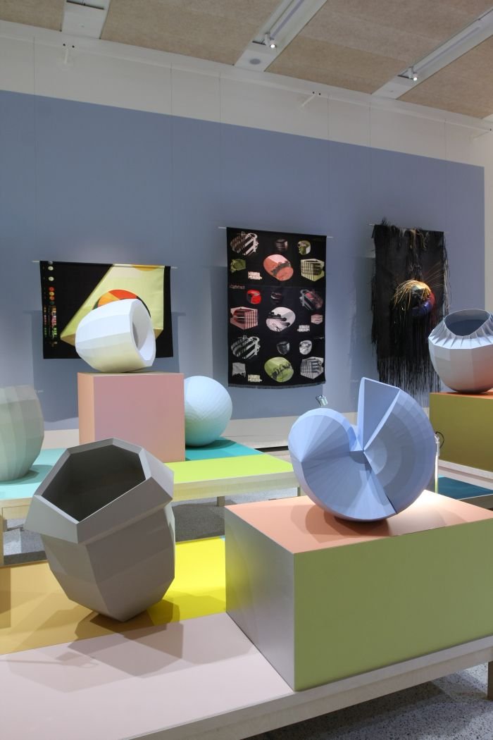
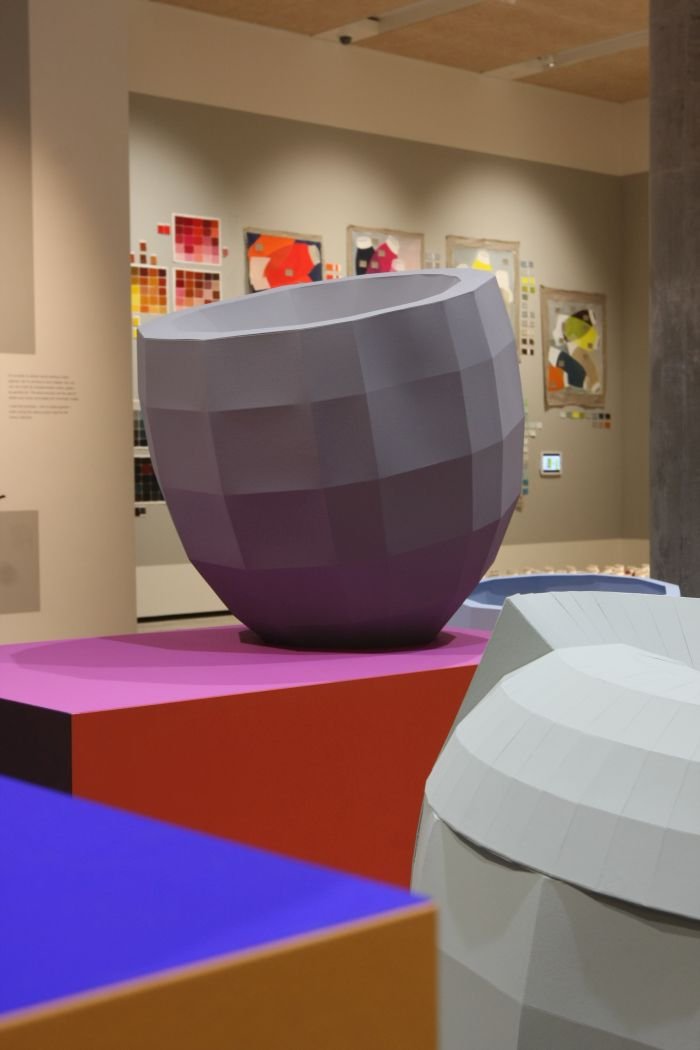
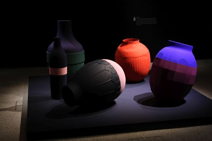
In many respects more an installation than an exhibition, Breathing Colour features, save for the 2010 Colour Vases projects, exclusively new, specially created and commissioned works, from which two typologies in particular guide visitors through the exhibition: textiles of various designations, which through their construction and combination of hues help explain how we perceive colour and how that alters during the day, and the so-called Colour Catchers, a collection of abstracted objects which although all monochrome, appear toned: the deception arising from their folds, gaps, shadows and the colours which neighbour them. Existing as, in effect, 3D colour charts, the Colour Catchers help reinforce the transient nature of our colour reception and for all the idea of metamerism, the phenomenon that the context and conditions, for all light conditions, under which we view colours dictate how we perceive them.
According to Hella Jongerius metamerism is the starting point of her colour research, and it is also the key to the exhibition, on the one hand increasing consciousness of the phenomenon, and on the other demonstrating that it is this metamerism which brings the vibrancy, tactility, life, into our world.
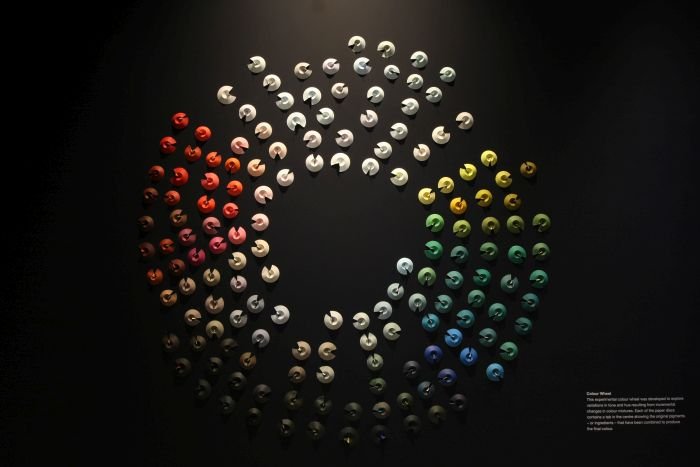
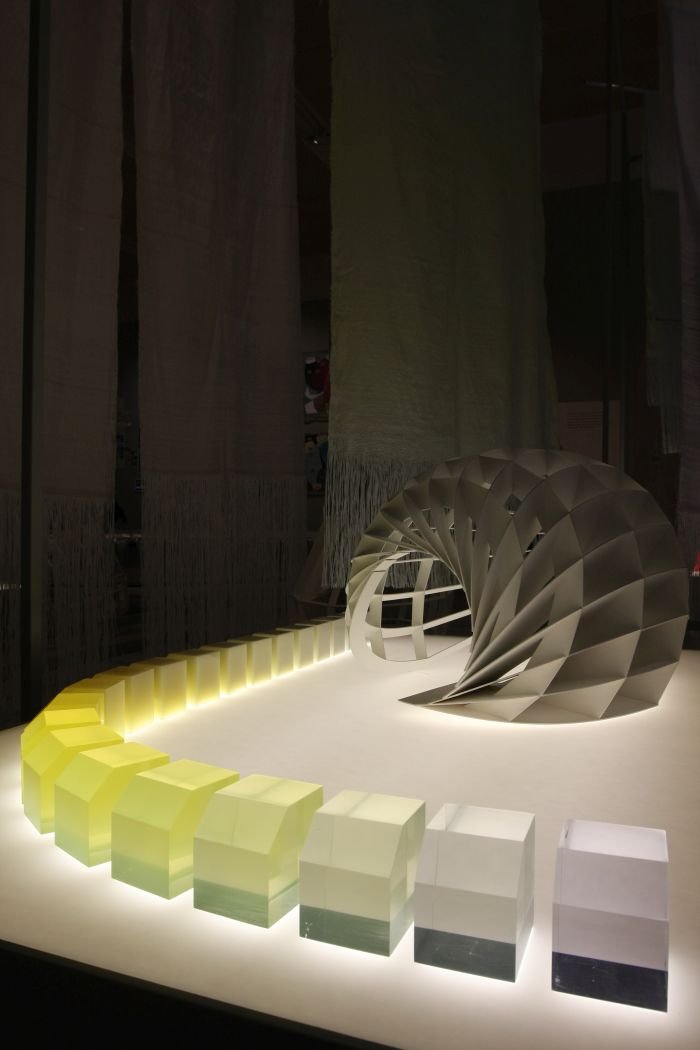
Underscoring this position Breathing Colour presents examinations on reflection, refraction, shadow and introduces a palette of new colour recipes created by Hella Jongerius, a palette of new colour recipes which use the traditional artistic process of creating shades through mixing complimentary colours in varying degrees, rather than, for example, adding carbon to darken a shade.
Through promoting this artistic tradition Hella Jongerius not only demonstrates the flexibility and variety of colours, but also promotes the artistic tradition of letting colours breath, of allowing metamerism.
Something she argues industry has long since ceased to.
Much as Breathing Colour is about motivating us to consider colour in more detail and to better understand the subtleties of colour, Breathing Colour is also an act of activism, an act of rebellion, a protest against what Hella Jongerius refers to as "the flatness of the colour industry."
By which she means?
"As industrial designers we are dependent on global industry for all our plastic granulates, powder coatings, and all those other colourants we require, but the recipes the industrial manufacturers use are created to be stable during the day, they don't react to the light conditions, and I miss that very much", explains Hella Jongerius, "as an industrial designer I would like to have colours that breath with the light, which show the morning light, and the evening light and that is why I wanted to work with colours and try to move the boundaries, bring some quality into the available colours and so bring this quality into our daily lives."
While there is theoretically no reason why industry couldn't produce such colours, indeed all the colour recipes presented in the exhibition were realised by Hella Jongerius in collaboration with a Swiss manufacturer, albeit a small, specialist manufacturer, the problem, according to Hella Jongerius, is largely one of scale, and a reluctance amongst the major manufacturers to produce colours in smaller batch sizes, in batch sizes more appropriate, for example, for the furniture and textile industries.
A state of affairs Hella Jongerius hopes to change.
"First I have to show what colour can bring, how rich it is, that it is a cultural material, that it is very powerful tool, and I hope that through explaining this I can persuade the manufacturers to offer alternative materials, alternative recipes, and also smaller, realistic, batch sizes."
Breathing Colour is that attempt.
Or perhaps better put, the public start of that attempt. For having spoken with Hella Jongerius we sense preparations being made for a long campaign.
One we're very much looking forward to following.
With Breathing Colour Hella Jongerius is positioning herself, in her words, as "a filter between consumer and industry", by demonstrating what she misses in contemporary, industrial colours she hopes to show us consumers what we have, what we are missing, and thereby what we could have and then encouraging, urging, us to demand that from industry.
As such Breathing Colour not only challenges us to consider colours more carefully, to listen with our eyes and to revel in the joys inherent in the stochastic vagaries of metamerism, but also to be aware, wary even, of the way the hard RGB colours of digital technology affect, influence and corrode our relationship to and perception of colour. And also, we venture, to stop concerning ourselves too deeply with generic colour advice, and for all with the ubiquitous "trend" colours?
"Terrible", comes the instantaneous response, "but that is the way the industry works, they have this whole world of styling, marketing, "colour of the year", and while that isn't without value, while such can be of value to textile designers, please also invest in the material itself, invest in your recipes!!"
Breathing Colour however also sets Hella Jongerius, in our words, as a filter between herself and the global design community, challenging designers to think more carefully about not only how they use colour in their work, but the colours they use. If you will, and with apologies to Charles & Ray Eames, to see that the colours aren't the colours, they make the design.
The sub-title of the exhibition is "The power of colour versus the power of form", a most apposite concept in the year that sees De Stijl and Florence Knoll celebrate their centenaries, both of whom relied on colour to help them define space and form, while taking the form follows colour concept a little further, and as Alex Newson explains, "we often think of the Modernists as only creating white cubes but, for example, Le Corbusier used colours in extremely complex and clever ways. He used it to shoot walls backwards, or ceiling upwards and thereby completely transformed the appreciation of space and scale, and so colour can have a huge influence on how objects appear."
An understanding which transposes the thoughts on colour and metamerism presented in Breathing Colour from objects and textiles and into architecture, public spaces and urban planning.
Hella Jongerius is not the first to explore colour, from da Vinci over Newton, Goethe and on to Ólafur Elíasson, colour has long fascinated artists and scientists. In context of architecture and design the most relevant example of studying colour and colour theory is/was, arguably, that practised at Bauhaus, for all by Johannes Itten.
A practice that doesn't exactly resonate with Hella Jongerius.
"I really believe in the Bauhaus as a system of how to study, and I am standing on the shoulders of Anni Albers as a weaver, and also of Johannes Itten, but Itten taught that there was only one truth about colour, and I don't believe that is the case".
Were Itten alive today it would be most interesting, and we hope highly entertaining, to follow him and Hella Jongerius through Breathing Colour, to eavesdrop their discussion and see if the textiles and colour catchers convinced him otherwise, if the changes in the understanding of colour which have occurred over the intervening century, and the influence of contemporary industry, of contemporary industrial colour manufacturing, on contemporary colours, would lead him to re-evaluate his position. Or not.
Johannes Itten might not be able to walk though Breathing Colour, but you can, and in doing so question your own understanding of colour, learn to view colour more critically, comprehend why your colour choices are often limited and so re-evaluate your own position.
An intelligently conceived and constructed exhibition, Breathing Colour isn't instantly obvious, you have to take your time, have to work with it, whereby the neatly written information panels ably assist you at every stage. As does the visitor guide, a delightfully succinct yet informative booklet which competently expands the information boards, and, perhaps most pleasingly, includes an easily digestible introduction to colour, colour theory, optics and pigments. And after visiting the exhibition, a reading area furnished by Hella Jongerius products for Vitra, Artek and Danskina provides ample literature, and comfort, to allow you to deepen and expand your thoughts.
Or put another way, you don't have to be a colour specialist to view the exhibition. Just interested in design, colour, the world around you and the maliferous influence of global industry on our daily lives.
And while we can't guarantee that having viewed Breathing Colour you will become a colour specialist, you may just find the world around you becomes a lot more colourful than you thought it was.
Breathing Colour by Hella Jongerius runs at the Design Museum, 224-238 Kensington High Street, London, W8 6AG until Sunday September 24th.
Full details, including information on the accompanying fringe programme, can be found at http://designmuseum.org/