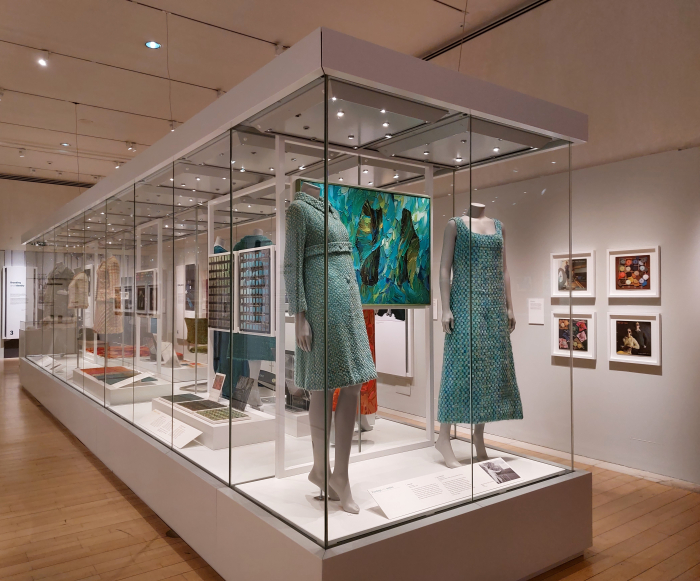
"Design", opined textile designer Bernat Klein in 1976, "means to enjoy the exploration of new possibilities. It means to take pleasure in finding new solutions to old problems; or to have fun juggling with a number of old solutions until they suddenly click and coalesce into one, beautiful, new solution".1 With the exhibtion Bernat Klein. Design in Colour the National Museum of Scotland, Edinburgh, allow insights into how Klein explored, discovered and juggled. And the new possibilities and
read more
Amongst the many developments that have influenced and informed the path of furniture and interior design in the past 120ish years one must, without question, count developments in context of colour. Whereas in previous centuries colours were limited in their availability, range and durability, recent decades have seen not only progress in that availability, range and durability, and as such ever more possibilities in our use of colour, but also seen increasing study of psychology and colour
read more
"It is possible to live without taking colours in daily life seriously just as it is possible to live and to ignore music, sculpture and other arts" opines the textile designer Bernat Klein in his 1965 book Eye for Colour, and thereby not only freely equating colour with other cultural goods but also very neatly setting up the refutal, "no one will doubt, however, that life will be fuller and richer if colours are daily absorbed, handled and savoured as they can and should be".1 Eye for Colour
read more
"Green is beautiful" proclaims an anonymous youth, an anonymous youth blind since birth, from Sophie Calle's 1986 photography project The Blind, "because every time I like something, I'm told it's green. Grass is green, trees, leaves, nature too... I like to dress in green". An indication, a confirmation, that even for those who have never seen colour, colour can awaken associations, stir emotions, have agency on the human being. With the exhibition Color as Program. Part One the
read more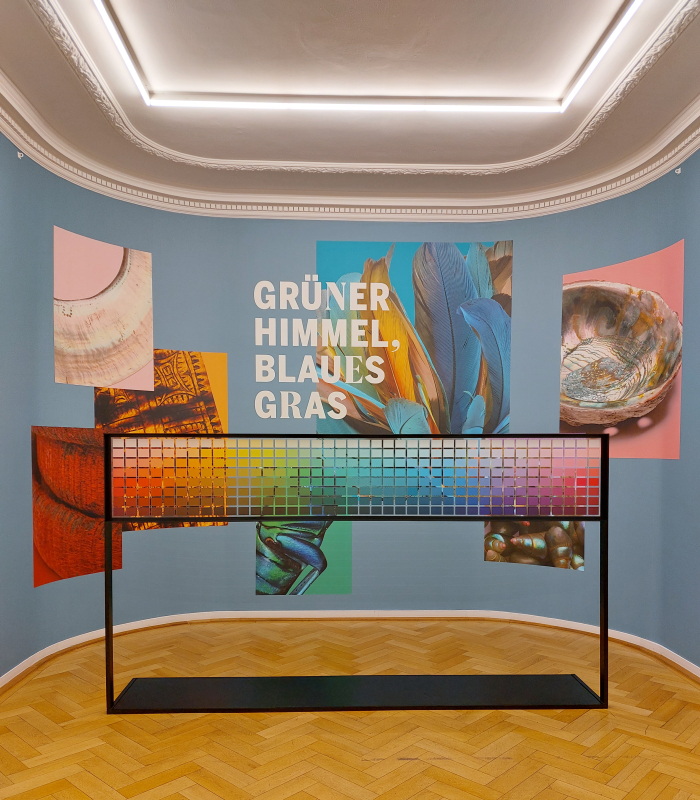
Our relationships with colour are invariably shaped and informed by the culture and society in which we were raised. A state of affairs that, equally invariably, leads to us all possessing relatively strictly defined understandings of colour, understandings of the psychology of colours or of the agency of colours or of the use of colours. With the exhibition Green Sky, Blue Grass. Colour Coding Worlds, the Weltkulturen Museum Frankfurt discuss the cultural relevance and social functions of
read more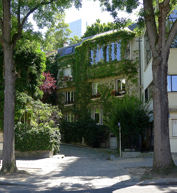
"We must endeavour to introduce a little order into this business, or at least sense into a great deal of it. But what is sense without order? We must try to find some method of arriving at some sort of order - one that will at least enable us to escape from this vagueness in the design of colour", opined Amédée Ozenfant in 1937.1 And had an idea or two as to the how....... Not directly associated with Amédée Ozenfant, but being as it is the house next door to the house/studio designed by
read more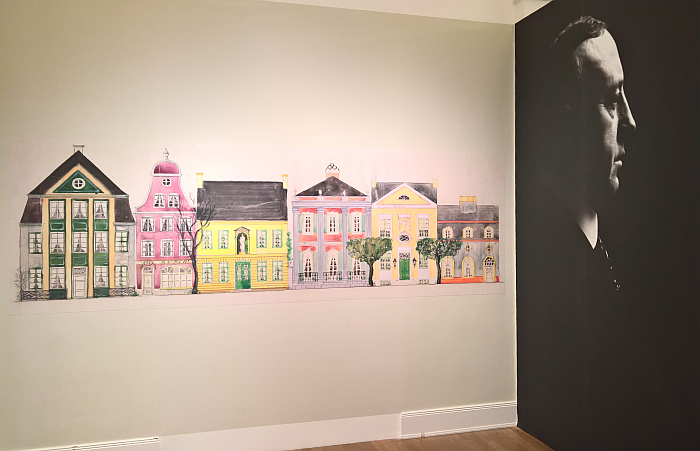
"Conservative Hamburg only permits white paint for its ceilings, doors and windows, and, at most, economical gilding", remonstrated once the decorative painter Peter Gustaf Dorén.1 And set about rectifying that, set about bringing more colour to Hamburg...... Peter Gustaf Dorén. Interior Design in Hamburg circa 1900 Museum für Kunst und Gewerbe Hamburg Born on September 21st 1857 in Sireköpinge, southern Sweden, as Peter Gustaf Andersson, the "Dorén", we learn in the exhibition, being
read more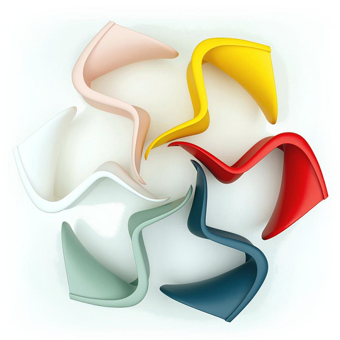
"One sits more comfortably on a colour that one likes" declares Verner Panton in his 1997 book Lidt om Farver/Notes on Colour.1 A succinct expression of an understanding of colour as more than just a decorative element, and one of many reflections on the function and relevance of colour beyond the merely decorative which, in a myriad guises, pervade the history of furniture and product design. And contrasting, if at times complementary, reflections, pun intended, we will consider in the
read more
Red and yellow and pink and green, purple and orange and blue..... Life is so simple as a child. Yet whereas in almost all other respects the progression to adulthood is one of simplicity to complexity, in terms of our understanding of colour we never lose our inner child. With the exhibition Breathing Colour at the Design Museum London the Dutch designer Hella Jongerius encourages us to sing a rainbow, sing a rainbow, sing a rainbow new. Noon colour catchers, as seen at Breathing Colour
read more
