"Design", opined textile designer Bernat Klein in 1976, "means to enjoy the exploration of new possibilities. It means to take pleasure in finding new solutions to old problems; or to have fun juggling with a number of old solutions until they suddenly click and coalesce into one, beautiful, new solution".1
With the exhibtion Bernat Klein. Design in Colour the National Museum of Scotland, Edinburgh, allow insights into how Klein explored, discovered and juggled. And the new possibilities and new solutions that thereby arose.......
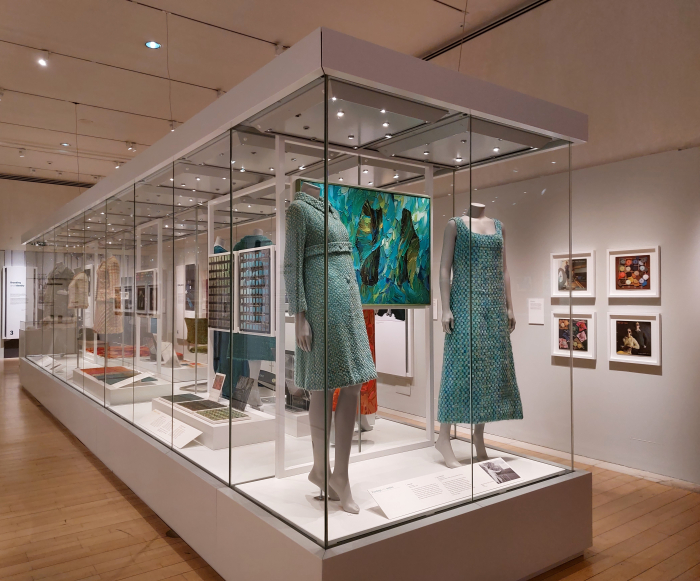
Born in Senta, then Yugoslavia, now Serbia, on November 6th 1922, we discussed the Bernat Klein biography in some detail in context of his 1965 book Eye for Colour, and so refer you there dear reader, and dive here straight into Design in Colour, a showcase which takes you on a sprightly tour through the life, work and career of Bernat Klein in five succinct chapters.
Five succinct chapters which for all their apparent brevity provide for a pleasingly, deceptively, expansive jaunt through subjects and themes such as, and amongst others: Bernat Klein and art, Design in Colour not only neatly illustrating, pun intended, the direct link between Klein's own painting and his textile designs, the open exchange in which they stood, he once noting that, "if I spent the weekend struggling with a group of colours and their proportions in the painting on which I was working, Monday found me in the mill using, quite unconsciously, the same colours and groups of colours in the cloth I was designing"2, but also the role of art in the development of his own positions; Bernat Klein and the natural world, be that as found in his native northern Yugoslavia or his adopted southern Scotland and which served as an important source of information and inspiration, and that from the earliest days of his career, as can be gleaned from a curtain design he developed while a student at Leeds University based on an analysis of the stratification of a shell3; Bernat Klein and post-War Modernism, something perhaps expressed most directly, certainly most elegantly, in every sense of the word, by the house and studio at High Sunderland he commissioned from Peter Womersley, and both of which Klein in many regards co-designed; Bernat Klein and corporate identity, the very carefully managed staging and positioning of his brand, of himself, including the strict, conscientious use in the early 1960s, of the, then, new, typeface, Helvetica across the brand, and that at a period when corporate identity was still very much a fledgling concept, certainly in the Scottish textile industry; Bernat Klein and Scandinavia, an oft poorly illuminated link but an important one not only in understanding Bernat Klein and the development of his positions, even if in his 1976 book Design Matters he does do that unfortunate, irritating, thing of confusing Scandinavia for a country, but also important in better appreciating the influence of Denmark, Sweden, Norway and Finland on post-War European design positions. And how that influence became reduced to a ubiquitous, lazy, marketing tag line.
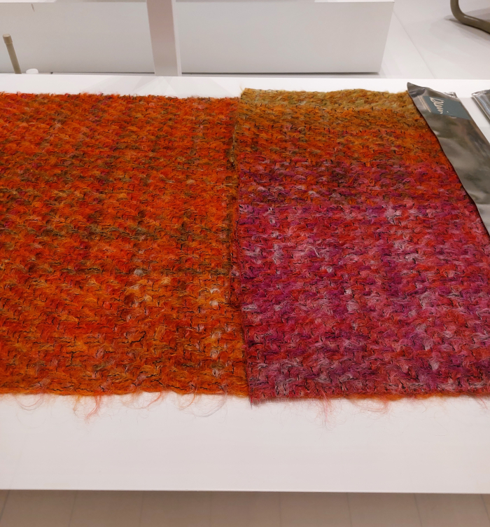
Or Bernat Klein and textiles; textiles which feature in Design in Colour not only in context of the infinite glamour of the Parisian Haut Couture of the 1960s in which Klein made his professional breakthrough, and which saw his textiles being employed by the likes of, and amongst others, Chanel, Pierre Cardin, Dior or Balenciaga, and which in doing so helped the centuries old Scottish woollen and textile industries to shine in a new, contemporary, international light, but also Bernat Klein and screen-printed polyesters and Bernat Klein and yarns for home knitting: Bernat Klein wasn't all exclusive brushed mohair and the catwalks of Paris, he was also a response to, responses to, the turmoil and questioning and challenging and repositioning of the 1970s.
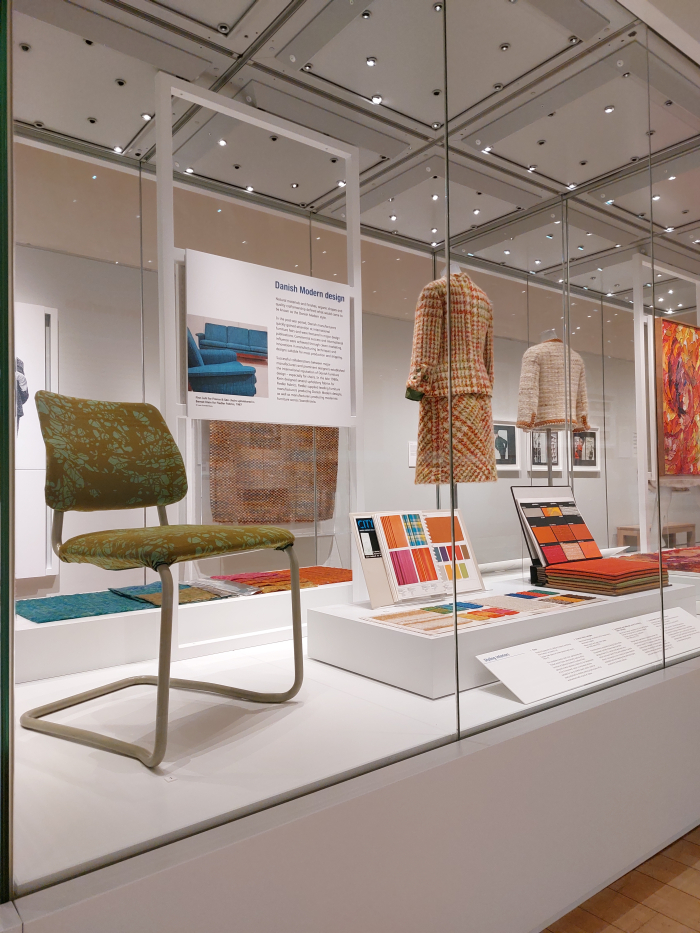
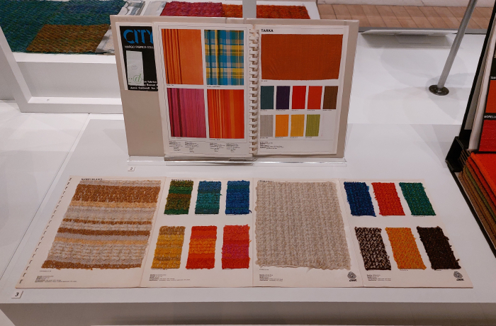
And also Bernat Klein and interior textiles, Design in Colour very pleasingly featuring innumerable examples of and references to the various and varied furnishing, curtain and carpet collections Klein developed and designed for, and again amongst others, Margo Fabrics, Weston Carpets or Fiedler Fabrics; the latter two being Danish and Klein's close involvement with them in the 1960s and 70s enabling, forcing, some important questions about how Danish the much vaunted, marketed, Danish Design, is, or to reframe the question Trapholt, Kolding, posed in context of their exhibition Arne Jacobsen – Designing Denmark: Er det dansk?, Is it Danish design?
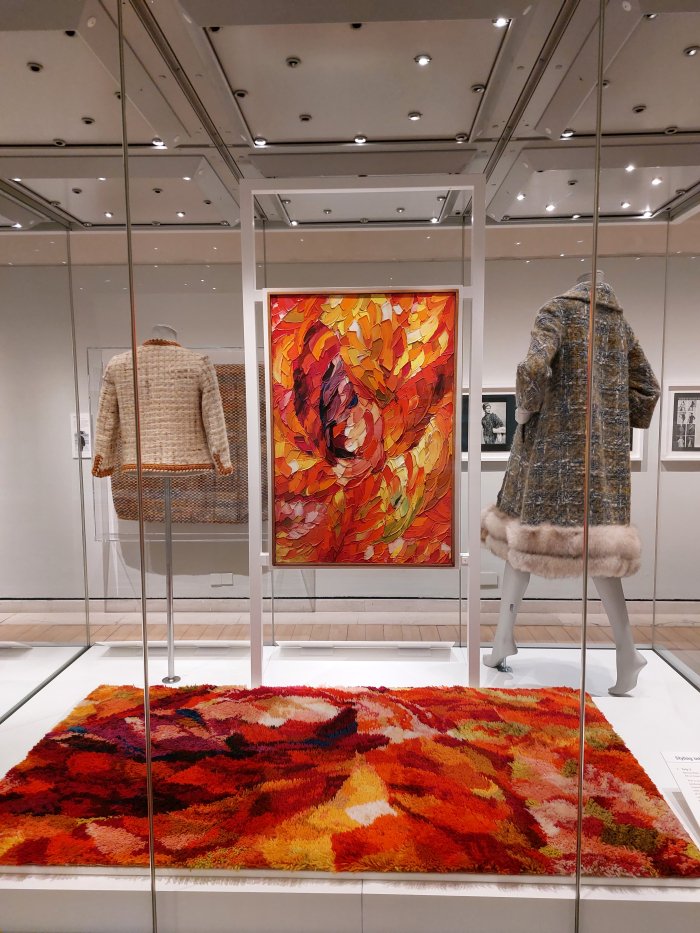
Textiles which, yes, in many cases, certainly in context of the clothing textiles, you do question how relevant they are today; ¿are they perhaps a little too heavy? you ask yourself when viewing, for example, a woven wool and mohair coat by San Francisco based Lilli Ann, or a woven mohair, wool and silk skirt suit by Chanel or a length of velvet tweed, a luxurious mix of velvet and mohair developed by Klein, ¿perhaps a little too physical for our digital, networked, transient world? ¿Perhaps a little too involved and complex for a world ever more geared towards simplification and superficiality? ¿Perhaps a little too shimmery and bright and optimistic for an age of climate emergency, Brexit and enforced mass migration? Or is that perhaps that which makes them so necessary, so urgent today, and for our part we just can't read them? Similarly, you invariably ask yourself, have the screen-printed polyesters aged well?
¿?
But then you remember, it's not about the textiles, it's about the hows, whys and wherefores off the textiles, about what Bernat Klein wanted, why he developed them, how he approached their development, how the textiles relate to Klein's views and understandings of the world, how the textiles relate to Klein's understandings of textiles, Klein's position to design, about the location, relevance and validity of the textiles in the (hi)story of textile design, about how the textiles related to the society and the prevailing realities in which they arose and to which they were to contribute, about textiles as components of and expressions of a society. About textiles as design not craft. About textiles as design not art.
Considerations beyond the physical what of the textiles Design in Colour not only ably supports and abets you in undertaking, but actively demands you undertake.
And considerations which bring you not only to questions about our own contemporary textiles and their relevance, or otherwise, but for all bring you to that which is all around you, in which you are immersed, but of which until now you've only been passingly aware.......
.......Colour.
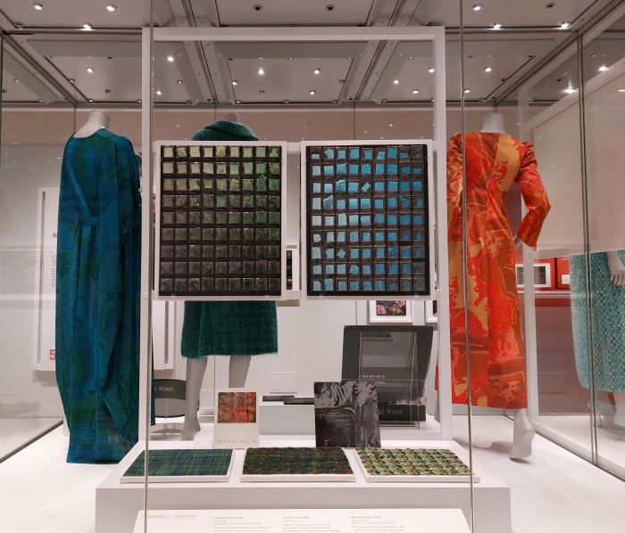
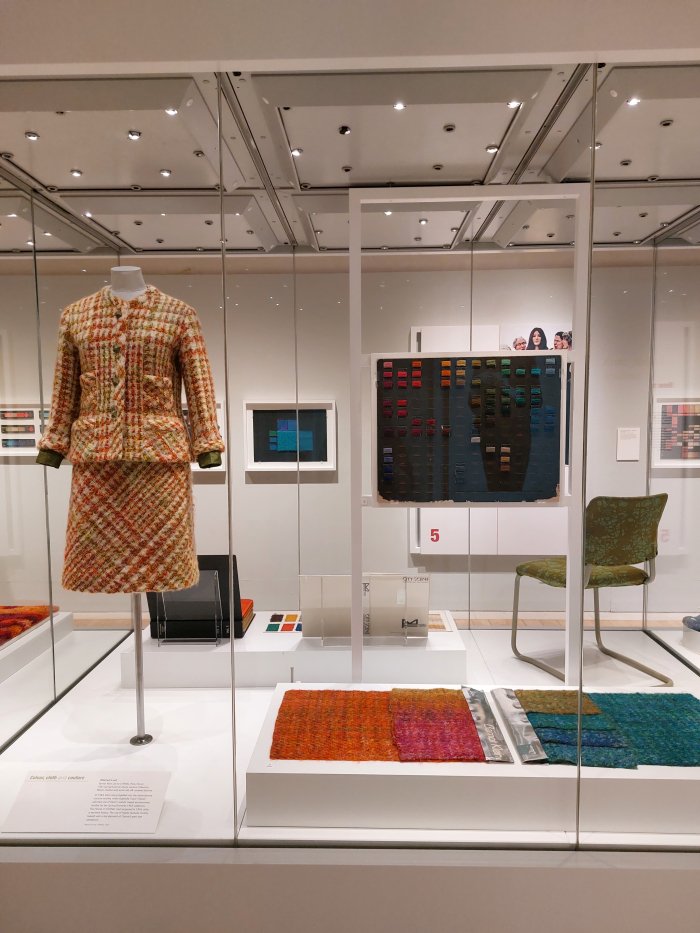
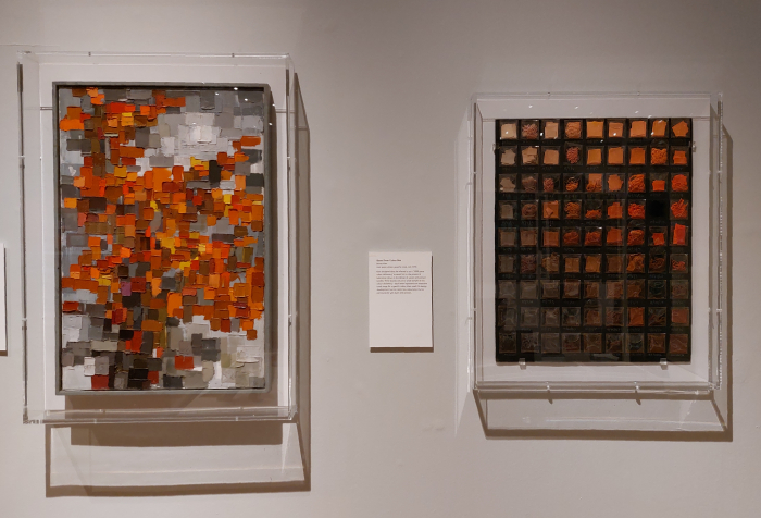
Colour present not only in the textiles of varying types and genres, but also, for example, in several boards from Klein's so-called Colour Box, a self-compiled dictionary of some 5,000 hues collected by Klein over the years, "tiny twists of yarn, snippets of paper, dimples of wool and fingernails of cloth"4, collected and subsequently arranged, methodically arranged, as progressions through a dominant colour, from light blues to dark blues, from light greens to dark greens, etc, and which Klein used as an extensive reference work to help him combine colours. Colour present as Klein's so-called Personal Colour Guides, a series of six cards discussed in great detail in Eye for Colour and which were based on, and, embodied, Klein's opinion that the secret to deciphering your natural colouring, and thereby what colours of clothing would best compliment that colouring, was to be found in the eyes, the eyes being, for Klein, "the most positively coloured part of the human body", organs that "contain strong, definite colours", colours that are "alive, of a size that can be easily noticed by an observer and usually contain dozens of tones of their basic colours and also mixtures of these colours"5; and thus a deciphering of your natural colouring in which the first step was to study in fine detail the differentiation in the grade of colour of your eye, something akin to the iris photography that is à la mode today, and subsequently match the colours of your eyes with the respective Personal Colour Guide for your mix. Colour present in discussions on the so-called Co-ordinated Colour Guide Klein developed in the late 1960s for the UK Department of the Environment as the basis for the interior colour schemes of various and varied government properties, a cooperation with the Department of the Environment that also saw, as can be enjoyed in Design in Colour, Klein develop screen-printed nylon jersey seat covers which could be slipped onto existing chairs and thereby allow existing chairs to integrate into new interior schemes, or allowed one chair type to be used in numerous locations and contexts; screen-printed nylon jersey seat covers which are very much a variation on the screen-printed polyester caftans and dresses he developed, and screen-printed nylon jersey seat covers which, if one so will, represent a variation on the so-called bikini upholstery pads developed by the Eames and Don Albinson in the early 1950s for the Eames' wire chairs, and which thus also helps one approach Bernat Klein in context of post-War Modernism.
And colour present in Klein's paintings, including Seascape from 1963, a work that provided the basis, and information, for a luxurious velvet tweed employed in a dress which hangs next to Seascape; a dress that while, today, we may, do, question tweed velvet as the basis for a dress, the greens and blues and whites shimmer with a charm and joy and deliciousness all of their own that hasn't, can't have, faded. Probably never will. And a comparison between painting and dress, a same same but different, that not only helps one to better appreciate how Klein handled and employed colour, nor only the inherent honesty in that handling and employment, but also to better approach the fundamental importance of the link, the borderless interchange, between Klein's art and Klein's design in Klein's oeuvre.
Colour that is not only omnipresent in Design in Colour, but helps steer and guide the narrative; it's presence in all the chapters being less a linking element between the chapters, between the various facets and components of the Bernat Klein biography and oeuvre as told by Design in Colour, and much more a thread, pun again intended, that runs through Design in Colour, and which if followed allows one to better approach not only the numerous themes, but also to better approach Bernat Klein.
And for all to better appreciate the fascination with and the passion for colour that is and was the core of Bernat Klein; a fascination with and a passion for colour, Klein himself uses the term "obsession"6, that we discussed in detail in our post on Eye for Colour, a fascination with and a passion for colour that accompanied him his whole life, and a fascination with and a passion for colour that informed his approach to design: as Design in Colour effortlessly elucidates Bernat Klein did design in colour. Didn't design achromatic and then add colour. Didn't design achromatic and then let a marketing department add colour. And then let them change it whenever they wanted. According to whatever the latest t**** tones were. But designed in colour. From the basis of colour.
And did so because his fascination with and passion for colour, his obsession with colour, underpinned how he viewed the world around him, how he related to the world around him, how he understood relationships in and between the world around us all; a fascination with and passion for colour which meant that Bernat Klein never tried to contain nor restrain colour, but rather let himself be guided and led by colours, let his designing be guided and led by colours.
There is a moment in one of the video interviews that run on constant loop in Design in Colour with some of those who worked with and for Klein in the development of his textiles where a tale is told of how one day Klein brought a leaf into the dye-works and wanted it colour matched there and then, not later on that afternoon but now: because the colour would change over time, and the colour he wanted was the one there and then and now. A tale which not only helps underscore that Bernat Klein viewed the world through colour, was continually aware of the colours around him, nor only helping underscore the importance of the natural world in Klein's use of colour, but for all helping underscore Klein's appreciation of the complexities of colour in the natural world, and how that informed his use of colours in the manufactured world. Klein's appreciation not just that naturally occurring colours continually change, are unstable, but are the sum of their component parts, not a homogenous whole.
An appreciation, and a leaf if in another context, also found in Shelley Klein's easily recommendable part autobiography, part biography of her father, part biography of her mother, part exploration of belonging, loss, identity, in which she recounts a tale of Bernat gazing at the beech trees that surrounded their house and extolling, "those leaves are made up of hundreds and thousands of colours. They aren't just flat and green. Remember that. You have to look, really look beyond what is there", and not just leaves, "it's extraordinary", he continued, "how many colours a single blade of grass can contain, or a feather or a pebble".7 A really looking also inherent in a tale Shelley recounts of Bernat and her viewing the soil of a freshly ploughed field through a fisheye lens, inarguably something only a Bernat Klein would do, something only a Bernat Klein could consider doing, and Bernat's delight at what he saw, that freshly ploughed soil as "a study in brown; the texture and grain of it, its raw physicality".8
Appreciations of the complexity and instability of colour Klein had learned and appreciated and studied not only in and from nature but in and from art, not least the late 19th century Pointillists, a group who, as we all recall, also greatly inspired Alessandro Mendini. Which, yes, is an odd link to forge.
And appreciations of the complex heterogeneity of colour, appreciations that the agency of any colour is the result of the mix and inter-play and relationships of the various colours, and hues of colour, contained within it, that one can clearly read in Klein's work: allows one to read Klein's work with an understanding that the agency of colour in clothing textiles, furnishing textiles and interior design is also the result of the mix and inter-play and relationships of various colours, and hues of colour. An interior as Pointillism.
Bernat Klein wasn't the first to appreciate the complexities of colour and colour perception, nor the only person to appreciate such, his influences were many, but we'd argue, the manner in which he responded to and applied his understandings of colour, of perception of colour and of the agency of colours, the manner in which he based his approach to his work in colour in all its complexities, not only allowed Bernat Klein to continually develop and evolve as a designer, but allowed Bernat Klein to enable textiles to develop and evolve.
And also allowed Bernat Klein to contribute to expanding and extending the definition of function, allowed Bernat Klein to help extricate that definition from the purely technical and mechanical the inter-War Modernists had sought to strictly define it by and to help make function something emotional, communicative, responsive, intangible; and thereby allowed Bernat Klein to enable textiles to have more than a tactile quality, to do more than give warmth, to be more than visually interesting, to be more than appropriately physically durable for their intended role. Which, yes, would bring us back to Alessandro Mendini and his Radical cohorts. All variations of post-War design positions, of post-Modern design positions.
And a contribution to developments in textiles, coupled to Klein's contribution to the business of textiles, another interesting factor, which very naturally causes you to reflect on the contemporary relevance of Bernat Klein in context of the contemporary Scottish textile industry.
Considerations that can, should, must, be continued outwith Design in Colour in the wider Scottish textile presentation within the National Museum of Scotland.
And that not least because Bernat Klein doesn't feature in the short film running on constant loop just a few feet from Design in Colour: a film which claims to depict Scottish Textiles: Past to present, but manages to do so without mention of Bernat Klein.9
Which, having viewed Design in Colour, does strike you as a most odd situation, especially as you've appreciated the novel material typologies he developed, the novel processes he developed, his differentiated approach to designing textiles, his differentiated understanding of a textile, his differentiated understanding of relationships with textiles, the truly international scope of his cooperations and trading, the many new markets in which he was active, the manner in which he helped the centuries old Scottish woollen and textile industries to shine in a new, contemporary, international light. And a situation which quickly becomes even odder when you realise that the section of the National Museum in which you are now sitting is titled Scotland Transformed.
And as you sit and try to work out why Bernat Klein isn't part of the telling of the (hi)story of Scottish Textiles: Past to present, why Bernat Klein isn't part of a Scotland Transformed, trying as hard as you can to blame the selfish vagaries of fashion and a popular focus on visuals over principles, presentation over content, you come, or at least we came, to the realisation that Bernat Klein's period of greatest activity in context of designing textiles was just before the, at first slow, then increasingly rapid, decline of the Scottish textile industry, for all the woollen industry, as increasing numbers of clothing manufacturers began using non-Scottish textiles and increasing numbers of Scottish producers responded by moving production overseas; a decline that not only saw many, near all, of the mills and dye-works in the Scottish Borders cease trading, but in many regards saw the sheep of the Scottish Borders become essentially unemployed, left them just standing there in the mud and rain waiting for an errant postcard photographer to spot them.
And those mills, those manufacturers, that remained, we'd argue, albeit with a goodly degree of incautious, reckless, if necessary, generalisation, responded to the challenges of the period by seeking to position themselves as being traditionally Scottish, by placing themselves on an unbroken tradition stretching back through the centuries, by underscoring and validating their authenticity through a focus on that which was readily readable as Scottish, that which could be extolled as quintessentially Scottish.10 And still do, as can be appreciated but a hop, skip and jump from the National Museum at the top end of the Royal Mile.
Thus at a moment when they could have, should have, been looking forward, grasping an opportunity, (near) all thoughts were drifting ever quicker backwards; and in such a world there is no place for innovation, for imagination, for the novel, for exploring, for discovering, for juggling. For design.
In a world of static tradition there is no place for a Bernat Klein.
In a narrative of immutable authenticity there is no place for a Bernat Klein.
Thus Bernat Klein became a footnote in the (hi)story of Scottish Textiles: Past to present
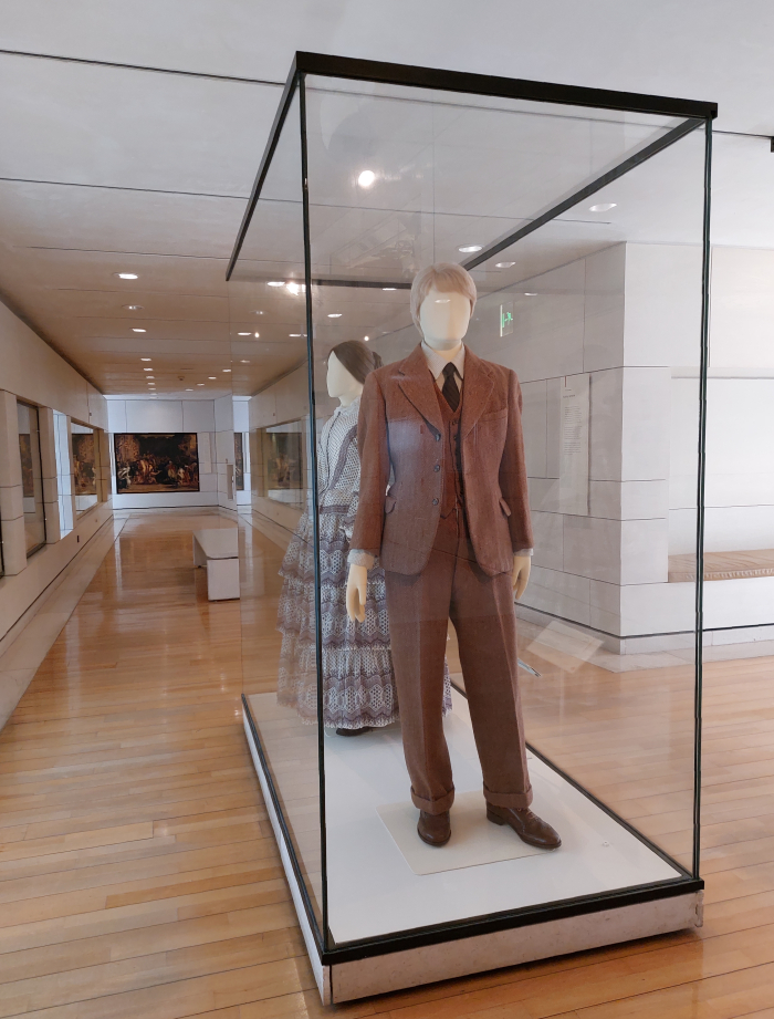
Yet, that positioning towards a marketable tradition, towards a self-fulfilling authenticity, towards an it's aye bin in the 1970s and 80s was, in many regards, certainly we'd argue a convincing argument can be made, an expression of a recurring feature of the Scottish textile industry over the past century and bit, since industrialisation established its unshakeable dominance: when, for example, faced with the speed and volumes at which the new big mills could produce cloth the smaller, invariably regional, producers pointed at their tradition and with the aid of the groups such as the Scottish Home Industries Association purveyed guaranteed authenticity to the drawing rooms of the wealthy; or the post-War textile industry of the late 1940s faced with, essentially, a restart, a restart in a society irrevocably altered by the experiences of war and the shifts in social and cultural norms and conventions that had brought about, but did so by recreating days of yore and calling upon tradition. And a late 1940s textile industry in which a young Bernat Klein began his career. In Eye for Colour Klein describes his first experience of the Scottish textile industry, a job with the company Munrospun in Edinburgh, and the telling off he got from the directors, and the dejection and despair he consequently fell into, for suggesting ties shouldn't be made of thick wool, nor even necessarily wool, and shouldn't be multi-coloured. Thick, colour heavy, woollen ties, Klein was informed, were what sold, were what customers expected, were what Munrospun would continue to make, because that was what they'd always made.1112 From your seat watching Scottish Textiles: Past to present you can view a Scotland Transformed display case containing a 1950s men's suit in a brown and fawn herringbone twill, which, we'll argue, is in many regards representative of the late 1940s thick, colour heavy, woollen tie that that young Bernat Klein rebelled against.
And a herringbone twill, and a thick, colour heavy, woollen tie, which are also highly representative of a world and a narrative in which there wasn't a place for a Bernat Klein.
He took it nonetheless.
And, arguably, needs to retake it.
Or perhaps more accurately, viewing Design in Colour one approaches an appreciation that Bernat Klein needs to be allowed to retake his place in the main narrative of the (hi)story of Scottish Textiles: Past to present.
A Bernat Klein needs to be allowed to explain it can be different, needs to be allowed to explain it needn't be: Bernat Klein's work is rooted in nature, rooted in tradition, rooted in Scotland, but wasn't developed for living in the forests and glens of Brigadoon; rather, was related to, was for living in, contemporary society. His textiles may or may not be relevant for our contemporary society, much like thick, colour heavy, woollen ties that's a matter very much up for debate; but that's also not the important question, the important question is their relevance for the societies of the period he developed them in and for. And the important point, a important point, is that through developing them, through designing them, Klein proposed new possibilities and new solutions for a new society based on new technologies and materials and understandings. Brought design into the craft and industry of weaving and thereby enabled new possibilities and new solutions.
Or put another way, Scotland Transformed with its looms and steam engines and shamelessly exploited workers, neatly explains how throughout the course of the 18th and 19th centuries novel technologies and processes led to fundamental changes in the Scottish textile industry: in the production of textiles, in the industry of textiles, if less so in the textiles which, largely, maintained their traditional understanding of themselves. Or as Bernat Klein phrases it, "the same stuff, or nearly the same stuff, was being produced at a quicker rate", but the problem, in Klein's opinion, was that while "the Industrial Revolution was a revolution in methods of production", it "was not a Design Revolution".13
And that design revolution, one can convincingly argue, is what he understood as necessary. What he sought to instigate. And which, in many regards, stands as Design in Colour in context of, as a contextualisation of, as an alternative, Scotland Transformed.
For while Klein argues one can, must, always refer to tradition and learn from tradition, design is, for Klein, in many regards, "the antithesis of tradition", and therefore design "should actively question accepted thought and dogma", "has to be destructive, almost brutal, in its insistence on doing away with pretensions, irrelevancies and inessentials", that the designer must "work out each problem anew without taking for granted the validity of anything which already exists".14 And, importantly, a design process, that questioning, revisiting and destruction, that exploring, discovering and juggling a Bernat Klein took such pleasure and fun in, doesn't result in an "ultimate" solution, "it merely suggests a closer approximation than existed before to the best solution of the problem in hand", a closer approximation, not least, we'd argue, because society and technology and materials et al have moved on since the last closest approximation; and a closer approximation in which for Klein "the implication is clear that this too will one day be replaced by something better."15 Luxurious velvet tweeds, space dyed mohairs and screen-printed polyesters aren't the end of the story, aren't meant to be produced and used for ever more. They are but a proposition in a moment of time. As are all textiles. Or should be.
Or put another way, the path on which society is on is one going forward, thus so must our objects of daily use, including our textiles.16
And as we move into a coming era of ever more smart materials, of 3D weaving, of modular clothing, of increased textile recycling, etc, etc, etc a Bernat Klein, we'd argue, can help inform that move, can be an important voice in the discourse on how the new technology and the new materials and the new understandings of the world, and our responsibilities in it, enables new possibilities and new solutions for that new society.17
A Bernat Klein doesn't have all the answers, can't have all the answers, and sometimes he's just plain wrong; but such a discourse needs the voice of a Bernat Klein. Design in Colour is a good place to start listening.
But can be but a start.
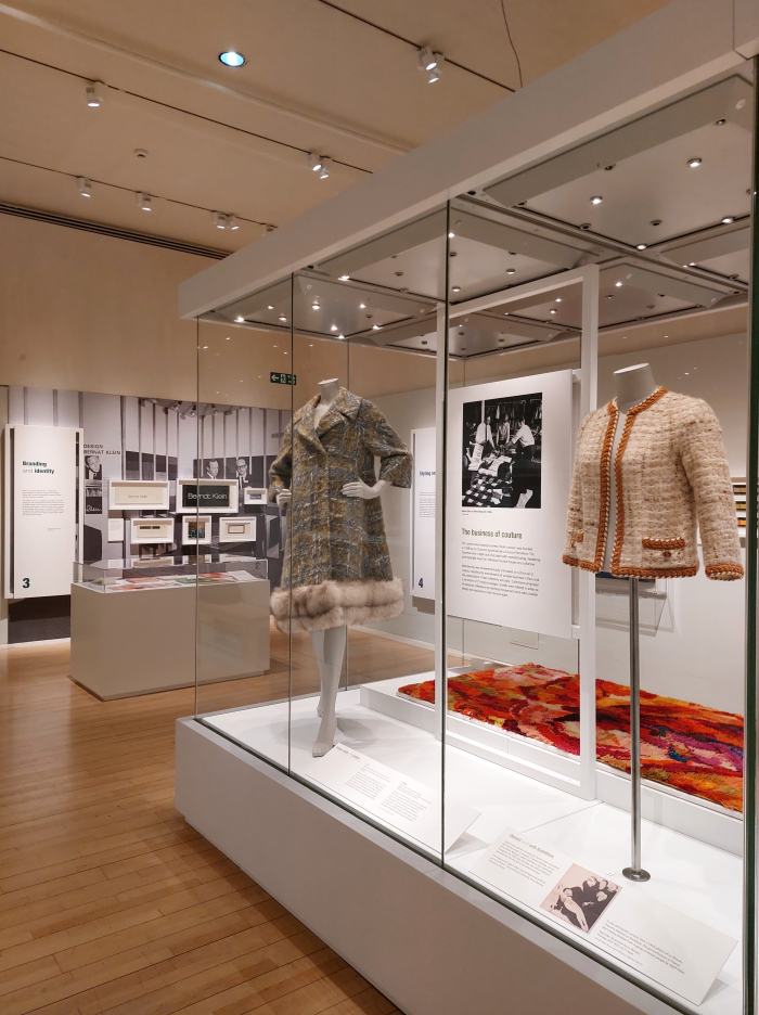
Presenting, despite its apparent brevity, a pleasingly wide mix of objects, photographs, archive documents, and examples of Klein's mail order catalogues, alongside innumerable fragments and samples of textiles created in the many contexts in which Bernat Klein worked, Design in Colour allows for a highly accessible and entertaining elucidation of not only the scope of Bernat Klein's work and the basis of his positions and origins of his motivations, but also neatly and comprehensibly explains the various stages of his career and the variety of disciplines and ventures in which he was involved.
And while doing so also very satisfyingly finds space to highlight and underscore the contribution of Bernat's wife Margaret to his numerous ventures, specifically highlighting Margaret's development and designing of the knitting patterns that enabled all to knit your own Klein original from Bernat Klein wool, and thus reminds that Bernat Klein was very much Bernat and Margaret Klein, which is one of those often overlooked facets. And also pleasingly finds space to discuss Coco Chanel's infamous anti-Semitism; which is not irrelevant, for although the teenage Bernat broke away from the Orthodox Judaism of his family and childhood, he remained not only a (non-practicing) Jew, but a son whose beloved mother had been murdered in the holocaust on account of her faith. Thus highlighting the complications of Chanel being that couturier who was instrumental in Klein's international breakthrough, and who was one of his most regular customers. They never met.
And also finds space to allow Bernat Klein to explain that textile design is more than just creating pretty pictures and patterns, or appropriating the art of ancient cultures for commercial gain, but is a multi-disciplinary profession, a multi-disciplinary approach and understanding on a par with all other design professions; whereby if we did have one complaint it would be that the technology comes a little short in Design in Colour. As a designer Klein developed new methods of dying and weaving to enable him to produce that which he wanted, or more accurately, Klein, together with the dyers and weavers of Galashiels, developed new methods of dying and weaving to enable the production of the textiles Klein wanted, a link, a close cooperation, with crafts that further underscores that textile design isn't just pretty pictures and patterns. And isn't just down to the designer, the designer is but the person who brings all the threads... sorry!... together. And a contribution to the success of Klein's projects by those dyers and weavers that deserves to be noted and celebrated.
But that would be the only complaint; otherwise Design in Colour allows not only for a pleasingly varied, variegated, introduction to Bernat Klein, to the work and legacy and relevance of Bernat, and Margaret, Klein, and can be but an introduction, a place to begin to find paths to follow yourself afterwards, nor only does Design in Colour only allow for differentiated consideration on design, textiles and the contemporary Scottish textile industry, but for all Design in Colour allows Bernat Klein to assist you to better approach colour and those colours with which we surround ourselves, to be more aware, actively aware, of colour in all contexts, not least clothing and interiors. To question colours more.
And very satisfyingly does so in an exhibition design which plays very neatly with the architecture and concept and positions, of the Klein family home at High Sunderland: the vast majority of the exhibits are housed in a monstrous glass vitrine, as were family Klein. A glass vitrine which reflects that for Bernat Klein "a naked building ... was a perfect building. Plain wood and glass were all he required"18; a glass vitrine which echoes Peter Womersley's preference for a building design that aims to be "as simple as possible by eliminating all unnecessary corridors and walls", the practice of "subtractive architecture, commencing with one simple volume and breaking it down"19; a glass vitrine which extends beyond its own apparently limited, well-defined, dimensions, that is both self-contained and infinite; a transparent, structured space that not only allows the inside and outside to become one, allows that which is on the walls surrounding the vitrine to be part of that which is in the vitrine and vice versa, much as High Sunderland is and was interior and exterior in one, nor only allows Bernat Klein to be viewed simultaneously from several perspectives and in varying contexts, viewed as part of a whole rather than a collection of discreet moments, but for all a monstrous glass vitrine that allows Bernat Klein to be viewed as he viewed the world: as a profusion of ever changing and infinitely stimulating colours in unstable relationships to one another.
To view Bernat Klein in Colour.
Bernat Klein. Design in Colour is scheduled to run at the National Museum of Scotland, Chambers Street, Edinburgh, EH1 1JF until Sunday April 23rd.
Full information, including information on opening times, the accompanying fringe programme and current hygiene rules, can be found at www.nms.ac.uk/bernat-klein-design-in-colour
In addition a copiously illustrated catalogue with numerous short essays on Klein and his work is also available.
1Bernat Klein, Design Matters, Secker & Warburg, London, 1976 page 3
2Bernat Klein, Eye for Colour, Bernat Klein Scotland with Collins, London, 1965 page 121
3Yes, it could have been a set task, creating something from a natural model, it's the sort of task students are set, and the context of its presentation in Design in Colour doesn't allow one to know if it was or wasn't; but let's assume it wasn't, less assume he thought it up himself.......
4Shelley Klein, The See-Through House. My father in full colour, Vintage, 2021 page 132
5Bernat Klein, Eye for Colour, Bernat Klein Scotland with Collins, London, 1965 page 100
6ibid page 51
7Shelley Klein, The See-Through House. My father in full colour, Vintage, 2021 page 42
8ibid page 93
9Writing such a sentence, once your back in the office, away from the source, you do tend to panic if it's true... We watched the film at least four times and didn't see him, did however see that today many international designer brands use Scottish textiles, which you would have thought would have allowed a segue to Klein.......
10Clearly there are and were exceptions, we're clearly dissing a few companies and individuals, but here is sadly neither the time nor place for an extensive, exhaustive, essay on the (hi)story of the Scottish textile industry, and so for all the inherent dangers we'll stick with our incautious, reckless generalisations. With apologies. And safe in the knowledge that at some pont in the future we'll have to correct ourselves.
11see Bernat Klein, Eye for Colour, Bernat Klein Scotland with Collins, London, 1965 page 44
12There is, yes, a slight incongruence between the late 1940s Bernat Klein bemoaning multicoloured ties and the early 1960s Bernat Klein wanting to pack "as many colours as was economically practical into each single thread", and thereby enable the placing of "dozens of colours into a single piece of colourwoven cloth" [Eye for Colour, page 118]. For us, it could be to do with the manner in which Munrospun were organising and arranging the colours, and their choice of colours. We're not familiar with the ties in question, they may genuinely have been a confused mess, we no know. Or it could be that Klein didn't feel multicoloured was appropriate for the late 1940s, but was definitely required in the 1960s as European society raced ever closer to 1968. However, Munrospun was also before Klein had seen Georges Seurat's Une Baignade, Asnières a, as one can read, important, pivotal, moment in the development of his appreciations and understandings of colour. And so maybe the late 1940s Bernat Klein was simply more fixated on harmonising larger patches of single colour than harmonising within colours, wasn't far enough down the road, needed more time.... The answer may be out there, and we just haven't found it; but if it's not, it would be good to try to clarify....... The response of the directors was however still wrong. And Klein was right to feel aggrieved.
13Bernat Klein, Design Matters, Secker & Warburg, London, 1976 page 10
14ibid pages 4 - 6
15ibid page 6
16Which, no, doesn't mean that we should all buy new things to replace functioning older things, for our part we're very taken with a Karl Clauss Dietel's Gebrauchspatina, Patina of Use, that patina an object acquires through being an object of use, including, we'd argue, an emotional patina acquired with time and familiarity and intimacy, and like the idea of encouraging that, even if we're fairly certain a Bernat Klein would strongly disagree. And we're talking about design not consumption, and there is a lag between the two, certainly before wide scale popular consumption of design. So, yes, keep things you've got until such time as you decide you need new ones.... in which context we also very taken with Dietel's differentiating between replacing objects when they are verbraucht – used up, exhausted, worn out, finished and when they are gebraucht – used, not so fresh, old, not the newest model. Dietel being another example of, another version of, the post-Modern designer. Whereby there is obviously a difference depending on the type of object: textiles, clothes, furniture, furniture fabrics, electronic goods, cars, crockery, artworks, etc all having differing reasons for being replaced, differing cycles and contexts...... but that's a subject for another day.
17Which isn't to dismiss the work and efforts and experience and contributions of the great many in Scotland researching, investigating and speculating new approaches, the great many exploring, discovering and juggling their way towards new solutions, new possibilities, rather than concentrating on patterns and pictures and tradition, including numerous companies in the Scottish Borders undertaking interesting, future-orientated work in the fields of 3D printing and smart materials. We're not dismissing all that, far from it and lang may yer lums reek.......Design in Colour just got us thinkin.......
18Shelley Klein, The See-Through House. My father in full colour, Vintage, 2021 page 161
19Architects' approach to architecture: Peter Womersley, RIBA Journal, Vol. 76, May, 1969 page 193