"It is possible to live without taking colours in daily life seriously just as it is possible to live and to ignore music, sculpture and other arts" opines the textile designer Bernat Klein in his 1965 book Eye for Colour, and thereby not only freely equating colour with other cultural goods but also very neatly setting up the refutal, "no one will doubt, however, that life will be fuller and richer if colours are daily absorbed, handled and savoured as they can and should be".1
Eye for Colour is both an introduction to how Bernat Klein arrived at such a position, and an argument in support of its validity.......
Born on November 6th 1922 in Senta, then northern Yugoslavia, today northern Serbia, as the eldest child of the textile merchants Leopold and Serena Klein, the young Bernat enjoyed, as best we can ascertain, a comfortable, largely untroubled, childhood in the rural familiarity of Senta until in 1936, aged 13, he was sent to boarding school: first for two years in Galanta in, then, Czechoslovakia, and subsequently Jerusalem, in, then, Mandatory Palestine. Experiences which, as one can read in Eye for Colour, he neither particularly enjoyed nor particularly engendered in him the deep, orthodox, committent to the Jewish faith they were supposed to. But did lead him to Jerusalem's Bezalel School of Arts and Crafts.
Established in 1906 Bezalel School of Arts and Crafts, and summarising more than is prudent, was in many regards imbued with a new lease of life in the second half of the 1930s by the numerous young Jewish creatives who moved to Mandatory Palestine by way of escaping the rising fascism of Europe, took up positions at the school and thereby brought the contemporary creative positions of Europe, for all Germany, to Bezalel. Creatives such as the painter Mordecai Ardon, who between 1921 and 1925 had studied at Bauhaus Weimar, and who was Director at Bezalel when Klein enrolled in 1940; thus placing Klein's arrival at Bezalel, as one of just 40 students in 19402, at an important moment in the (hi)story of not just the institution but in the development of art, craft and design in the contemporary Israel.
And an arrival in 1940 at a timeous moment for the development of Bernat Klein: during his second year Bezalel opened a textiles department3, a department specialising in that branch of design the scion of a textile merchant family had long considered pursuing professionally, as a youth in Senta he had, by his own account, "spent many a day-dreaming hour imagining how one day I might learn to be a designer and run a mill of my own". Thus, not illogically, a new Bezalel textile department in which the young Klein spent most of his time, and where the feeling hardened that "what I wanted more than anything was to design textiles". A desire that took a step nearer fulfilment when in August 1945, and after a great deal of effort, and the end of the War, Bernat Klein swapped the warmth and brightness of Jerusalem for the dank and grey of northern England and a Textile Technology degree course at Leeds University.

Under the programmatic titles of The Warp and The Weft the opening chapters of Eye for Colour take one on a chronological tour through Bernat Klein's first 40-ish years, elucidating not only the importance of his formative years on what would later come, but also recounting his journey, and the relevance of that journey, from Leeds University over stations in Bolton and Edinburgh and on to Galashiels in the Scottish Borders where Eye for Colour opens, specifically in Klein's Galashiels office in the spring of 1962 and where Klein is skimming through the latest edition of the magazine Elle, when "to my amazement, there in front of me, in full colour and over several pages, was our newest cloth, modelled by Chanel."
You can almost see the feather knocking him down and the delighted disbelief that so obviously shone from his entire being.
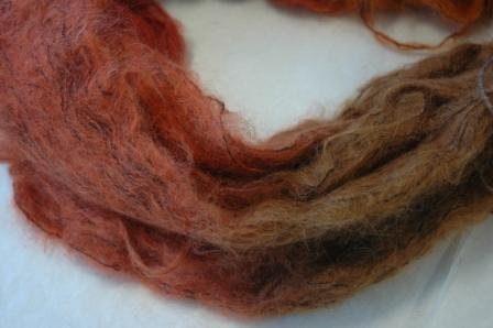
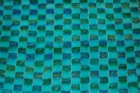
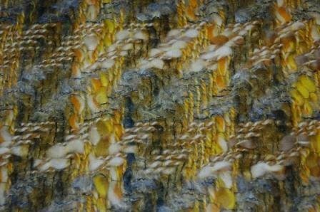
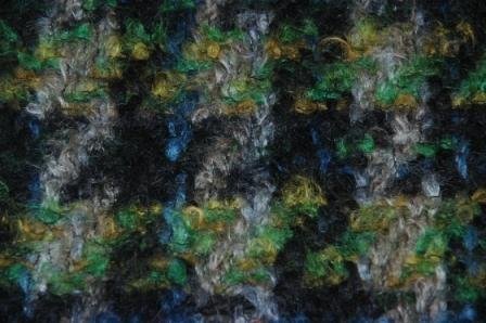
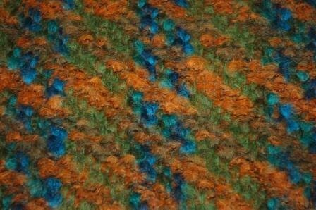
And that not least because that new cloth was not just new in sense of colour or pattern or material, but in terms of concept: or as Klein explains in Eye for Colour the aim of the project was a cloth "bright and living with colour", and that to be achieved through the incorporation of "dozens of colours into a single piece of colourwoven cloth". To this end he and his team sought to place "as many colours as was economically practical into each single thread", which "meant that instead of dyeing a yarn to a solid colour I wanted to dye it to seven or more colours", and thereby producing multi-coloured yarns which could serve as the basis for "a non-repeating colour pattern in woven cloth", a cloth featuring a random mix of small patches of colour, random small patches of colour which "the eye could either add them all up together and so enjoy the fun of their varied subtlety amounting to a clear hard fact or it could see them merging in their multitude to remain an amorphous, cloud hint of tints, of softness and of endless possibilities". But for all, so hoped Klein, random small patches of colour which meant that the "colours in my new cloths would blaze or shimmer". A blaze and shimmering to be enhanced through Klein's decision to use brushed mohair as the yarn, a relatively novel material in early 1960s Europe, a novel material for whose production there were no machines in the UK when Klein started to work with it. The very first being Bernat Klein's.
Now we hear you at the back, "multi-coloured yarn, multi-coloured woven cloth, and???" A valid enough response today, but in the early 1960s the natural retort to your unnecessary sarcasm would have been "AND!!!"; what Klein and his team, and in Eye for Colour Klein makes very clear that it was a team effort, makes very clear that in achieving what he did he was reliant on the knowledge and skill of the yarn dyers and the weavers, if one so will, on that craft understanding we discussed, for example, in context of Glass – Hand Formed Matter at the Bröhan Museum, Berlin, craft understanding coupled to his design positions, aesthetic positions and technical knowledge; and a team effort that produced something mildly revolutionary in the (hi)story of textile design.5 A genuinely new type of cloth with new properties. A patented production process. And a minor revolution employed not just by Chanel, but by many of the larger Parisian couture houses including, for example, and amongst many others, Dior, Balenciaga, Pierre Cardin or Yves Saint Laurent. And that at a time when Paris and Parisian couture was still very defining. For those people for whom clothing is important, obviously.
Yet our interest here is not the cloth itself, interesting as it is, but the why of the cloth?
Why a cloth driven by the desire of achieving such a complex, multifarious, endless colouration in and of the finished cloth?
The short answer is that, as Eye for Colour helps one appreciate, Bernat Klein had a life long obsession with colour. An obsession that began in his childhood in Senta and not only accompanied him on his many journeys, but grew with each journey to become what he refers to as an "incoherent enthusiasm for colour". An incoherent enthusiasm he was equally enthusiastic about sharing.
The longer answer can be best approached in the chapter The Liberation of Colour, for us the key chapter in Eye for Colour6, and which takes the reader on Klein's interpretation of the evolving function, relevance, contribution of colour in society, primarily European society, throughout history as expressed in and through art.
"Liberation presupposes suppression" he announces, and that suppression of colour, he argues, was of fundamental importance in ancient societies including ancient Egypt or ancient Rome, and was primarily expressed through specific significances attached to colours, significance and symbolism irrevocably assigned to colours, a strict symbolic significance of colour which he argues continued on into the European Middle Ages where "religious paintings had to follow certain rules of colour or lose their impact". And while Klein can see in the Middle Ages the start of the liberation of colour, for all in the works of a Giotto, the first sustainable change, he argues, comes in the 19th century: "Turner departed from representation and began to express his internal feelings about his subject in terms of paint", was an artist who "painted what he saw, not what others taught him to see". Of particular relevance for Klein is Turner's ca 1837 work "Interior at Petworth" of which he notes "only colour matters", continuing to argue that Turner must be considered the first Impressionist for it was Turner who "first broke through centuries of convention by endowing colour with new powers of expression and giving it a primary function in painting as compared to the function of almost pure form".
And having sensed liberty, there was no stopping colour: Klein's argument moving from Turner via Manet to the French Impressionists "the first who purified colours so that they could vibrate in their natural intensity" on to Van Gogh, Seurat and Matisse, the latter who "felt that the artists must each time try to find colours to fit his sensations" and further to the Cubists, the Futurists, the Surrealists and onto to the Objective Expressionists and Abstract Expressionists, amongst the latter of whom one painter in particular is deemed worthy of extended discussion: Paul Klee. A Paul Klee of whom Bernat Klein states "is particularly a designer's painter for he was outstanding as a colourist". A Paul Klee whose simile of the "passing stream of image and experience"7 which feeds the artist as roots feed a tree, providing nourishment which having arrived in the artist/tree leads to an expression in a crown incomparable with the roots "explains the freedom of colour and form that has been achieved by painters in the last hundred years", the freedom to interpret inputs as one feels most appropriate based on personal positions rather than as the truthful 1:1 repetitions of yore.
A Paul Klee who was also one of the aforementioned Mordecai Ardon's teachers at Bauhaus Weimar. Bernat Klein doesn't mention this fact. He may not have known. May not have considered it important. We very much like the link. And are very keen to understand it better. Not least because of the very obvious warmth and respect in Klein's, albeit brief, recollections of Mordecai Ardon.
And a Paul Klee with whom Klein's sprightly tour through art (hi)story largely ends, for although there is mention of (predominately) post-War artists such as Jean-Paul Riopelle, Peter Lanyon or Nicolas de Staël, artists where colour is very much in the foreground, as Klein notes, "it is difficult to say what their influence on the general trend of colour use has been or is likely to be"; a sage point that these days we all too often forget when hyping living, working, creatives as having irrevocably changed their genre. They might not have. And certainly not on their own. And it would be interesting if someone more qualified than us could take up Klein's journey, for surely enough time has now past to allow one to approach a meaningful assessment of such artists' "influence on the general trend of colour use", or lack of, and in doing so bring Klein's discussion closer to our contemporary age. Bring Bernat Klein's tour through the (hi)story of art closer to our contemporary age.
A tour through the (hi)story of art, a tour through Bernat Klein's personal understandings and interpretations of the (hi)story of art, which allows one to appreciate from where Klein's new approach to yarn, weaving, cloth, and textile design came. One is left at then end of the tour with a very clear understanding of Bernat Klein's revolutionary, blazing, shimmering, new cloth "bright and living with colour" as Bernat Klein's liberation of colour in textiles, as an expression of Klein's understanding of the necessity of a new approach to textile design, of Klein's understanding of the necessity of a new approach to colour in textiles, of Klein's new cloth breaking the bounds, the rules, the conventions in textile design much as artists past had done in painting to realise a work appropriate and meaningful for contemporary society: for lest we forget we're in that decade when the privations of War have been forgotten in Europe and when European society was becoming ever brighter, ever more Pop, ever more tactile, ever more colourful, ever more liberated, ever closer to the moon, ever more aware of its "endless possibilities", ever closer to the oil crises of the 1970s. And a liberation of colour in textiles Eye for Colour allows one to appreciate was fed, as with Klee's tree, by the impetuses of Bernat Klein's biography and by that which he had learned from art, from artists, for all, in our reading of Eye for Colour, from Klee, from Turner, from Cézanne and from Seurat whose Une Baignade, Asnières was, as one reads in Eye for Colour, a very direct inspiration and motivation for the development of Klein's multi-coloured cloth.
A tour through the (hi)story of art which neatly elucidates the reciprocal relationship between art and society, that art is life and life is art, or is when the art is an honest response to, reflection on, criticism of contemporary society; and thereby by extrapolation an elucidation of both the reciprocal relationship between art and design and also, and, as discussed from The Magic of Form – Design and Art at Kunsten Museum of Modern Art, Aalborg, of the increasingly complex functional demands of both art and design as life, society, has become increasingly complex.
A tour through the (hi)story of art without the academese and opaqueness of so much art theory which allows one to begin one's own considerations on colour and society. Past. Present. Future. And which in doing so allows one to approach an appreciation that while painters may have liberated colour as European society evolved and developed, we today still (largely) ascribe colours attributes, significances and symbolisms, much as ancient Egyptians and ancient Romans once did.
Why?
When Klein notes that "one of the points I'm trying to make is that colour symbolism was all very well in its time; its use today, on the other hand, by modern artists or designers or indeed by anybody, would be a retrograde step", your first response is, typical Modernist, and your second is, but we all do. Of our own volition.
Why?
Or put anther way, in his ca 1908 polemic Ornament and Crime Adolf Loos argues that the "evolution of culture is synonymous with the removal of ornament from everyday objects", and considers the use of ornament "backwardness" and those who use ornamentation "degenerates".8 Here is, sadly, neither time nor place for a comparison of Loos and Klein, but in many regards Eye for Colour develops a similar position, argues, in effect, that the evolution of culture is synonymous with the liberation of colour and that the use of the symbolism is "retrograde"
Yet today ever more individuals adorn their bodies with the tattoos that set Loos in an apoplectic fit, and a majority of us still suppress colour.
Why?
Both Loos and Klein are discussing a possible removal and liberation, are arguing that evolution in culture enables, empowers, a removal and a liberation which at earlier stages of that culture would have been not only impossible but unimaginable.9 The freedoms in approaching the subject we have today simply didn't exist previously. Couldn't have existed. But just because it is now possible doesn't mean that we all grasp it, or must grasp it. Freedom is (also) about taking or leaving, about finding your place as an individual in a community, and decisions for or against ornamentation and/or colour symbolism are invariably personal decisions made in context of shared social structures and positions. Through its discussions on colour, the liberation of colour and use of colour, Eye for Colour offers, for us, insights into three contributing factors for our continued suppression of colour.
On the one hand, as Eye for Colour helps one glean, for all European painters may have helped liberate colours, may have liberated colours in their art, many of the frameworks that enforced colour symbolism in painting, and society, in days of yore remain; reinforces an appreciation that as, for example, discussed from exhibitions such as Green Sky, Blue Grass. Colour Coding Worlds at the Weltkulturen Museum, Frankfurt or Color as Program. Part One at the Bundeskunsthalle, Bonn, cultural colour coding is an inherent, inherited, feature of all societies and communities. Fairy tales, folk tales, folk legends, for example, are heavily imbued with a colour coding that passes from generation to generation, as does the colour coding of religion, Bernat Klein discusses at length the colour coding of the Orthodox Judaism he was raised in, but all faiths have their unshakable colour codes as much as their unshakable moral codes.
On the second hand, as Eye for Colour encourages one to consider rather than directly tackling, our scientific exploration of colour and for all our development of systems and orders for colours have established their own inheritable codes and traditions; codes and traditions we're all taught as young children and which, as Verner Panton would no doubt argue, rob us of our innocence in our use of colour. Bernat Klein, for example, speaks at various points of warm or cold colours and of contrasting and harmonising colours: but such don't exist in nature, such are artificial concepts we humans have devised to help us to define colour, to manage colour, to deal with colour. To suppress colour every bit as much as the ancient Egyptians or Romans once did. And although colour systems have been developed since antiquity they are very much associated with developments of the late 19th/early 20th century, and thus one of the central moments in Klein's liberation of colour: as for example noted in context of Amédée Ozenfant and colour, the scientist Charles Henry, whose Cercle chromatique was important in establishing ideas of colour harmony in late 19th/early 20th century France, was very closely involved with the likes of a Georges Seurat. Not that Seurat's association with Henry places his role in the liberation of colour in question, far from it, for as Klein convincingly demonstrates Seurat was, as with all, a moment in an ongoing journey. And Seurat did literally liberate individual spots of colour from their neighbours. But it does allow for appreciations that the liberation of colour in the late 19th/early 20th century, and by extrapolation Modernist positions on and to colour, occurred (largely) in a rational scientific framework.
And on the third hand, "then one day when I was being interviewed by the fashion correspondent of one of the large weeklies, that perennial question: "Which will be next season's colour? was again put to me. I found myself blurting out, with more conviction than I had ever managed before, that I didn't know and that as far as I was concerned it didn't matter". Bravo Bernat! Bravo!!! But for a great many it does matter. There are today industries involved in little more than announcing that next season's colour will be Wistful Orange or Ashen Faced Teenager or Chicken Beak or whatever. And within 24 hours of the announcement Instagram is full of mood-boards in Wistful Orange, or posts explaining how to dress and/or furnish your home in Chicken Beak. While in the clothing and furniture stores of the land it's all but impossible to escape the omnipresent Ashen Faced Teenager.
"A question started to nag at me and it was about fashion in colours: where do colours come from and why? And where do good colours go when they die?" The concept of a colour dying perfectly encapsulating for us the absurdity of a marketing driven approach to colours, of colour as a commodity, of our ongoing obsession with fashion colours and t**** colours. And also of the ongoing suppression of colour.
Religion and superstition once bound our colours, then science and rationality and today big commerce and a manufactured fear of missing out.10 Colours, as Bernat Klein convincingly argues, have long been liberated but, so the inescapable conclusion, we're not comfortable with that. Collectively or individually. And so in our lives, in our objects of daily use, we contrive ever new ways to contain colours. To ensure we don't have to decide for ourselves.
But what if we did decide for ourselves?
Bernat Klein is acutely aware of this imbalance between what is possible and what is and Eye for Colour is his gentle attempt to encourage us all to dispose of our colour crutches. He himself doesn't manage completely: while his multi-coloured mohair cloth, arguably, demonstrates that that liberation is possible, and that, again arguably, more clearly than had been achieved previously, he still talks in context of the science and rationality of compliment and harmony, of warm and cold colours, when advising readers on how to choose the colours for their clothes. Typical Modernist. But as a work Eye for Colour is an argument against definitives in colour, against symbolism in colour, against marketing in colour, an appeal to us us all to make our own decisions.
An appeal for us all to personally liberate colour in our lives.
As a work Eye for Colour is a discussion on colour told in colour with a passion for colour, a passion for colour expressed not only in Klein's use at every opportunity of a hued adjective, nor only in the pro-colour arguments he advances but also in examples of Bernat Klein's own art presented alongside examples of his cloths, juxtapositions which help one appreciate the direct connection between art and design in Klein's work. And it is design not applied art, for Klein's work started not with the cloth but with the yarn, and was primarily about developing a system for producing cloth through the integration of craft, technology, science, art, reflections on contemporary society and a healthy dose of an "incoherent enthusiasm for colour".
And thus as a work Eye for Colour is today, arguably, most relevant for designers and manufacturers, for all textile designers and textile manufacturers: the multi-coloured yarns Klein developed and whose existence he saw as essential may be commonplace today, but the question of appropriate and meaningful contemporary textiles will always remain in need of an answer. As will questions of the textile industries approaches to and use of colours, questions of the colours offered, of why those colours are offered, of how one can bring more flexibility into colour programmes, how can manufacturers offer the colours individuals want rather than trying to get individuals to want the colours manufacturers offer? "Where do good colours go when they die?" Why do colours die? Can colours die?
However as a work Eye for Colour also remain relevant for us all, yes, primarily in context of textiles, be they clothing textiles or domestic textiles, but also in context of the general colour composition of our spaces. Our worlds. As a work Eye for Colour enables, demands, a differentiated questioning on the hows, whys and wherefores of our colour consumption practices and a questioning of the symbolisms and associations and characteristics we assign to colour; or as disco pioneer Giorgio Moroder once phrased it in context of another cultural good, "once you free your mind about a concept of 'harmony' and of music being 'correct', you can do whatever you want".11 Eye for Colour makes a similar point in terms of colour.
A concept of a correctness in colour Eye for Colour allows one to approach not only through the myriad perspectives on our relationships to colour it introduces, nor only through its demand for personal, individual approaches to colour rather than mass, collective, approaches, but also through the manner in which it expands on and compliments arguments advance elsewhere by others, not least in our own age by a Hella Jongerius, on the volatility of colours, that colours are alive and always exist in a particular context, that colours breathe. That if one things colours aren't, it's fixed and static.
Nor is our relationship with colours. As Eye for Colour neatly elucidates the function, the relevance, the contribution of colour in society, our relationships with colour, change with time, are in constant flux, and will continue to be, that colour is a cultural good and by necessity must evolve and develop as cultures evolve and develop. Which may be why colours die.12 And while art historians can only define the nature and significance of those changes long after the fact, we can all contribute to those changes in the now; we, as Bernat Klein encourages, just have to consider more critically how we absorb, handle and savour colour, learn to absorb, handle and savour colour more freely, with a greater sense of liberty. To absorb, handle and savour colour as they can and should be.......
1and all other quotes unless stated from, Bernat Klein, Eye for Colour, Bernat Klein Scotland with Collins, London, 1965
2"there were about forty students studying painting, graphic art, sculpture and metal work and later weaving", page 31
3We currently can't locate who was responsible for establishing the textile department at Bezalel, and/or who were the first staff of that department. In Eye for Colour Klein makes no mention of any particular individual and so presumably he didn't feel them that important in his development. But in the interests of completion it would be important to know. And useful.
4Further examples of Bernat Klein textiles, and objects created from them, are available via the Heriot-Watt University's Bernat Klein Collection on JSTOR and in the National Museums of Scotland Collection.
5We're not 100% certain that Bernat Klein was the first person in the world ever to produce a commercial multi-coloured yarn, the (hi)story of yarn dyeing isn't that simple to follow. Or if it is, we don't know how to. The so-called space dyeing process he employed was, as best we can ascertain, known before Klein employed it, and indeed a 1964 amendment to his 1963 patent makes clear that there is no claim over the yarn dying process, even that is a large part of the patent. That may however be because patenting processes is harder than patenting a machine for a process. But we don't know the details. Of what we can be certain is that Bernat Klein was a leading protagonist, developer and advancer of the process, and without question one of those designers, the designer, with the clearest position as to how to use the process to produce contemporary cloth.
6Key chapter according to our singular reading of Eye for Colour. For others the more important chapters will be Klein's reflections on choosing and combining colours in clothing and accessories, or his distinction between being fashionably dressed and being well dressed, or his thoughts on textile design education, or his assertion that when defining our own colour, when deciding what colours best suit us, the most important guiding factor is the colour of eyes.
7Paul Klee, On Modern Art with an introduction by Herbert Read, Faber & Faber, London, 1924
8Adolf Loos, Ornament und Verbrechen, in Adolf Loos: Sämtliche Schriften, Franz Glück, Wien, 1962 (amongst a great many other versions)
9Both Klein and Loos use in context of their arguments a comparison of European societies with non-European societies, Papua New Guinea being the prominent non-European society in both. Non-European societies discussed by both Loos and Klein as being "primitive", a problematic term for today's eyes, but one must always remember that until the 1970s that was how non-European societies were understood, was the official academic view of non-European society until 1968 shook up European and American universities. Which doesn't excuse it's use today, doesn't mean ¯\_(ツ)_/¯, but does explain and contextualise it.
10As with so much in life the progression isn’t successive but aggregative, cumulative, all three forms of colour suppression exist simultaneously, certainly in European society. But you knew that, which is why we added the explanation as a footnote rather than boring you in the main text.......
11Daft Punk, Giorgio by Moroder, Random Access Memories, 2013 Quote comes at around 5 minutes, just before Daft Punk, inspired by Moroder, do whatever they want
12Reading Eye for Colour our thoughts kept returning to the avocado bathroom suites once so popular across Europe, a colour that, arguably, died on account of evolving social and cultural positions.... and a subject we will return to at a later date.

