"Green is beautiful" proclaims an anonymous youth, an anonymous youth blind since birth, from Sophie Calle's 1986 photography project The Blind, "because every time I like something, I'm told it's green. Grass is green, trees, leaves, nature too... I like to dress in green".
An indication, a confirmation, that even for those who have never seen colour, colour can awaken associations, stir emotions, have agency on the human being.
With the exhibition Color as Program. Part One the Bundeskunsthalle, Bonn, explore colour beyond its physical reality, and in doing so allow for differentiated insights and perspectives into and on our relationships with colour, with colours.
As an exhibition Color as Program. Part One is the result of a cooperation between the Bundeskunsthalle's entire curatorial team, supported by English artist Liam Gillick as guest co-curator; the first time the Bundeskunsthalle have employed all their curators for one exhibition, and a mixing of specialities and foci that means Color as Program1 is not only an exhibition without a unifying central narrative, an exhibtion not built on a central theoretical, curatorial, pillar, but also an exhibition without a set, far less an optimal, route through it. You're very much free, actively encouraged, to find your own way around and through the presentation.
And thus Color as Program stands very much diametrically juxtaposed to how colours are normally approached, as definable and systematic.
A freedom in approaching colour that allows Color as Program to enable you to explore colours afresh, and for all to enable you to better appreciate the myriad functions colours posses and perform; a myriad functions colours have always possessed and performed, but which over the centuries of human civilisation have not only become ever more complex as human civilisations have become ever more complex, but have become increasingly difficult to recognise, to isolate, from the background noise that accompanies contemporary human society.
Color as Program is an invitation to take a step back from the sensory overstimulation of daily life and to reflect quietly on colour. As colour.
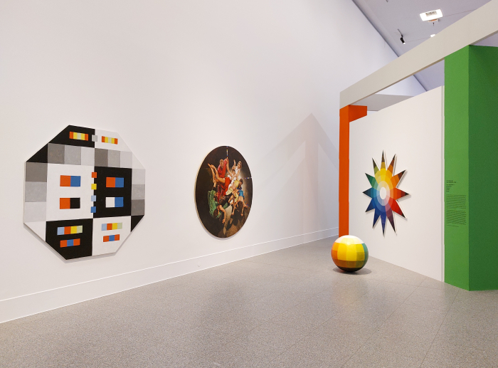
To this end Color as Program presents projects by some 47 international artists which represent and embody different aspects of colour, different functions of colour, different relationships with colour, different positions on and to colour, including the much discussed and pronounced psychological actions of colour, something perhaps most graphically illustrated by Gardar Eide Einarsson's 2016 Distinct Functional Layers Help Establish Hierarchy and Order which recreates the blue light that illuminates certain Japanese train stations by way of seeking to employ the calming and mood-enhancing characteristics of blue to reduce suicide attempts. And that with apparent success: research by Tetsuya Matsubayashi and colleagues indicating significant drops in suicides following the introduction of blue light.2
An unconscious use of colour, an unconscious application of the psychological actions of colour, to influence individuals' behaviour for what is, inarguably, a positive reason, that is also one of the more graphic examples of colours as manipulative; and a graphic reminder not only that the subliminal influences asserted by outside forces needn't always be positive, but that they are omnipresent in our contemporary societies. And thereby reminding us all of the necessity of being aware of our relationships with our environments, aware of the natures of our myriad, two-way, interactions with the world and the objects around us. And of critically reflecting on all that which we sensorily consume.
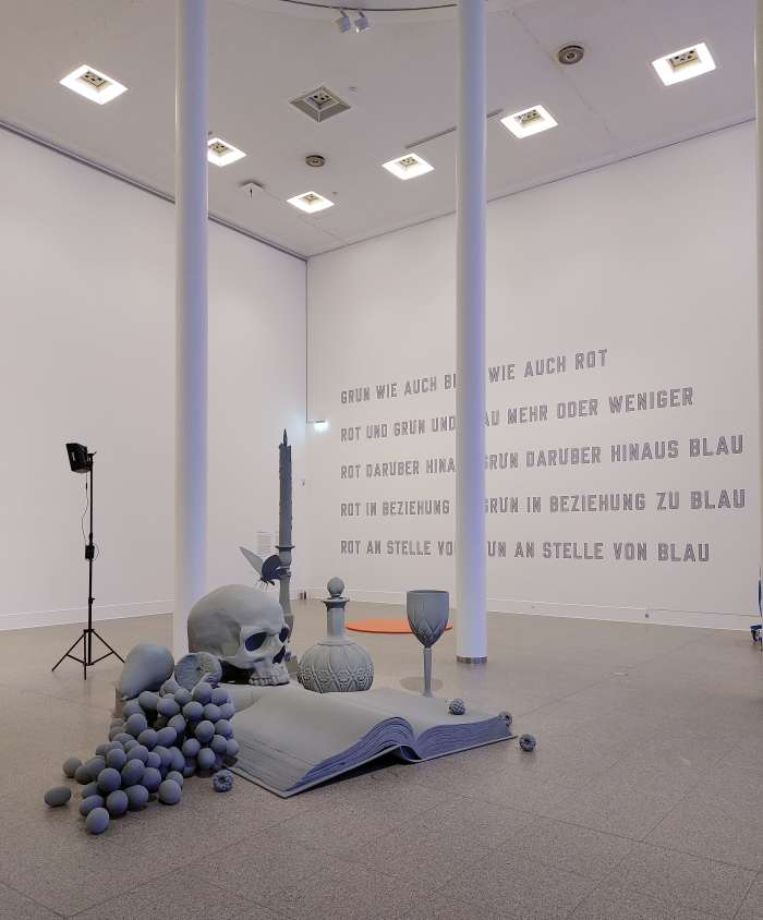
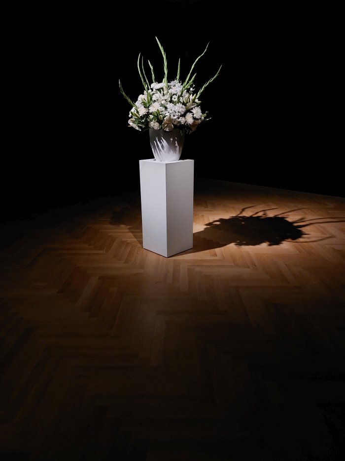
A reminder underscored, certainly for us, by projects such as, and amongst others, Willem de Rooij's Bouquet IX and its dominant, highly suggestive, highly fragrant, white; by the architectural colour research and application of Hans-Albrecht Schilling; by the liturgical violet of Carsten Fock's Every day is a day (of rebellion); or by two large billboards to which Rozbeh Asmani has pasted graphic works, graphic works that will be changed on a weekly basis3, graphic works based upon the colour schemes of popularly known brands, unnamed brands, but (relatively) readily identifiable brands. The opening two were widely distributed German(ic) discount supermarket chains. And a work that reminds very much of Verner Panton's discussion in Lidt om Farver/Notes on Colour on the considered and deliberate use of colour in brand identity and product design, and in which doing so helps underscore that colours not only subliminally affect us via psychological processes but also through associations, that to a degree we read the world, learn to read the world, around us, through colours. Something tending to be further underscored in Color as Program by Hans Op de Beeck's 3D still life Vanitas XL in its endless monotone grey, yet which it is all too easy to view in glorious technicolour, for we all have preconceived ideas of what colours things should be.
And which thus allows one to better appreciate that colour reading, unconscious colour reading, and the resultant unreflective associations can affect our behaviour as much as the psychological of colour. Which thus allows one to better appreciate the importance of being aware of how we respond to and interact with colour.
Not that Color as Program is all warnings and admonishments. That's just how we view the world.
There's also a goodly bit of activism through and with colour, regular references to the political function of colour, including, for example, Pamela Rosenkranz's project Firm Being with its plastic water bottles filled with silicon rubber dyed in a wide variety of skin tones; Gilbert Baker's 1978 Rainbow Flag alongside a great many of its alternative expressions for the colourful variety of humanity; Judy Chicago's feminism inspired, feminism inspiring, Women and Smoke or Thu-Van Tran's monumental Colours of Grey which employs the colours of the so-called Rainbow Herbicides deployed by the US Army in the Vietnam War as the basis for a work which joyously and defiantly highlights and thematises the destruction, the social, physical and environmental destruction, of war.......
.......which, yes, brings us back to the work/project This Tortured Earth on show but a few kilometres Rhein downstream as part of Isamu Noguchi at the Museum Ludwig Cologne.......
.......which yes, brings us back to warnings and admonishments.
But, honestly, can we be subjected to too many warnings and admonishments these days?
Not that Color as Program is all warnings and admonishments......
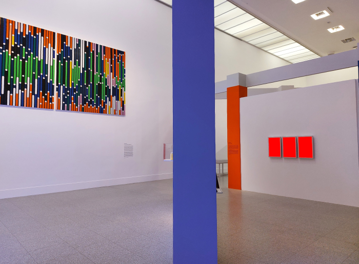
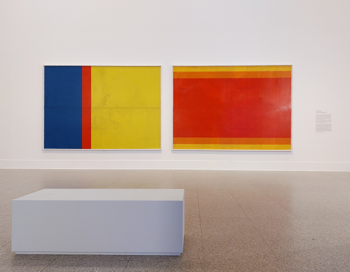
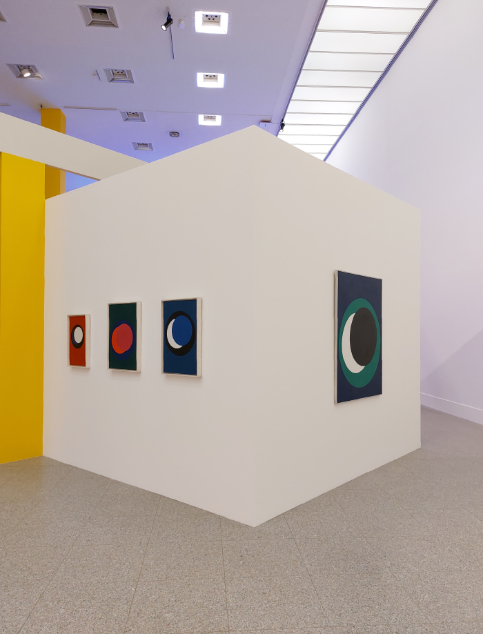
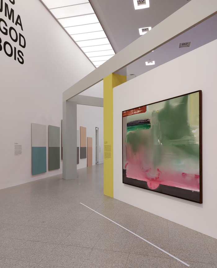
......Color as Program also poses questions of, explores, challenges, delights in, colour as autonomous entities in their own rights, independent of associations and psychology and politics and information; and does so through works as varied as, and amongst a great many others, Geneviève Claisse's various Cercles, Helen Frankenthaler's wholly engaging Zarathustra and When the Snow Melts or Leo Lionni's 1959 book Little Blue and Little Yellow with its heart-warming tale of two befriended blobs of colour.
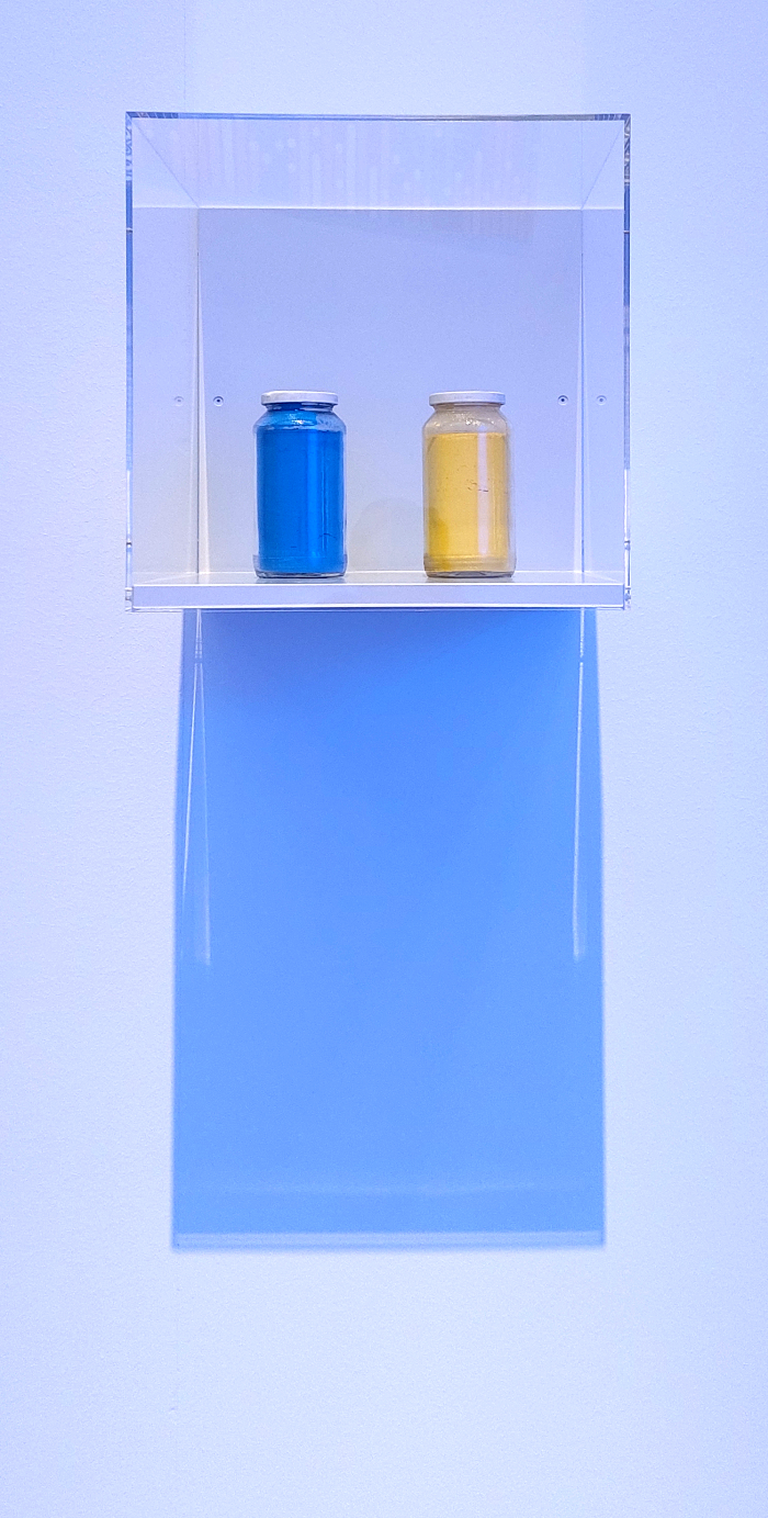
Two befriended blobs of colour, or more accurately two colours, that remind us not only that in mixing, in interaction, in cooperation, we can become something beyond that which we are as individuals, but also reminds that even the most innocuous of colour combinations can become imbued with an associative function, can become political. Something, and staying with the same colours, very satisfyingly, and very poetically, underscored by Franz Erhard Walther's 1963 work Yellow and Blue in which a jar of his own ochre yellow stands alongside alongside a jar of Yves Klein's International Klein Blue. A unity of blue and yellow that in 1963, and arguably near anytime since, would have been largely about ownership of colours, about the the monetisation of the naturally occurring absorption/reflection of light waves, but which stands today in the Bundeskunsthalle as a pertinent and apposite reminder of the fragility of that which we call life. And of the urgent need for fundamental changes in global society.
For all that Color as Program doesn't have a natural, or optimal, path through it, it is does very much have a chronology, as an exhibition it begins in the mid-19th century and the start of industrial colours and the artificial, mechanical, reproduction of colours before, ....... no ....... stop ....... more accurately, Color as Program starts in the mid-19th century and the start of industrial colours and the artificial, mechanical, reproduction of colours in a western, European, context.
For all its international perspectives and international roster of artists Color as Program is very much an exploration of colours (primarily) in context of western, European, colour conventions; something tending to be underscored by the prominence afforded European inter-War Modernist positions, positions which are not only centrally placed in the exhibition design, but central to much of the underlying theory of later works. Yet, as discussed from Green Sky, Blue Grass. Colour Coding Worlds at the Weltkulturen Museum Frankfurt, colours have differing cultural relevancies amongst differing societies and communities, the associations and values attached to colours, the psychology of colours, the political and power statements of colours, differ as one moves through differing cultures.
And we very much missed that understanding, if one will, that openness, in Color as Program.
Not least because for all that, and as Color as Program confirms, it is well worth exploring colours in greater depth in context of your own cultural conventions and conditioning, for all that it is important to understand that you do view colours in context of cultural conventions and conditioning, sometimes its good to step outside your personal bubble, ....... no ....... stop ....... it's always good to step outside your personal bubble.
That Color as Program doesn't, doesn't detract from the presentation, that which is missing rarely does, because its missing, but one should be very aware of the curators gaze, and for all your own personal, culturally conditioned, gaze4, as you wander through and around the exhibtion space.
Indeed if you do Color as Program can become even more rewarding.
A physically and conceptually free-ranging exhibtion that gives you the physical and cognitive space to reflect on, question, challenge, interact with, enjoy the myriad works on show, one of the principle delights of Color as Program is the variety of positions represented; a variety that you don't have to find good in its entirety, you are allowed to wander, head shakingly away, from works, it's an art exhibition; but, which in its variety allows one easy access to differentiated understandings and appreciations of colour, of the whys, whats, hows and wherefores of colour, of our relationships with colour and on the development and diversification of those relationships in the most recent decades of (western, European) human civilisation as that civilisation has become ever more complex. An arguably thoroughly unnecessary increasing complexity, but ¯\_(ツ)_/¯
Reflections and considerations which can, should, must be but a start: the Part One of the title being very much an invitation to continue those reflections and considerations, to develop Part Two, Three, Four etc yourself, on your own. An invitation the freedom afforded by the presentation concept leads one to readily accept.
And an invitation to continue on your own that which began in a communal exhibition space, that helps elucidate that for all the great many other things colours are, they are also individual.
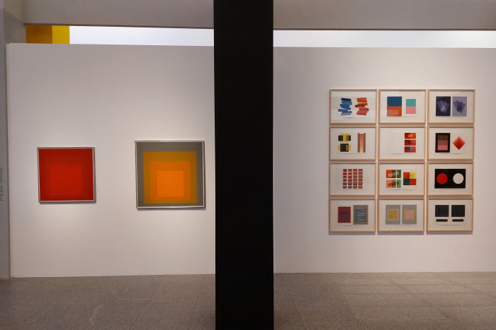
An individuality dependent not only on the viewer, Color as Program helping one better appreciate that the conscious viewing of colour is very much a subjective act and the unconscious viewing a culturally coded act, but an individuality also dependent on the circumstances in which any given colour is viewed, helping as it does one better appreciate that, as a Hella Jongerius teaches us, colours exist not as definitives but in a specific context, and thus as Josef Albers opines in his 1963 book Interaction of Color, and demonstrates in works such as Homage to the Square, "in visual perception, a colour is almost never seen as it really is - as it physically is".5
Or put another way, and to return to the aforementioned anonymous green loving youth: not only can one experience colour without seeing colour, but that experience of colour is always individual, that colours are an excellent example of a mass product that is always unique.
Yet how often do we view colours as such?
How often do we view colours not as static defined systems one can learn, but as active components of our appreciation of and relationships to the world around us which can teach?
Color as Program is a good place to not only reflect on such questions, but to consider the consequences of such a questioning.
Color as Program. Part One is scheduled to run at the Bundeskunsthalle, Museumsmeile Bonn, Helmut-Kohl-Allee 4, 53113 Bonn until Sunday August 7th.
Further details, including information on the accompanying fringe programme, can be found at www.bundeskunsthalle.de/en/color
And as ever in these times, if you are planning visiting any exhibition please familiarise yourself in advance with the current ticketing, entry, safety, hygiene, cloakroom, etc rules and systems. And during your visit please stay safe, stay responsible, and above all, stay curious.......


1The curators, as is their right, have gone for the American English "color" in the title, as is our want we remain with the British English "colour" on all other occasions. The curators, as is also their right, have gone for the American English "program".......
2see, for example, Tetsuya Matsubayashia et al, Does the installation of blue lights on train platforms prevent suicide? A before-and-after observational study from Japan, Journal of Affective Disorders, Vol. 147, Nr. 1–3, May 2013, pages 385-388
3The new posters will be placed on top of the existing with the finished bundle of posters being the final piece.
4Yes, there is an implication in this statement that only westerners, Europeans, will view Color as Program. We hope that's not the case, it is deserving of a wider audience. And whatever the implication, everyone should, must, be aware that they are viewing any given exhibition in context of their personal, individual, gaze.
5Quoted in a wall text in the exhibition, or can found in the Introduction of Josef Albers, Interaction of Color, of which there are many editions, but the sentence is always in the introduction

