"One sits more comfortably on a colour that one likes" declares Verner Panton in his 1997 book Lidt om Farver/Notes on Colour.1
A succinct expression of an understanding of colour as more than just a decorative element, and one of many reflections on the function and relevance of colour beyond the merely decorative which, in a myriad guises, pervade the history of furniture and product design.
And contrasting, if at times complementary, reflections, pun intended, we will consider in the coming weeks and months via a selection of texts and pronouncements from a contrasting, if at times complementary, collection of international creatives. And while not all the sources considered represent theories in a classic understanding of the term, and certainly not colour theory in a classic understanding; in representing the respective creative's understandings of the relationships between colour and form, colour and function, colour and user, colour and artistry, etc, can be considered as contributions to the development of a more formal design.colour.theory..
We start with Verner Panton and Lidt om Farver/Notes on Colour......
Born on February 13th 1926 in Gamtofte on the Danish island of Fyn, Verner Panton is, inarguably, as well known for his use of colour as for his furniture, lighting, textile, product and interior designs. Arguably Verner Panton is best known, most popularly known, universally known, for his use of colour; or put another way, such is Verner Panton's association with colour even black and white photos of his work shine with a multi-coloured glory.
And an association with colour that can all too easily be understood as the use of colour as a means to itself, colour for the sake of colour, and occasionally even understood as colour as a frivolity. Or even understood as a style.
Lidt om Farver/Notes on Colour corrects such misunderstandings, helps one approach a more probable understanding of Verner Panton's use of colour and understandings of colour, while also being very much an appeal for not just greater but more considered use of colour by us all, and also an argument for "more courage about colours."
But before it is such, Verner Panton takes the reader on a quick tour through some of the fundamentals of colour, including the physical basics of colour and a brief (hi)story of not only the use of colour by early societies but for all the sequence via which our world became more colourful, how the handful of colours the very earliest societies could (re)produce were successively extended, added to and became the cacophony we know today.
And also provides a brief description of the functioning of the human eye and the transfer of optical impulses from eye to brain and their subsequent processing in the neocortex which, we learn, "is responsible for conscious rational thought" and also in the limbic system which is responsible "for emotional reactions."
"This sounds complicated and it's going to get worse" Panton gaily informs us, before going on to describe that while the neocortex reacts to subtle colours, colours Panton refers to as "cultivated", the limbic system reacts to qualities such as "lightness, shine or glimmer and to the symbolic meanings" of colours, and going on to note Peter Smith's assertion that for too long architects have focused on pleasing the neocortex rather than stimulating the limbic system. Have opted for the rational rather than the emotional in their use of colour.2
Verner Panton, you can safely assume, considers such an error. And one whose source he can identify.
But before he does, the considerations on the fundamentals of colour continue.

"Man's natural inclination to systematize things has led many artists, physicists and philosophers to formulate systems of colour", notes Panton as he leads into his reflections on not just the myriad colour theories and colour systems, including mentioning the Pantone Colour Matching System without commenting on either the similarity between "Panton" and "Pantone", or the fact that "Panton" can also be understood as a derivation of "all colours", which isn't inappropriate, but also subjects such as orders of colour, complimentary colours, harmony, or interaction of colours, the latter including a chart which illustrates how a colour appears different depending on the colours which surround it, and which, as we all recall, is one of the more central arguments Hella Jongerius follows and expounds upon in her exhibition Breathing Colours.
And colour systems and colour interactions which also bring us to the psychology of colour. Or "psychology!!!" as Panton suddenly exclaims.
A burst of excitement which helps underscore the central place of the psychology of colour in Verner Panton's understandings, of Panton's interest in and fascination with that interplay between the neocortex and the limbic system, with the understanding that colours aren't strictly defined entities in themselves, but are that which exists within us, are the responses they illicit within us, are that which, if one so will, we make them, and that invariably in context of the situation in which we're exposed to them. An interest and fascination awoken in his student days, which saw him briefly carry out research at Copenhagen's Institute of Psychology, and which remained throughout his career. And although early on in Lidt om Farver/Notes on Colour Panton writes that colours are subjective, he does, and as we believe is also a legal requirement in any text on colours, list numerous of the many, possible, perceived, interpretations of colours that have been collected and recorded over the decades and centuries, including, for example, the notion that "red is dynamic, aggressive, full of life", "green is critical, analytical and rectangular", or "yellow is joy, happiness, hope for liberty", the last statement causing an involuntary, and slightly too loud, rendition of, "Tie a yellow ribbon 'round the ole oak tree......".........or is that just us?
In addition to such generalisations, Panton also very pleasingly includes a few historical, and possibly apocryphal, anecdotes, and also academic research, relating to interpretations and receptions of colour, including, and amongst others, the tale of how Piet Mondrian's aversion to green was so acute that he couldn't face sitting with a view of a garden; why you shouldn't paint the walls of retirement homes in pastel shades (research indicating that over 65s prefer primary, secondary and tertiary colours to pastels); and also recounting Goethe's use of colour in his Weimar home, and how each room was painted a different colour, the dining room, for example, being a sunny yellow, while guests who were more tolerated than welcomed were given "a cold blue room which made them leave faster", and which might be worth remembering when decorating your own spare bedroom. And which also recalls the tale of Verner Panton's redecoration of the, then, Vitra CEO Rolf Fehlbaum's apartment in Basel, in which every room was entirely one colour: as in walls, ceiling, floor, furniture, textiles, everything, all one colour. And each room a different monotone.
An interior design project which, sadly, doesn't feature in Lidt om Farver/Notes on Colour, but does, arguably, represent, an understanding of Verner Panton's demand that we all show "more courage about colours."
"It saddens me that so many people do not understand that colours are a dimension which can add to the experience", Panton confides, before going on to argue, convincingly, that it is our fault we don't understand such, that the aforementioned error which places more focus on the rational than the emotional in our use of colour is our error, or more accurately our collective error, societies' error: "in the kindergarten one learns to love and use colours. Later on, at school and in life one learns something called taste. For most people this means limiting their use of colours."
And which helps one approach a better understanding of not just Verner Panton's use of colour, but of Verner Panton's approach to design.
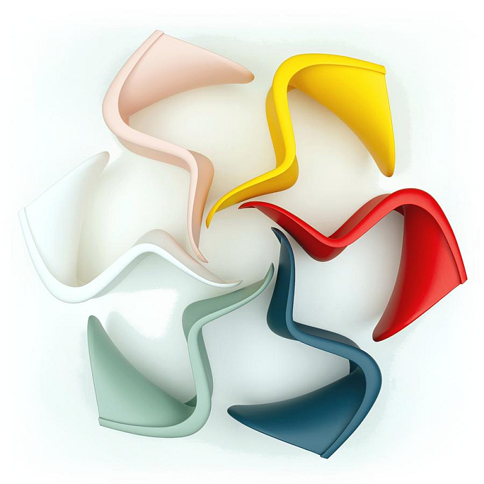
Verner Panton is childish. Not immature, but rather maintained an inner child, arguably failed to fully succumb to the dictate of a perceived correctness in his use of colours, to fully yield to a popularly defined taste as having a natural primacy in our world, to an idea that one colour is more cultured than another, that while he unquestionably listened to the rationality of his neocortex he refused to let it drown out the emotion, the excitement, of colour, the open discourse with colour, his limbic system was stimulating. And an inner child which, arguably, allowed him to view and review the world around him without all the encumberments of adulthood, and thereby to develop solutions which reflect the unhindered emotion and joy of a child's understanding of the world rather than conscious, preconditioned adult understandings. Or put another way, while works such as, and amongst many others, Living Tower, Amoebe Highback, Sitting Wheel, arguably also the eponymous Panton Chair, may have a very rational basis and are appropriate, meaningful, tools for daily life, they aren't the work of a rational adult creativity, but rather are the result of a kindergarten creativity. Which we genuinely don't mean as an insult. Rather as a celebration. And as an invitation for us all to question our own attitude to and approach to life. To question if our acceptance of standards and conventions of taste, of a perceived correctness, hinder and burden us. To question if we shouldn't all listen a little more to the child within us than to the adult. To question where it might take us if we did. And to start that questioning with a questioning of our use of and attitude to colour.
Or to very slightly, but not inaccurately so, miscontextualise Verner Panton, "using colour is like life. One must have a goal. The goal can be almost anything - also to make the most awful colour combinations."
Which we're now claiming was our life's goal all along.....
Lidt om Farver/Notes on Colour ends by looking at examples of colour in design, including, and amongst others, the Mercedes S Class, the top of the Mercedes range and whose seriousness, and thus the importance of the occupant is, as Panton argues, reflected in the fact it "only comes in black, grey and dark blue", and thus very serious colours, whereby dark blue is no longer available, perhaps it wasn't serious enough, or became too frivolous; an AT&T cashier's keyboard which uses colour coding to improve usability, for as Panton notes grey on grey keyboards “may be found “elegant” by some” but are anything but functional; the use of colour to help objects either be instantly visible or allow them to gently merge in with their surroundings, the red telephone boxes of Copenhagen given as an example of the former, the blue bus stop shelters of the latter; and numerous corporate identity examples including the who knew? that Kodak's visual identity is a 4:1 yellow:red mix and McDonald's' is a 1:4 yellow:red mix.
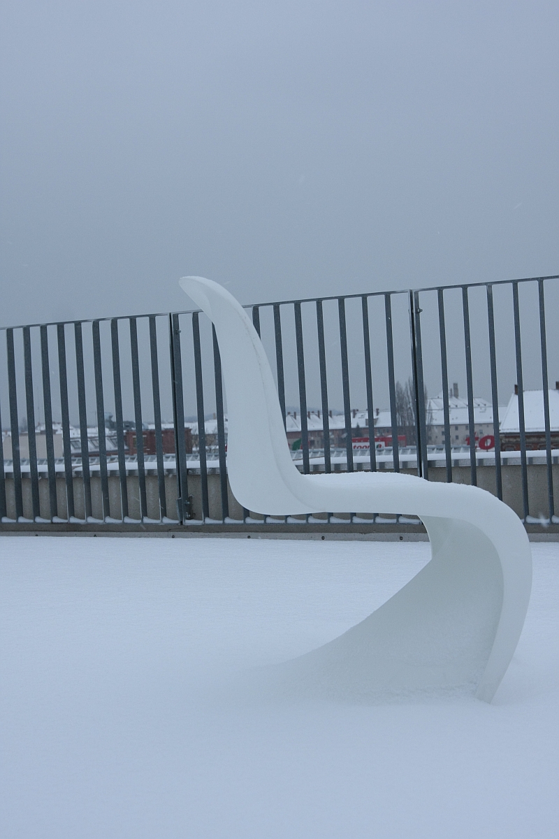
And examples which in many regards stand as the practical component of the preceding theory, stand as examples of Panton's understandings in practice, of Panton's understanding of the psychology of colour in practice, of the function of colour in practice, of the necessity of colour in our objects of daily use in practice; if without, and somewhat regrettably, direct reference by Panton to any of his better known uses of colour, without any detailed explanation of the paths which led him to the Astoria hotel restaurant in Trondheim, the Spiegel building in Hamburg or the 1970 Visiona II project for Bayer in Cologne, amongst the many, many, one could highlight, but which Panton choose not to. Not that Panton doesn't refer to himself, "I am not fond of white", he tells us, to the surprise of absolutely no-one, "the world would be a more beautiful place without it. There should be a tax on white paint". And thus, one assumes, we haven't asked, but we assume, that he demanded a higher license fee for the white version of his Panton Chair by way of compensating him for compromising, and for the publication of a version of his chair that he, presumably, didn't sit comfortably upon.
The final section also continues Panton's appeal for a more considered and courageous use of colour, including note of the Braun KF40 coffee maker which, according to Panton marked a novum for Braun ... red, "for many years Braun confined itself to colours like white and black and, as a merry prank, grey", then suddenly Braun was also red, there was colour in the domestic West German kitchen. "Try something new!" Panton admonishes us all. And also admonishing us to keep on trying, "colours", he notes, "can be a useful device for making otherwise unchanging products keep up with changing times". Which yes, could be interpreted as a reference to t**** colours, of fashion in design, but which everything that has come before tells you can't be the case; everything that has come before tells us that for Verner Panton reactions to, receptions of and interactions with colour are too intrinsic to be subject to faddish fluctuation, to change from year to year. He's Verner Panton not Verner Pantone. But on the other hand, it does sound like........
.......specifically Verner Panton refers to Arne Jacobsen's Ant Chair, an object Panton had helped develop during his brief tenure in Jacobsen's office, and which was originally available "in black and white, and in different shades of plywood", which you can't imagine was to Panton's liking; however, as Panton goes on to explain, a few years after its launch Fritz Hansen released the first painted versions and over the intervening decades have regularly released it in ever new colour schemes, including one featuring "colours coordinated with a series of textiles designed by Verner Panton". Which is an odd use of the third person, but also allows an alternative understanding of "keep up with changing times", one associated with generation changes rather than t***** and fashions. That the colours of societies invariably and organically evolve and change along with societies. That change occurs generation to generation, not year to year.
Verner Panton also suggests of the Ant, that "you can always give them a new coat of paint yourself": firstly, read the warranty information before you do so; secondly, we presume, certainly hope, Verner Panton is speaking from experience; thirdly, we do like the idea of Fritz Hansen releasing the Ant in a "Paint-it-Yourself" version, or perhaps the Series 7 Child's Chair to self decorate. And fourthly, painting your chair yourself in a colour of your choosing is surely the best way to achieve optimal seating comfort, for, as Verner Panton declares, "one sits more comfortably on a colour that one likes."
As previously noted, for all the fantastical and reverie in Panton's oeuvre, it is and was an oeuvre largely based on not just a detailed observation of human behaviour, but on systems thinking, modularity and formal reduction, on a rational; if a rational, as Lidt om Farver/Notes on Colour helps us appreciate, practised in context of, under the guidance of, the emotional excitement of the limbic system, and with colour very much at its core, or as Panton notes, "to me colour is more important than form". The unfortunate adjunct, "however this is not the case when I am looking at women", being one of only very few moments that place Lidt om Farver/Notes on Colour in a previous century. Whereby one is, strangely, relieved to know it is not the case.
Published just a year before Verner Panton's untimely death, Lidt om Farver/Notes on Colour is a brief summary of the decades of research, considerations and experimentation in context of colour Panton had undertaken since the 1950s, and with its use of short sentences and sprightly jumps from thought to thought, from note to note, is a most accessible work. An accessibility which is aided and abetted by its relative brevity: at just 48 pages long it is by necessity not a work that goes, can afford to go, into extreme depth or detail rather skims sprightly across the surface. If a work in whose relative brevity one can very clearly glean the very real depth and detail Verner Panton went to with his research and the seriousness with which he took his work and considerations on colour. A seriousness which stands diametrically juxtaposed to the untroubled lightness of much of Panton's oeuvre, and a seriousness which also enables that lightness. And while Lidt om Farver/Notes on Colour should in no way be considered as a definitive representation of Verner Panton's understanding of colour, for that it is too brief, it is an excellent place to begin to approach a better understanding of Verner Panton and colour and by extrapolation of Verner Panton and design.
And thus all the more sadly a work that is out of print.
For as a book Lidt om Farver/Notes on Colour helps one understand that Verner Panton's use of colour isn't about the colours but about why the colours, about why colour, helps one understand that for Verner Panton "colours influence our lives, moods, our humour and our working capacity", that "colours are a dimension which can add to the experience", that "colours have meaning and function" and through helping one approach a better understanding of the foundations of, and considered analysis, behind Verner Panton's use of colour Lidt om Farver/Notes on Colour builds a framework which allows you to understand why Verner Panton understood that "one sits more comfortably on a colour that one likes".
And that one might just. Whether one is aware of the fact or not.
1and all subsequent quotes, Verner Panton, Lidt om Farver/Notes on Colour, Danish Design Centre, Copenhagen, 1997
2The reference is to Peter Smith, The Dialectics of Colour, in Tom Porter & Byron Mikellides, Color for architecture, Van Nostrand Reinhold, 1976

