One could be forgiven for thinking that little would be as pointless as a Le Corbusier colouring-in book.
So singularly achromatic is the popular understanding of Le Corbusier, a lack of colour reinforced by the dour, austere, round bespectacled, persona which so universally defines Le Corbusier: what, one asks oneself, could there possibly be to colour in a Le Corbusier colouring-in book?
Yet in contrast to the popular Le Corbusier image, Le Corbusier's career was one undertaken in colour. A career accompanied by, informed by, arguably driven by, considerations on and the study of colour.
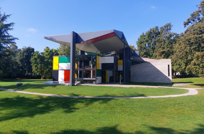
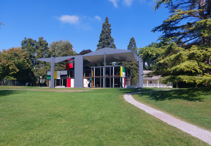
An (oft overlooked) aspect of his work, of his understandings and approaches, and persona, explored in the exhibition Le Corbusier and Color at the, appropriately kaleidoscopic, Pavillon Le Corbusier, Zürich.
Born in La Chaux-de-Fonds, Switzerland, on October 6th 1887 as Charles-Édouard Jeanneret-Gris, we've oft discussed the Le Corbusier biography in these dispatches, and so refer you there dear reader for the wider Le Corbusier biography....... or perhaps better put, and staying in context, we refer you there dear reader for the outline sketch of the Le Corbusier biography and concern ourselves here with a tinction of particular aspects, particular perspectives, particular features, or more accurately, particular columns, cornices, vaults, plinths, atriums, walls, et al of that biography: for as an exhibition Le Corbusier and Color1 is very much Le Corbusier (Architect) and Color.
"Having made the leap from painting to architecture in 1924..." the introduction informs you, without looking back as to what that means; similarly the exhibition (largely) picks up its narrative in the second half of the 1920s, without any notable reflection on what may have come before. In those 37ish years of the Charles-Édouard/Le Corbusier biography.2
Which is regrettable, because there is an awful lot that comes before, including a lot of colour, a lot of study of colour, a lot of consideration on colour, something tending to be underscored by the inclusion in Le Corbusier (Architect) and Color of Le Corbusier's 1922 painting Nature morte pâle à la lanterne with its inherent proposition of colour as a formal, structural, element. And there was also a goodly amount of architecture that came before. Including coloured architecture, architectural colour. And that which came before is important to that which came after; Le Corbusier, as with any creative, is as much a journey as a person.
Yet, while that which came before would unquestionably enrich and deepen the discussion on that which came after, the lack of reference to the past doesn't fundamentally detract from the presentation, doesn't fundamentally detract from Pavillon Le Corbusier's discussion on and of Le Corbusier (Architect) and Color.
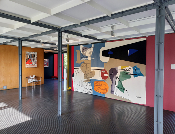
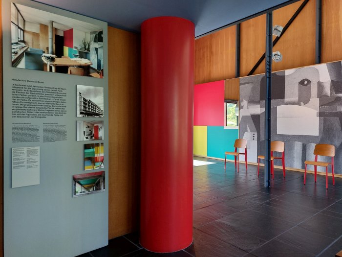
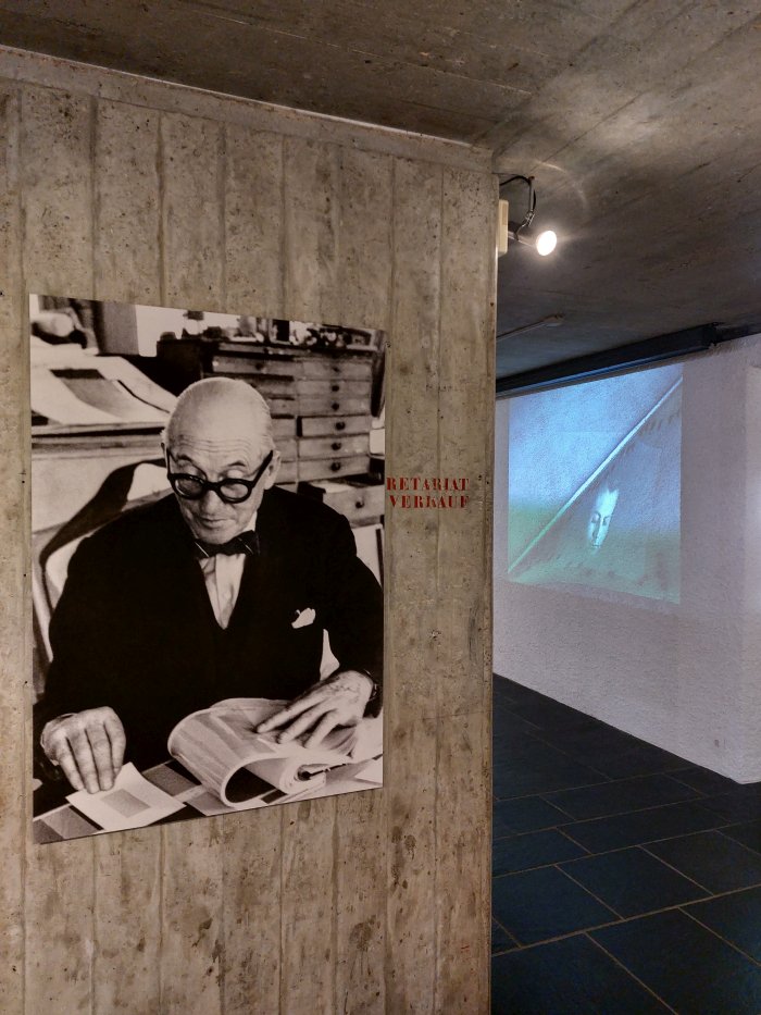
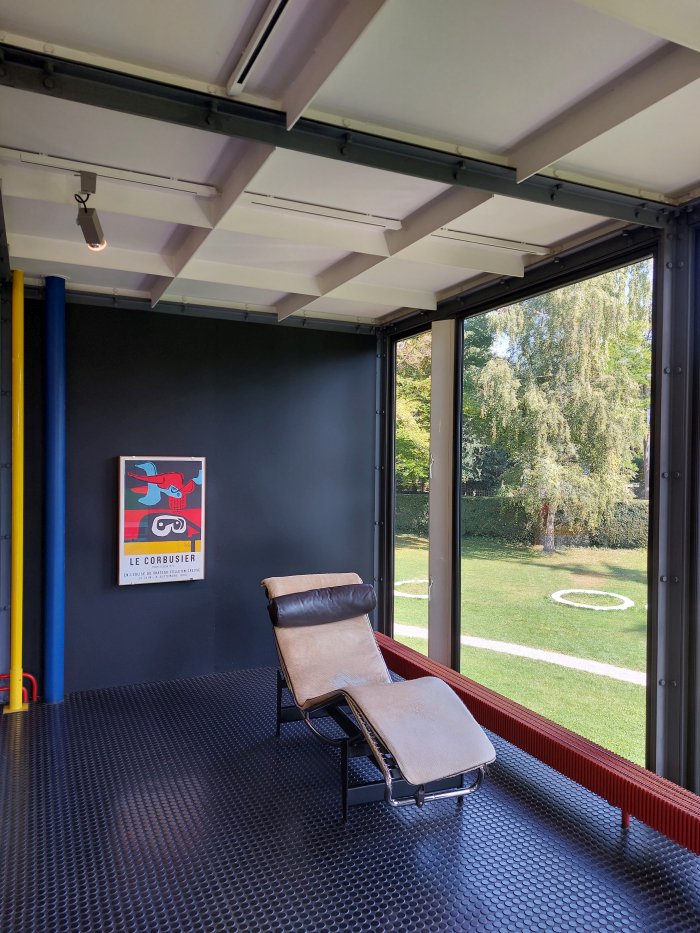
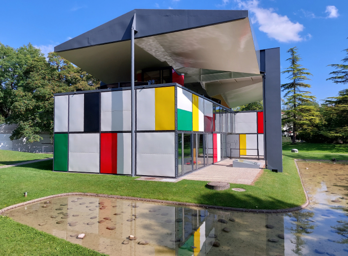
Opening with aspects of Le Corbusier's use of colour in the (post-1924) inter-War years, including a model of his and Pierre Jeanneret's semi-detached house for the 1927 Weissenhofsiedlung building exhibition in Stuttgart by way of elucidating Le Corbusier's use of colour within the white quadratic structures he is so popularly known for, works which unquestionably add to his popular achromatic persona, Le Corbusier (Architect) and Color moves on to explore the changes in his use of colour enforced and informed by his post-War focus on concrete, and also by his evolving understandings of the relationships between colour and form, two aspects neatly illustrated in his factory building for the Claude et Duval millinery company in Saint-Dié, his first major post-War project, before ending with reflections, pun intended, on Le Corbusier's use of light as colour, something typified, for example, by his Notre-Dame-du-Haut cathedral in Ronchamp or the Poème Électronique he presented, decanted, at the 1958 World’s Fair in Brussels, that immersive multi-media presentation we discussed in context of our reflections on Le Corbusier and music. And for which Le Corbusier not only swathed the auditorium in a dress of ever changing hues, but disrupted, invaded, the black and white film which served as the visual centrepiece with abstract coloured splodges; an impression of the effect can be gleaned in the reconstruction of the film which plays on constant loop in Le Corbusier (Architect) and Color, an impression enhanced by listening to Edgard Varèse's accompanying symphony as you watch.
But an impression that can never be more than an impression, lacking as it does the all-important ageometric, hyperbolic paraboloid, space Iannis Xenakis developed in which to bottle le poème.
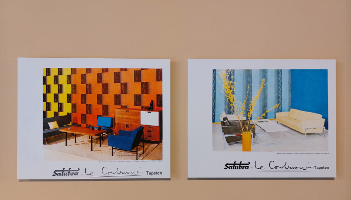
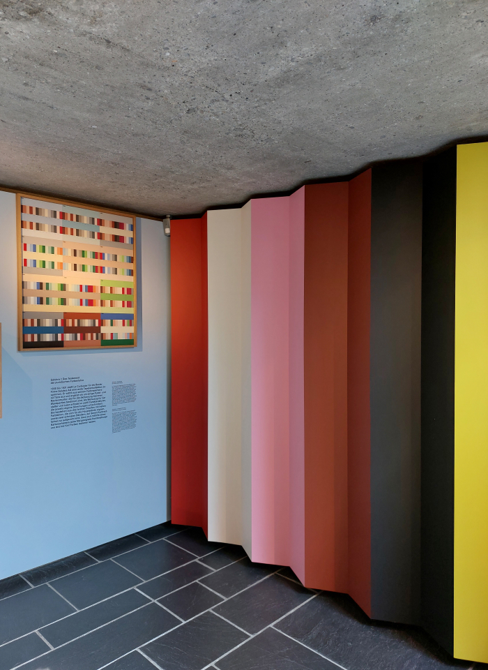
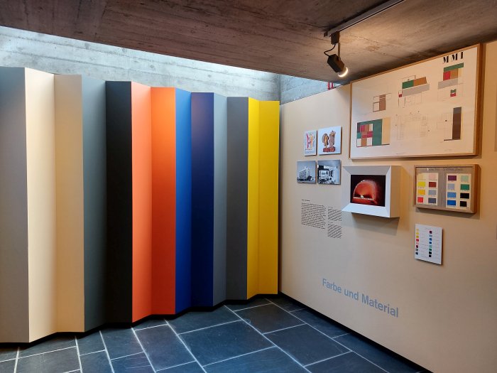
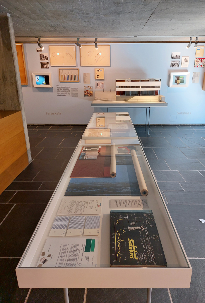
In addition to Le Corbusier's own use of colour in his architecture the other central focus of Le Corbusier (Architect) and Color is the commercial colour systems Le Corbusier developed, specifically the two wallpaper collections he developed for Basel based Salubra, the first in 1931, and thus in a period when use of wallpaper wasn't as widespread as it is today, and wallpapers which for Le Corbusier ensured "consistently good quality and durability in colour and material"3, and thereby avoided the, then, reality in which the architect, and house owner, was/were thoroughly dependent on the the skill, care, reliability, or lack of, on the part of the individual painter in terms of mixing the paint.
In 1959 there followed the second Salubra collection for which Le Corbusier not only updated the colours in line with the new tones and hues he considered necessary for concrete, but also saw him add a series of patterned papers based on the surface structures of materials such as marble or stone, but which he visually corrupted with colour to create, as one can glean from 1950s Salubra adverts, interior spaces far, far, removed from the dogmatic white quadrats one popularly associates with Le Corbusier.
Beyond the discussion on Le Corbusier (Architect) and his use of and understandings of colour, Le Corbusier (Architect) and Color also briefly discusses colour pigments, including a presentation of Johannes Itten's pigment collection and palette, the latter resembling a particularly challenging jigsaw, and also extends its discussion on colour and architecture to considerations on the use of colour by other architects, predominantly in the 1920s, so that period when Le Corbusier (Architect) and Color opens, and a period which as Arthur Rüegg notes in the accompanying booklet is often considered as achromatic as Le Corbusier.4
Yet which as the very brief discussions on projects by the likes of Gerrit Rietveld, Bruno Taut or Mies van der Rohe, help illustrate wasn't; and in doing so, in reinforcing that there was colour in inter-War Modernist architecture, tending, for us, to confirm, as we opined from Peter Gustaf Dorén. Interior Design in Hamburg circa 1900 at the Museum für Kunst und Gewerbe, Hamburg, that in the course of time colour fades from our collective memory.
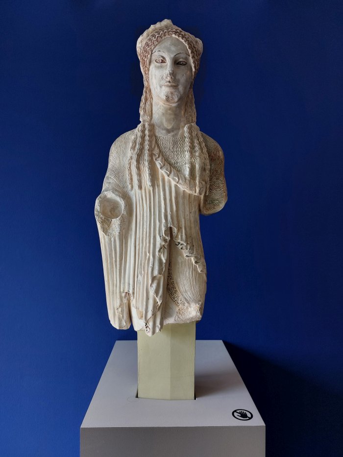
Something graphically demonstrated in Le Corbusier (Architect) and Color by a 1st century BCE Kore that was once part of the Acropolis, and which was once brightly coloured; a colouration that on account of the physical nature of the colours employed has long since faded.
That the colour of Le Corbusier has long since faded is, arguably, more to do with the nature in which Le Corbusier exists today; the popular image of Le Corbusier is a very limited one, one reduced down to the same recurring projects, objects, quotes, and, invariably, black and white photos of a dour, austere, round bespectacled, persona. And an image so often repeated, and thereby confirmed, that there is little room for anything contradictory, anything that might challenge that popular image.
Reflections on the narrowness of the popular Le Corbusier image which flash up the other great omission in Le Corbusier (Architect) and Color.
The popular image of Le Corbusier is not only achromatic, but one of the lone genius, indeed an argument can be made that only very few architects and designers in (hi)story exist so singularly singular as Le Corbusier.
And which is obviously rubbish. The greater part of Le Corbusier's oeuvre is very dependent on the contributions and inputs of others, very dependent on Le Corbusier's cooperations with others. Including his cooperations with Amédée Ozenfant.
As previously discussed in these dispatches, Ozenfant and Le Corbusier enjoyed over many years a very close relationship, before it all went so spectacularly wrong; a close relationship most popularly embodied in the cultural review L'Esprit Nouveau they co-found in 1921 and co-edited until its closure in 1925, and also through their painting: Ozenfant and Le Corbusier (famously) developing what they referred to as Purism as their response to what they saw as the flaws of Cubism, and which, amongst other aspects, understood “painting not as a surface, but as a space“.5
And a relationship that was also very much staged in context of considerations on colour, on the physics of colour, on the psychology of colour, on colour as form, on colour as structure, on colour as an entity, and it is thus, for us, inconceivable that without those years with Ozenfant, without the discussions and shared experiences of that period, Le Corbusier's understandings of, positions to, and for all use of colour, would, could, have developed as they did, after he "...made the leap from painting to architecture in 1924...".
Something tending, for us, to be underscored by the similarities of much of Le Corbusier's positions on colour, certainly in the inter-War years, with those presented by Ozenfant in his 1937 series of articles for The Architectural Review; here is sadly neither the time nor place for a detailed, critical, comparison of the two, however, in Ozenfant and Le Corbusier's shared understandings of, for example, the importance of standardised colour systems, in the importance of referring to, learning from, historical uses of colour, understandings of relationships between colour and form, understandings of colour harmony, in the similarity of Ozenfant's analogy of music and colour with Le Corbusier's analogy of music and proportions, it is very hard to perceive Ozenfant and Le Corbusier as two separate development paths. And when Ozenfant writes that “colour is an essential element of architecture”6, they could just as easily be words from Le Corbusier's quill.
And so for us you simply can't discuss Le Corbusier and colour without discussing Amédée Ozenfant. The fact Le Corbusier (Architect) and Color does being very reflective of Le Corbusier's own reluctance to share credit for his projects/career with anyone else, and, again, is regrettable, because meaningfully understanding Le Corbusier's place in the (hi)story of art, architecture and design, meaningfully understanding Le Corbusier's legacy, necessitates moving away from the contemporary image of him.
Including moving away from the thoroughly improbable lone genius Le Corbusier, of better understanding Le Corbusier in context of, in discourse with, all the other Korai of various hues with whom he once shared the pedestal on which he now stands alone.
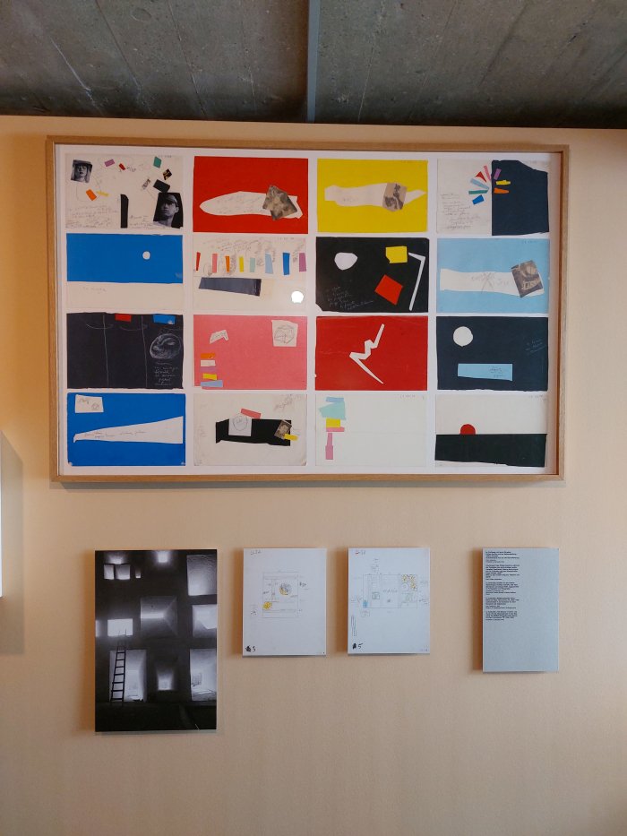
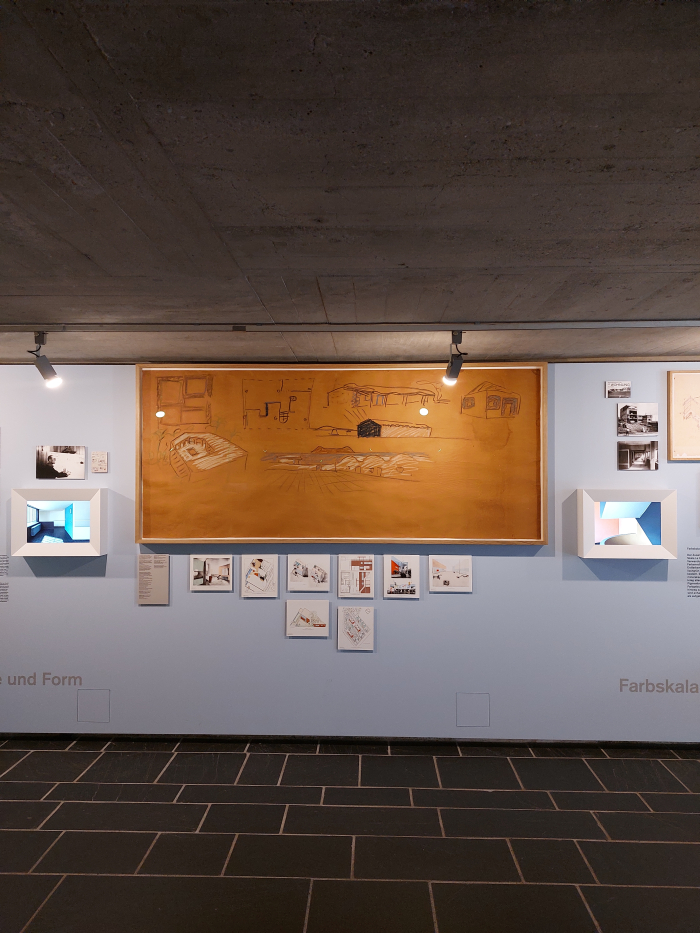
Featuring a mix of documents, sketches, models and photographs, alongside sample books and sales material for his two Salubra collections, in a trilingual German/French/English presentation, Le Corbusier (Architect) and Color is as much a journey through the evolution of Le Corbusier, a journey through his evolution from the inter-War Purism to the synthèse des arts of his latter years, as it is a tour thorough the evolution of Le Corbusier (Architect) and his understandings and use of colour.
If a journey you need to be very aware opens in Pavillon Le Corbusier long, long after it started.
However, and in the interests of fairness, for all its apparent infiniteness Pavillon Le Corbusier simply doesn't have the space for all that we regret Le Corbusier (Architect) and Color left out.
And with that which it left in, that which is does present, Le Corbusier (Architect) and Color provides for a pleasing, if by necessity brief, introduction to Le Corbusier (Architect) and his relationships with colour, a brief introduction which helps one better appreciate that Le Corbusier's work was not only full of colour, but full of carefully conceived and deliberately planned colour based on a lifetime of colour research, study, consideration, a lifetime's interest in and fascination with colour.
An improved understanding which allows you to appreciate that a Le Corbusier colouring-in book might not be such a daft idea after all, might even be something worth owning, and also leaves you keen to discover more, keen to do more research on your own, to fill in the omissions, and thereby move towards an understanding of Le Corbusier and Colour that doesn't require the qualifier (Architect).
Le Corbusier and Color is scheduled to run at Pavillon Le Corbusier, Höschgasse 8, 8008 Zürich until Sunday November 28th.
Full details can be found at https://pavillon-le-corbusier.ch/
And as ever in these times, if you are planning visiting any exhibition please familiarise yourself in advance with the current ticketing, entry, safety, hygiene, cloakroom, etc rules and systems. And during your visit please stay safe, stay responsible, and above all, stay curious……
1For reasons unknown the curators have opted for American "color" rather than Oxford "colour".... and while we have no problem with that, each to their own, we are sticking with colour. Apologies for any confusion when reading.
2There is reference to Jeanneret/Le Corbusier's biography, and work on/with colour before 1924, in Arthur Rüegg's essay in the accompanying publication Le Corbusier and Color, Pavillon Le Corbusier, 2021
3Quote by Le Corbusier from Salubra advertising as displayed in the exhibition
4see Arthur Rüegg in Le Corbusier and Color, Pavillon Le Corbusier, 2021
5Ozenfant et Jeanneret, Le Purism, l’Esprit Nouveau, Nr. 4, January 1921, accessible via http://arti.sba.uniroma3.it/esprit/ (accessed 13.10.2021)
6Amédée Ozenfant, Colour – The English Tradition, The Architectural Review, Vol 81, Issue 482, January 1937

