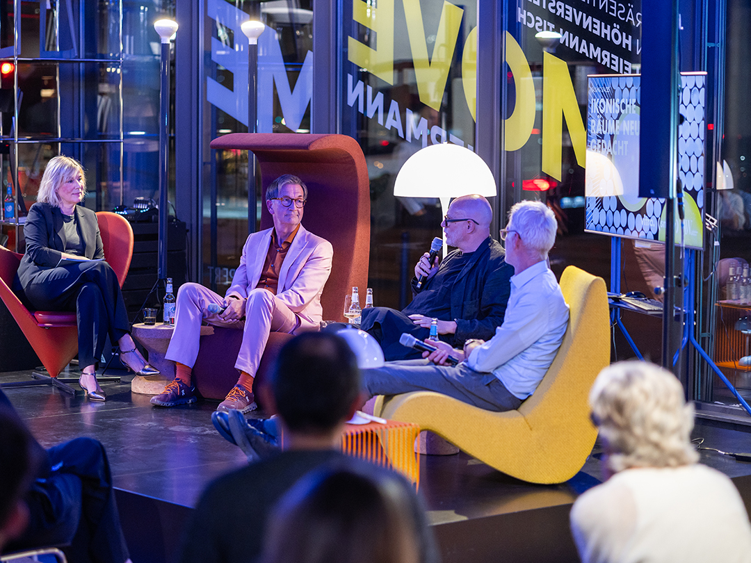
What effect does a space have on us? And how much atmosphere can architecture accommodate? To mark the 100th anniversary of Verner Panton’s birth, smow, Vitra and A&W Architektur & Wohnen have organised an event at the smow Store in Stuttgart on 7 October 2026. The panellists will be: interior designer Peter Ippolito, design historian Mathias Remmele and colour expert Prof. Dr Axel Buether. An evening exploring colour in the mind, forgotten ceilings and the question of why good spaces are allowed to create a bit of friction.
The evening begins with a little quiz. Jörg Oetinger, managing director of smow Stuttgart, points to a battery-powered lamp and asks the audience: ‘Is this an original Panton lamp?’ Many hands go up. The answer: it isn’t. Panton designed the Panthella as a floor lamp and a table lamp; battery technology didn’t exist back then. The small cordless version was developed later – faithful to the original in proportion and form, but not conceived by Panton himself. Nevertheless, almost everyone recognised it. Scaling up an iconic design, says Oetinger, is still relatively straightforward. What’s more intriguing, he adds, is the question of how form, colour and function come together in an architectural project.
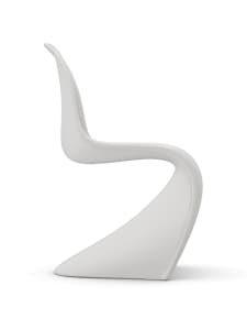
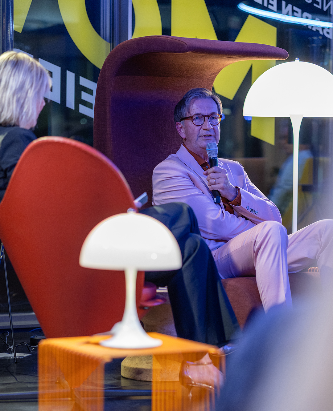
This very question is the focus of the first evening in the new ‘Talking Spaces’ series, launched by smow in collaboration with A&W. Under the title ‘Iconic Spaces Reimagined’, the guests discussed Verner Panton, the Spiegel canteen and the future of atmospheric spaces. The topic: Verner Panton, the Spiegel canteen and the future of atmospheric spaces. The setting was perfect: Vitra had created its own Panton-themed display for the evening at the smow Store at Breitscheidstraße 10 in Stuttgart, featuring the Heart Cone Chair, the Amoeba Armchair, the Panton Chair in shades of red and the Living Tower. One hundred guests were seated right in the middle of it all; the event was fully booked within a short space of time.
Verner Panton conceived of spaces as a holistic experience comprising colour, light, materials and furniture. For a designer of his time, this was almost revolutionary, says Karen Hartwig, editor-in-chief of A&W Architektur und Wohnen, who is hosting the evening. Design historian Mathias Remmele puts it into context: the Dane was a trained architect and worked with furniture, lighting and – though this is often overlooked – textiles. He became famous for a series of spectacular interior designs, foremost among them the ‘Visiona 2’ at the 1970 Cologne Furniture Fair and the canteen at the Spiegel publishing house in Hamburg.
Remmele considers it remarkable that the *Spiegel* canteen lasted for decades. It did not come to an end because people had grown tired of it, but because the publishing house moved. For Peter Ippolito, co-founder of the Stuttgart-based Ippolito Fleitz Group, Panton is, above all, an example of what timelessness actually means. Not restraint, but a strong statement that can withstand being both loved and hated.
Peter Ippolito:
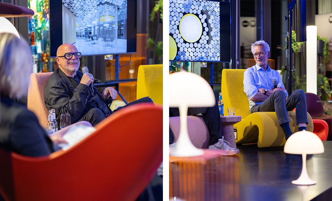
Axel Buether, a psychologist specialising in perception, an architect and one of the leading colour experts in the German-speaking world, regards Panton as a liberator of colour. He broke with the restrained Scandinavian colour palette and was, at the same time, a child of his era – the era of Pop Art, psychedelic concerts and the paintings of Bridget Riley. What was scarcely known at the time was that colour is not a component of the external world.
Axel Buether:
Buether illustrates just how immediately spaces affect us by taking the example of the very first moment we enter a hotel. Sensory information is first processed in the emotional centres of the brain, even before an image forms. In a fraction of a second, we know whether we’ll feel at ease. The colour sets the mood, much like a smell or the level of noise. Hardly any example illustrates just how strongly this can shape our perception of a space as impressively as Verner Panton’s design for the Spiegel canteen in Hamburg.
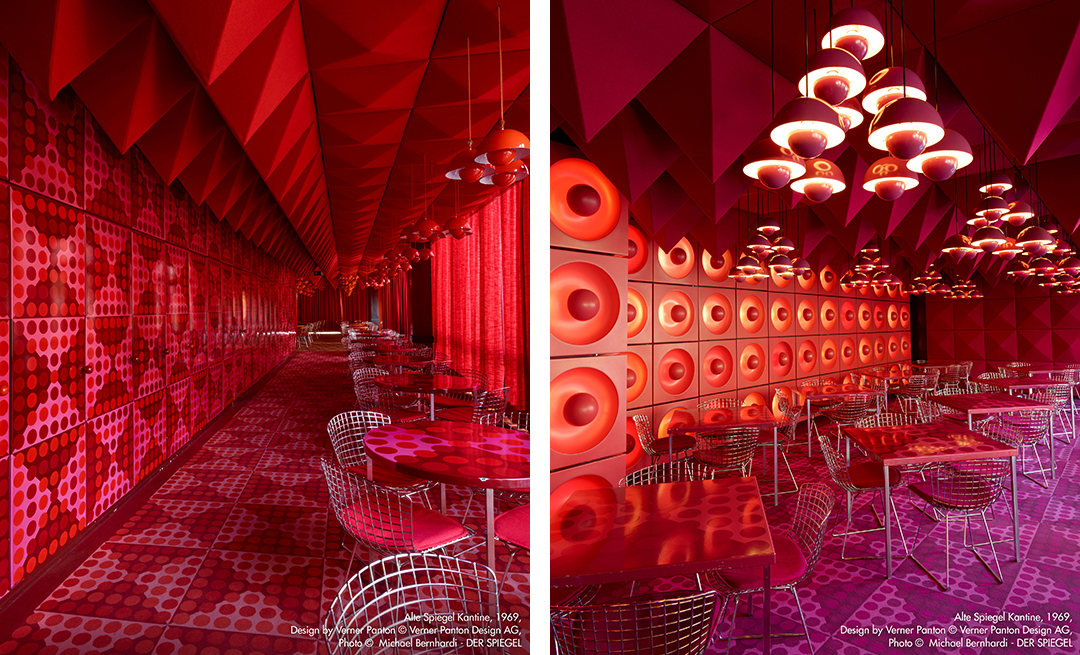
In 1969, Verner Panton designed the interiors of the Spiegel publishing house in the high-rise building on Brandstwiete in Hamburg. The canteen remains his best-known interior design project to this day: bold colours cover the floor, walls and ceiling, whilst the ceiling itself features a three-dimensional design with pyramid shapes. It is a space in which furniture, light and surface merge to form a single visual whole.
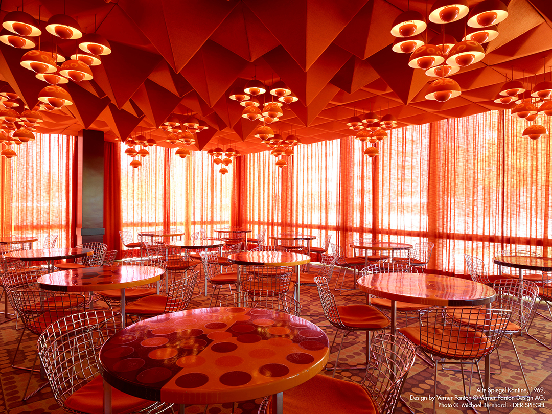
Mathias Remmele points out that the canteen was only one part of Panton’s design. He also designed the lobby, including the entrance area and waiting zone, a swimming pool, the corridors and the office floors for *Der Spiegel* – each in its own colour. The fact that Panton was able to realise his ideas so comprehensively was also down to Rudolf Augstein. The founder of *Der Spiegel* and the designer shared a special bond; without Augstein, says Peter Ippolito, the canteen would never have been built. Augstein recognised early on the significance such a place could have for a company. This was evident not only in the design, but also in everyday life: the food was exceptionally good, a Michelin-starred chef ran the canteen, and staff were served at their tables. Table manners also played a part – for instance, how people arranged to meet, chose a seat or signalled whether they wanted company or preferred to be left to their own devices.
Peter Ippolito:
For Axel Buether, the fact that the canteen has survived for over four decades is by no means a given. Periods in which colour and design are used in particularly bold ways are often followed by a generation that finds it all a bit too much and wants things to be more subdued again. The fact that the Spiegel canteen weathered such changes shows just how much it was appreciated right from the start. A large part of the original interior is now on display at the Museum für Kunst und Gewerbe Hamburg as a ‘room-within-a-room’ installation.
How does one deal with such a legacy? Peter Ippolito has experienced it first-hand. When *Der Spiegel* moved into Henning Larsen’s new building at Hamburg’s Ericusspitze in autumn 2011, his firm won the two-stage competition for the new canteen. The staff’s first request had been simply to take the old canteen with them. For Ippolito, this was the greatest compliment a design can receive.
Peter Ippolito:
Half of *Der Spiegel* is owned by its staff, and this was evident throughout the process. There was hardly any discussion about the workspaces in the new building, with around 20,000 square metres of office space; by contrast, the future of the canteen was debated all the more intensely, even leading to large staff meetings. *Der Spiegel* recognised early on that staff loyalty is fostered in a place where dialogue and mutual appreciation thrive. Ippolito did not want to compete with even more colour or even more form. Added to this were very real requirements: the facility manager expressly did not want any more pyramids or any carpet, but instead a ceiling that incorporates ventilation, acoustics and technical systems, and a space that can be cleared to accommodate a wide variety of formats.
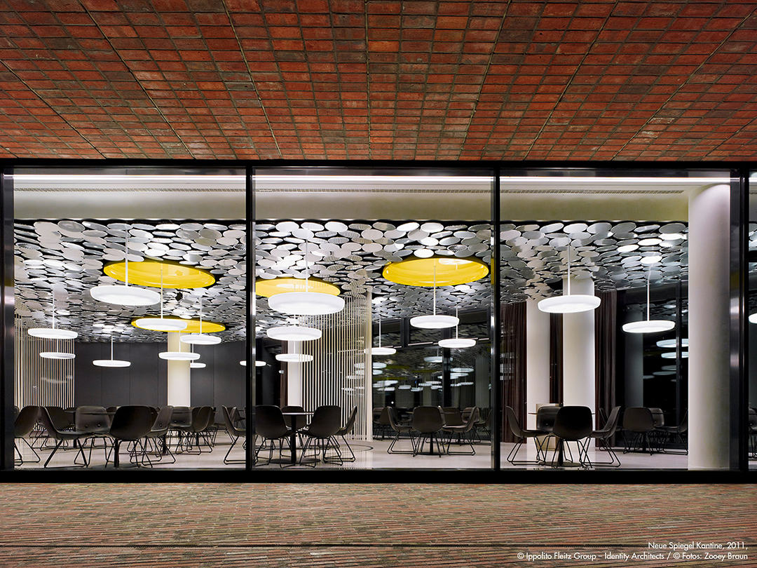
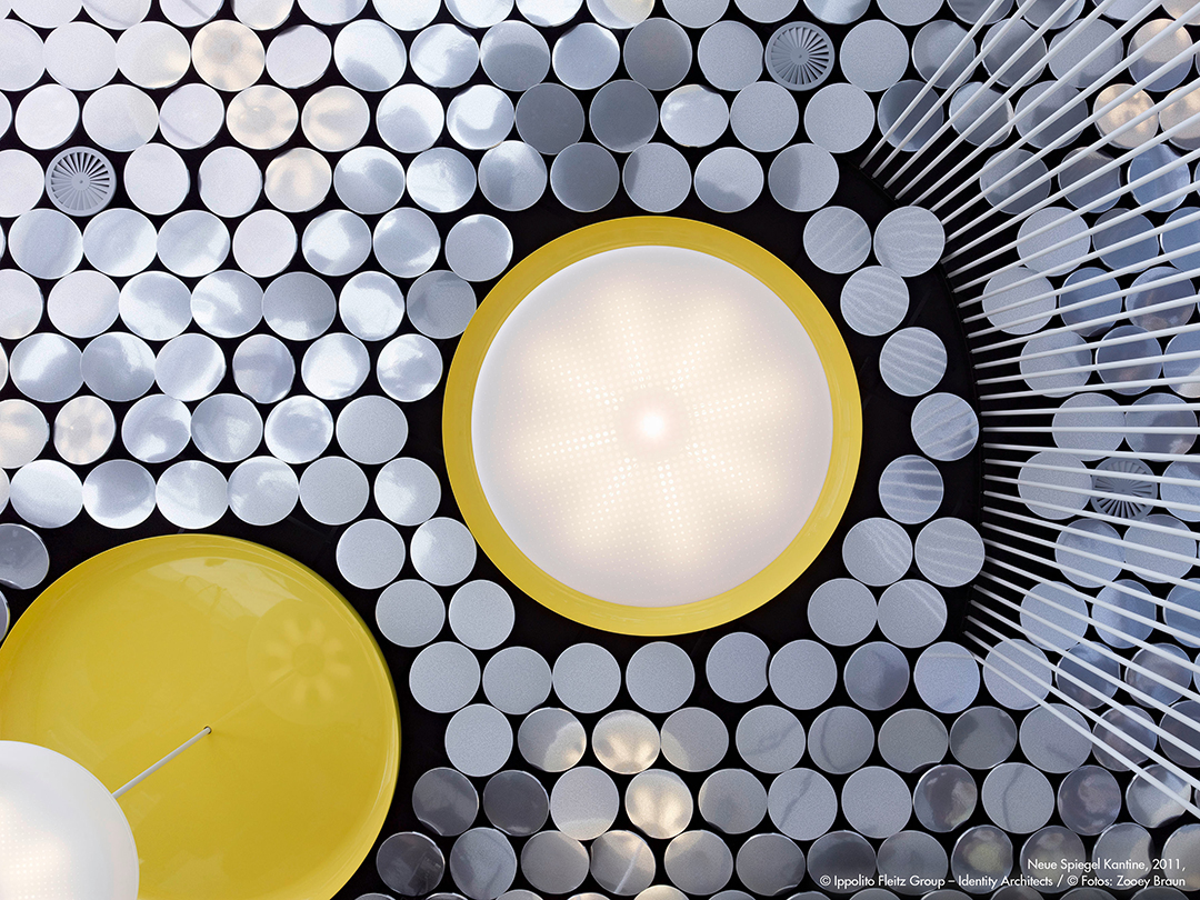
The team found the solution in the context: in the shimmer of the water in the harbour surrounding the building. Today, 4,300 aluminium panels, each slightly angled, form the ceiling. They conceal the technical installations and reflect the life within the space a thousandfold; for Ippolito, this is a metaphor for a place where very different opinions come together.
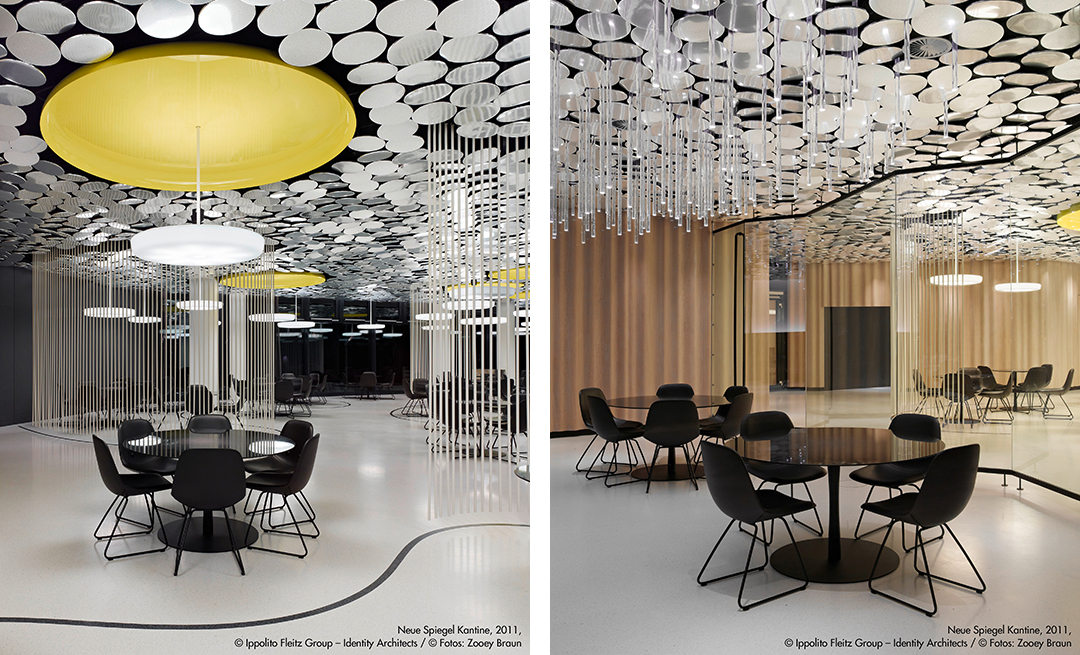
A piece of Panton has nevertheless remained. Around 90 per cent of the original furnishings went to the museum, whilst *Der Spiegel* kept about ten per cent and used them to furnish the *Spiegel* Lounge in the new building, clearly visible behind a large window front. For Ippolito, it is a cosy corner that connects staff to their past, and at the same time a showcase to the city. Anyone who thinks of *Der Spiegel* as a building thinks of its canteen. That, too, is an incredible achievement for a space.
The ceiling as a designed surface is a theme that preoccupies all three guests. Remmele recalls that, in the past, it was a matter of course for ceilings in prestigious rooms to be designed as coffered or frescoed ceilings. In post-war modernism, it became purely functional: grid lighting, acoustic panels – and, at best, white.
Peter Ippolito:
Buether cites examples from his research: hospitals, therapy centres and care homes, where people spend much of their time looking at the ceiling, yet it is rarely given any consideration in the design process. Yet it has been proven that a ceiling motif or a view of the sky can reduce anxiety and alleviate pain. His appeal to the audience is to plan the ceiling with just as much care as any other element in the room.
The quote comes from Panton himself. Is he right? Buether says yes, with a caveat. Much of our knowledge about colour is implicit – a gut feeling that leads us to our favourite chair or our cosy corner. Preferences are partly innate and partly culturally acquired. But alongside the question of what one likes, there is always the question of context: the red chair might be cool, but it doesn’t fit in one’s own living room. And many people aren’t even aware of their preferences because they’re afraid of colour and prefer to opt for neutrals.
Ippolito knows this from real-world experience. When it comes to textiles, you have to offer hundreds of colours, yet it’s mainly neutral shades that sell. That makes it all the more wonderful when someone dares to be bold. He tells the story of an entrepreneur who, after selling his company, was planning to build a villa in southern Germany and, whilst viewing the fabric samples, literally fell in love with colour – so much so that the team had to rein him in. The result is a vibrant, highly personalised space.
Peter Ippolito:
Buether even sees this as a responsibility. Just as with foreign cuisines or dancing, one’s appreciation of colour grows with experience. Anyone who challenges people – not too much, and not in every area – can make them a little happier. Challenge as a learning process.
Buether uses studies to demonstrate that atmosphere has a measurable effect. In one hospital, a new colour scheme changed the organisational culture: there were more applications for nursing and medical roles, and a better overall atmosphere within the teams. Both extremes are dangerous. Overly colourful children’s wards and nurseries can exacerbate restlessness, whilst completely white, low-stimulus rooms lead to sensory deprivation. The key is to adapt the atmosphere to suit what is intended to take place in the room.
Axel Buether:
Ippolito applies this to today’s working environments: spaces with different atmospheres, where people seek out the right place for whatever they want to do at that moment. And in retail, culture and housing, too, the traditional boundaries are blurring to give way to a form of experience design that no longer thinks in terms of typologies.
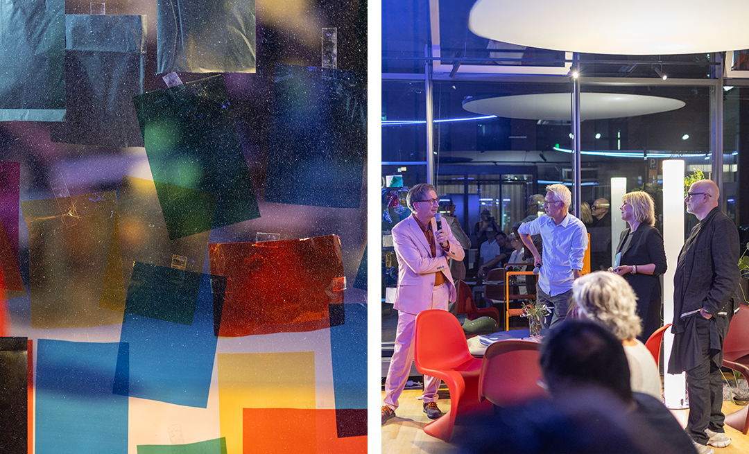
Finally, our attention turns to the window front, onto which the guests had stuck small coloured stickers before the talk, asking which colour spontaneously makes us think of a room where we like to spend time. The result is a colourful mix, in which blue clearly predominates. This comes as no surprise to Buether: blue tops the list of favourite colours worldwide because it symbolises openness and trust. Yet hardly anyone wants to paint their walls blue. According to statistics from the painting trade, 95 to 98 per cent of all walls are white, whilst furniture shops mainly showcase shades of beige.
That is why Buether offers the audience some clear advice: don’t hold a colour chart under anyone’s nose and ask them about their favourite colours. The answers are likely to be socially acceptable, not honest. It is better to take a close look at what sort of person they are, what they need, the environment in which they live, and to develop suggestions based on that. A thought that fits Panton well. His spaces never asked whether people liked them. They made a statement and endured being both loved and hated. That is precisely why, 100 years after his birth, we are still talking about them.
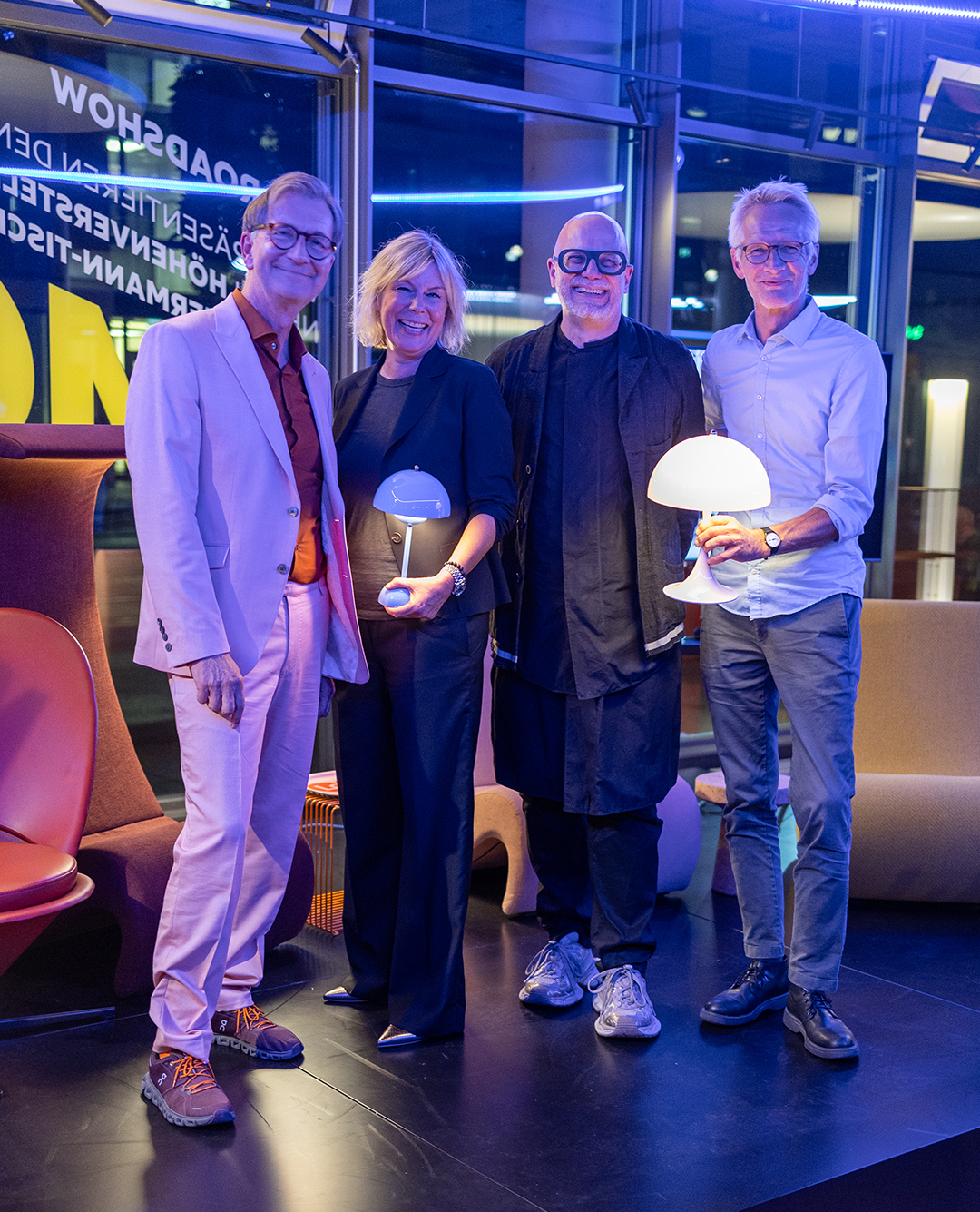
Peter Ippolito is an interior designer and architect, and co-founder of the Ippolito Fleitz Group in Stuttgart, a multidisciplinary design studio. In 2015, he became one of the first Germans to be inducted into the Interior Design Hall of Fame. Mathias Remmele is a design historian, journalist, writer, curator and lecturer, an expert in the history of modern furniture design and a recognised authority on Verner Panton. Prof. Dr Axel Buether is a cognitive psychologist, architect and one of the leading colour experts in the German-speaking world. He heads the Institute for Evidence-Based Colour Psychology. Moderator: Karen Hartwig, Editor-in-Chief of A&W Architektur & Wohnen
“Talking Spaces” is a series of talks organised by smow and A&W Architektur & Wohnen. The first event took place on 7 October 2026 at the smow Store in Stuttgart, Breitscheidstraße 10.