As we all know, the key to reading is learning your ABC. Once you've learned the letters, and combined them in simple words, you can approach more complex words, then sentences, paragraphs, essays and finally let that which you read discourse with your observations and experiences to help you better develop your understandings and appreciations of the world around us and those with whom we share it. But can learning the ABC of a designer help us to better approach understandings and appreciations of their work, their relevance, their legacy? With the exhibition Wilhelm Wagenfeld A to Z the Wilhelm Wagenfeld Haus, Bremen, attempt just that, in context of an eminently interesting and informative, if at times very difficult to read, designer.......
Born in Bremen on April 15th 1900, Wilhelm Wagenfeld initially trained as an industrial draughtsman in Bremen and Hanau before joining Bauhaus Weimar in 1923, where in 1924 he qualified as a silversmith. In the wake of Bauhaus's move to Dessau Wagenfeld remained in Weimar, taking up a position in, and from 1928 heading, the Metal Workshop at the Staatlichen Bauhochschule Weimar, the official Bauhaus Weimar successor institute, and where Wagenfeld not only worked alongside fellow ex-Bauhaüsler such as, for example, Erich Dieckmann who headed the Bauhochschule's Carpentry Workshop or Otto Lindig who headed the Ceramic Workshop, but also, through his cooperations with the institute's platform Bau- und Wohnungskunst GmbH, realised his first commercially marketed designs. The first of several commercial cooperations Wagenfeld entered into in the 1920s and 30s, the most important of which being, inarguably, those with Schott & Gen. Jenaer Glas and Vereinigten Lausitzer Glaswerke, Weißwasser. Commercial cooperations Wagenfeld continued in post-War West Germany where he contributed to the development of firms such as, and amongst a great many more, Lindner, Brunnquell, Braun or, and perhaps most enduringly, Württembergische Metallwarenfabrik, WMF. Wilhelm Wagenfeld died in Stuttgart on May 28th 1990, aged 90.
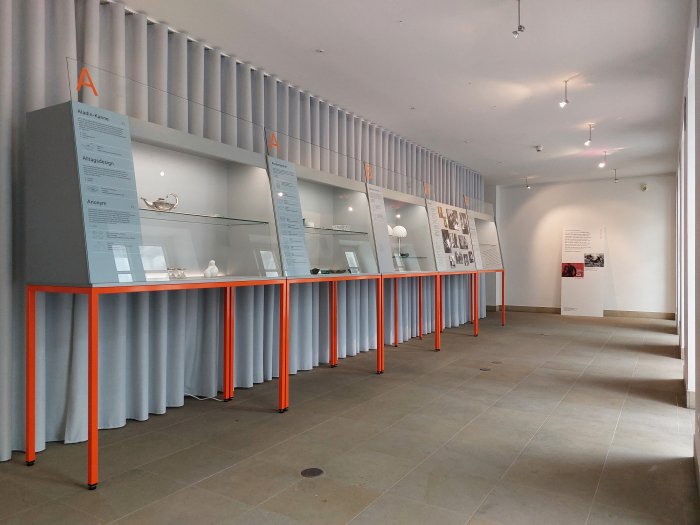
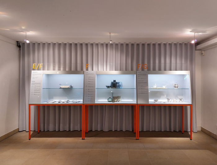
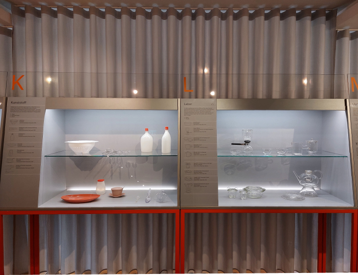
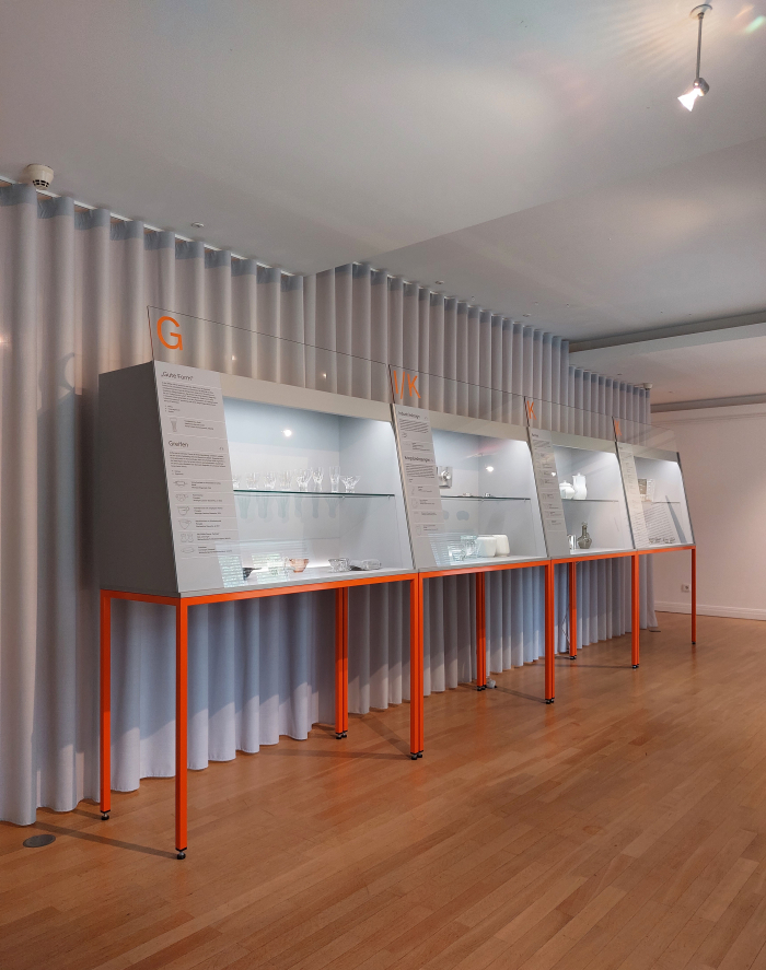
Conceived as what the Wilhelm Wagenfeld Haus term, with more than a little lightness of intonation, a Semipermanent Dauerausstellung, a semi-permanent, permanent exhibtion, a thoroughly delicious German word composite for a permanent collection exhibition that can be stored when a temporary exhibition is on show, brought out again for those periods between temporary exhibitions, and then put away again when the next temporary exhibtion arrives, a very satisfying solution for an institution who simply lack the space for a permanent collection exhibition alongside their temporary exhibitions, Wilhelm Wagenfeld A to Z essentially does what is promises: it discusses Wilhelm Wagenfeld from A for, for example, Aladdin Pot, Anonymous, or Ashtray to Z for... no, we'll get to Z, each term, each dictionary entry, being represented by a short text and an object or two or three or four or more.1 A very simple exhibition concept.
Deceptively so. For in its reduction of Wilhelm Wagenfeld to 50+ terms, 50+ entries, an ABC, Wilhelm Wagenfeld A to Z unfolds as much more than a Wilhelm Wagenfeld dictionary; rather, on the one hand, it is an opportunity for differentiated reflections and considerations on a creative all too often defined by a lamp he designed at the very start of his career, rather than by the immense body of work, including a great many lamps, he realised after that lamp, and on the other hand an opportunity for differentiated reflections and considerations on the term design, the process of design, the function of design, the role of the designer as explored through the, very singular, conduit of Wilhelm Wagenfeld. Or put another way.
Exhibitions devoted to a single designer are generally chronological or thematic in nature, presentation formats which always involve the construction of a narrative, requires the use of structural and grammatical tools and conventions to develop a presentation that can be not only followed and understood, but enjoyed, by a wide variety of visitors. A narrative which, by necessity, once decided upon imposes limitations in terms of, for example, what is presented, which aspects of the designer are presented or the voice of the presentation. Everything must fit within and conform to the narrative; that which doesn't is excluded, The use of letters and simple, general, words as the basis for your exhibition concept enables an alternative approach to the curation, an alternative approach which bequeaths an exhibition greater freedoms.2
Freedoms such as the ability to detach yourself somewhat from the subject, and the conformities of curating, to, as the Wilhelm Wagenfeld Haus describe, bring a little more fun into the exhibition's content: such as S for Spacig, Spacey, which isn't really a word, the real word is Star Trek or Salt and Pepper, and the entry a noting of the fact that in 1966 Wagenfeld's 1952/53, so-called, Max und Moritz salt and pepper set were used by the crew of the USS Enterprise to season their food as they explored strange new worlds during their five year search for life and new civilizations, going boldly where no man had gone before. Which obviously isn't directly related to Wagenfeld, but is a fun fact about Max und Moritz that can help you better approach Wagenfeld, his work and the relevance of both, and one that would be all but impossible to shoehorn into a conventional chronological/thematic exhibtion concept. And certainly not as meaningfully as in Wilhelm Wagenfeld A to Z. Freedoms such as the opportunity to present the same object in differing contexts; normally any given object pops up in a monographic exhibition but once, although, invariably, that which a designer realised is relevant, illustrative and informative on numerous levels, in numerous contexts, we all remember, for example, the complex levels on, and contexts in, which the Ulmer Hocker exists. Thus, for example, Wagenfeld's 1955/56 butter dish for WMF is presented as an example under the entries Gripping, Family, Cromargan and as itself under Use as an elegant demonstration of the multifaceted nature of Wagenfeld's interpretation of function, of functionality, in context of everyday objects. And a recurring appearance throughout Wilhelm Wagenfeld A to Z which not only allows one to better approach that so simple butter dish, but allows the butter dish to explain Wagenfeld. Or freedoms such as a lack of need for a sense of continuity or cohesion throughout the exhibition; the reduction of the concept meaning the presentation can jump about, as can the viewer, and while there is a very natural order given by the alphabet, that order is also challenged, negated, by the exhibition design through interlinking: as with any good dictionary Wilhelm Wagenfeld A to Z cross-references within itself.
Gute Form, for example, that design position that so dominates design in 1950s and 1960s West Germany and which one could reasonably assume a Wilhelm Wagenfeld was in favour of, yet as we all learn in Wilhelm Wagenfeld A to Z he wasn't, links to Timeless, True to Material and Gripping; the later linking to Pots and Ergonomics; the later linking to German Design? and its comparison of 1950s works by Dieter Rams and Wilhelm Wagenfeld for Braun which express differing approaches to design, differing formal expressions, and thereby initiating considerations on what is and was the much vaunted and celebrated German design? ¿Technically West German design? ¿Or what did we learn from the exhibition German Design 1949–1989. Two Countries, One History? And a cross-referencing that helps further deconstruct the formal structures in which monographic exhibitions are normally staged and thereby invites each visitor to develop the simple basics into a vocabulary from which more complex structures can be constructed, invites each visitor individually to develop their own narrative based on their responses to and interaction with that which is on display, invites the viewer to find their own path to Wilhelm Wagenfeld. If a cross-referencing, a Wilhelm Wagenfeld ABC, in which not all 26 letters of the English alphabet are represented.3
H, for example, is missing, from the Wilhelm Wagenfeld Haus's dictionary. A point to which we will return later.
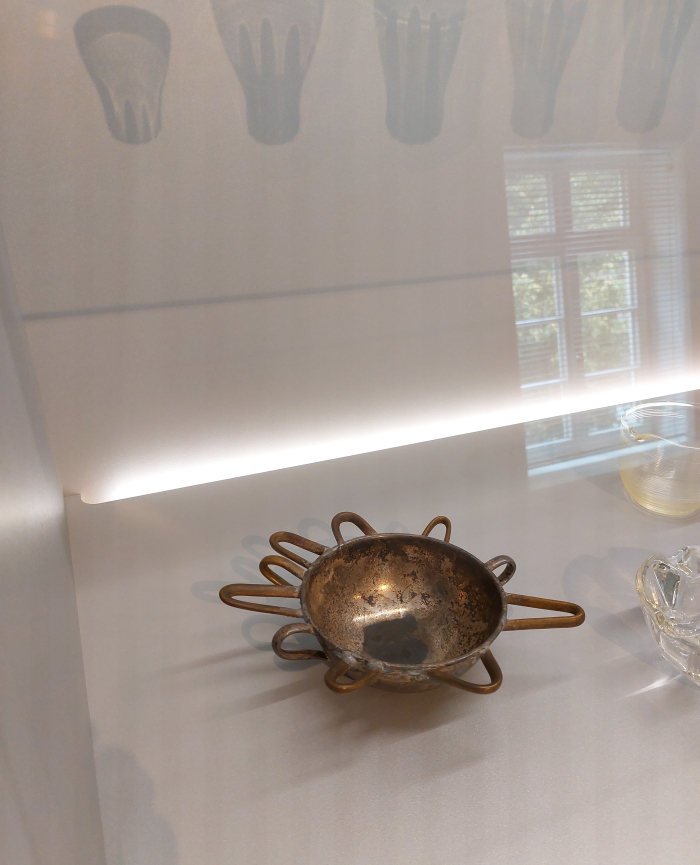
Intermingling, in a very satisfyingly random manner, objects by from across the six decades of Wagenfeld's career and from genres as varied as, and amongst others, lighting, crockery, technical objects or ashtrays, the number of later not only divulging, ¿for the first time?, just how many different ashtrays Wagenfeld designed, how many different approaches to the ashtray he employed, how many expressions of the ashtray he developed, how many relationships with the ashtray he enabled, nor only helping focus attention that today no one designs ashtrays, changing social habits having made the commercial ashtray a largely defunct anachronism, most contemporary ashtrays being works of Gambiarra crafted from old jam jars or flower pots, but also focussing attention on the fact that in decades past near all designers smoked, and the fact that while near all designers of yore are almost always photographed with a cigarette on the go, Wagenfeld was very much a pipe man: he never followed the crowd. And a random mingling of objects that not only helps explain the breadth of Wagenfeld's canon but also opens the possibility, the opportunity, of discovering a new personal Wagenfeld favourite.
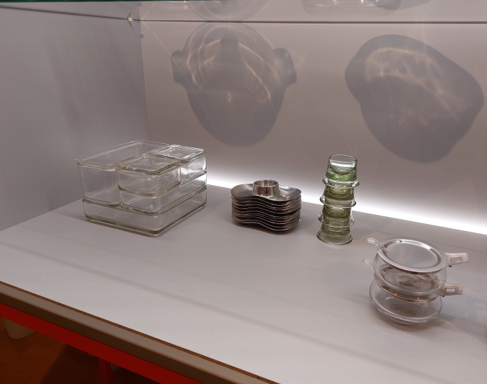
Juxtaposed with the works Wilhelm Wagenfeld realised, and under Drafts in a Drawer those that never left the model stage or under Werkstatt Wagenfeld those designed by members of Wagenfeld's team, Wagenfeld as with any busy designer was as much as team as individual, a team represented in Wilhelm Wagenfeld A to Z by Ralph Michel, Heinz G. Pfaender and Helmut Warnecke, are entries dealing with how Wagenfeld worked: under Model, for example, Wagenfeld informs us that "it is not the drafting machine that is the birthplace of new devices, but the model workshop", models for a coffee pot for WMF and a cherry schnapps bottle for Bado, alongside the finished items, helping elucidate how Wagenfeld understood that statement, similarly under Gripping one finds a shallow bowl adorned with a multitude of different handles which Wagenfeld developed in 1956 to allow him to compare the tactility and practicality of different forms of handle. While under True to Material one finds a discussion on Wagenfeld's position that the form of an object must be related to the material. Something that can be further explored and enjoyed and reflected on under Pots. Not that Wagenfeld was particular as to which material he used, as Wilhelm Wagenfeld A to Z helps underscore Wilhelm Wagenfeld worked just as elegantly in plastic or glass as in the metal in which he was trained, and when towards the end of the presentation the question is posed as to how a Wilhelm Wagenfeld would fit into contemporary design, you tend to an answer, (a) as idiosyncratically as he fitted into design between 1920 and 1980, and (b) that he would unquestionably be working today with new materials, and using those new materials to develop new forms of new objects with new functionalities relevant for the contemporary society. But objects which, as with the USS Enterprise's decision to use Max und Moritz salt and pepper shakers, would also remain relevant for future generations. An apparent dichotomy, yet apparently capable of resolution, which can be further reflected on not only by the fact that in the Wilhelm Wagenfeld Haus's dictionary Zeitlos, Timeless, is followed by Zukunft, Future, but that Zeitlos and Zukunft share a display cabinet. And thereby forcing each to question the other. And forcing you to question the relationship. Question the apparent ease with which they co-exist despite their all too obvious discord.
""Kauft deutsche Waren!" ruft man auch zu mir", ""Buy German goods", they also demand of me", complained Wilhelm Wagenfeld in 19344, whereby complaining, criticising and cantankerous are among some of the more notable omissions from the Wilhelm Wagenfeld Haus's dictionary, "why don't they demand the consumer chooses the best goods?", Wagenfeld asks by way of a reply. A deliberately unpatriotic reply, position, and an accompanying argument by Wagenfeld that not everything which is produced in Germany, and certainly not everything produce by 1930s German crafts and trades folks, was automatically good, regardless of what the label told you, coupled to his post-War rejection of the premises of Gute Form, which naturally poses the question: what did Wagenfeld consider "the best goods"? What did Wagenfeld consider good?
Longevity was definitely one component of Wagenfeld's understanding of good design, and a longevity that in Wagenfeld's work is often intrinsic in the construction, in the use of individual elements that could be repaired, or replaced, if need be; there is no inbuilt obsolescence, nor any sense of a possible obsolescence, in a Wilhelm Wagenfeld design, be that in terms of construction or materials or form. Or function ... except possibly the ashtrays.
Material respect, not just, as discussed above, that the form be relevant, true, to the material, but also that one used as little material as possible; Wagenfeld's oeuvre expressing a material reduction in unity with the formal reduction and the functional expanse.
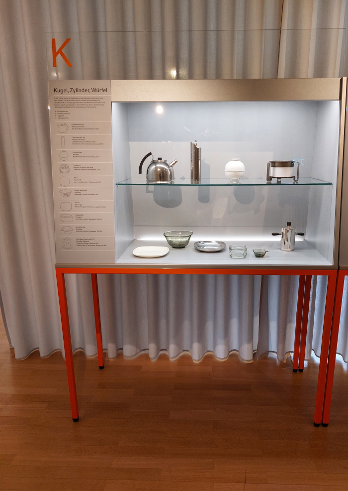
Naturalness of the object, not just that it functioned, and could be used, intuitively, but in terms of the form; Wilhelm Wagenfeld A to Z helping elucidate that over Wagenfeld's long career he moved ever more from the pure geometric of the inter-War years, as so elegantly demonstrated by the entry Sphere/Cylinder/Cube, and by that lamp, and moved ever more to organic forms.
Or put another way, in terms of sustainability and responsibility as key factors in design's contribution to society, of sustainability and responsibility as inherent components of objects and as important roles of a designer, Wilhelm Wagenfeld is very contemporary. Zeitlos and Zukunft.
Presenting itself pleasingly free of the all too obvious, yes the lamp is there, but its presence is actually required by law in any Wilhelm Wagenfeld exhibition5, and that in a pleasingly reduced, and for all colourful presentation format, colour, as one learns to appreciate in Wilhelm Wagenfeld A to Z, wasn't something Wagenfeld particularly employed, not that Wagenfeld was achromatic, but he was very much one for more subdued hues than the forthright orange of the exhibition cases, Wilhelm Wagenfeld A to Z is a very accessible, clearly formulated and intelligently conceived exhibition, and for all an exhibtion pleasingly free of theory, or the feeling you need to follow an argument, indeed when the curators note under Zeitlos of Wagenfeld's 1937 glass baking dish for Schott & Gen. Jenaer Glas, "Wagenfeld designed this baking dish more than 80 years ago. It would be an excellent addition to the range in a present-day household goods store, despite its old age!", it's a very nice step away from a curator explaining something through theory and instead expressing a personal opinion. The word "Discus?" has been forgotten at the end of the statement, but is very present in your reading of it. And thus Wilhelm Wagenfeld A to Z is an exhibition, a space, you can relax in, take your time in, jump back and forth within, discover at your will, in a manner to your pleasing, in a manner meaningful to yourself, and as you do you can attempt to fill in the missing letters: aside from the aforementioned H....... ¿Humorous?, one finds gaps at J....... ¿Jucker? , R....... ¿Restless?, T....... ¿Technology?, X....... ¿?, Y....... ¿Yucca?, or Q......., Q......., Q.......
¿Quintessential? No, for as viewing Wilhelm Wagenfeld A to Z helps elucidate, while Wagenfeld can be explained in numerous ways, narrowing him down to a quintessence is not only impossible but futile; rather, and much as a John Ruskin argues that there can be no defining quintessence of Gothic architecture, that Gothicness isn't definable but is called forth through the existence, to varying degrees, of a number of identifiable components, ideas, elements6, so Wilhelm Wagenfeld, who arguably in character is as pointed and unhewn as your average Gothic cathedral, can only be defined through a synergy of components, ideas, elements, not in a definitive description. Having viewed Wilhelm Wagenfeld A to Z we'd list, and amongst other components, ideas, elements, Anonymous, Use, True to Material, Invention, Stacking, as being important in Wagenfeldness. But none of which alone is enough to describe Wilhelm Wagenfeld. Nor does the absence of one or the other deny an object a Wagenfeldness.
Rounding off the presentation on Wagenfeld per se, and interspersed throughout Wilhelm Wagenfeld A to Z, is the project Mein Wagenfeld in which members of the public describe their relationships with a Wagenfeld in their possession7; a presentation which helps elucidate that for all the reduced anonymity of Wagenfeld's works, the near clinical sterility in many cases, one can form an emotional bond with them, and therefore tending to an appreciation that we don't bond with objects because of how they look, but how that how arose; that we can bond with the most anonymous and rational of objects if it is imbued with an integrity, an honesty, a functionality that goes beyond simply doing its job and has a character we want to communicate with. Considerations which very naturally bring one back to Wagenfeld's demand for the "best goods" rather than something adorned with a label and accompanied by loud marketing, to Wagenfeld's interpretation of good design, to Wagenfeld's insistence on respecting the material, to Wagenfeld's rejection of a formalistic approach, to Wagenfeld's definition of function, to Wagenfeld's iterative methodologies and approaches, to Wagenfeld's understandings of the responsibilities - social, cultural, economic, environmental - of a designer.
Stances, positions, characteristics all too often hidden from the Wagenfeld reader by the near mythical glow of that lamp. And whose placing in the shadows, logically, hinders any reading of Wilhelm Wagenfeld.
Taking the viewer on a wide and varied journey Wilhelm Wagenfeld A zo Z very neatly helps underscore why smaller institutions such as the Wilhelm Wagenfeld Haus are important and relevant: they can and do possess a variety of works larger institutions with their wider scope couldn't, wouldn't, and thereby not only allow for a much more comprehensive approach to a designer, but one which allows juxtapositions, contradictions, relationships impossible elsewhere, allows for differentiated insights impossible elsewhere. Or can if the objects are on display: an object on an archive shelf is essentially worthless in terms of what it can explain and teach. They need to get out there. With Wilhelm Wagenfeld A zo Z the Wilhelm Wagenfeld Haus have developed a very pleasing, very engaging and very simple method of getting their collection out there, And thereby allowing the possibility, the means, for the development of more probable understandings and appreciations of Wilhelm Wagenfeld.
Understandings and appreciations developed from a strengthening of your Wilhelm Wagenfeld ABC.
Viewing Wilhelm Wagenfeld A to Z allows one to appreciate the great many deficiencies we all have in reading designers, specifically Wilhelm Wagenfeld, but that lesson is, we'll argue, freely extendable, because the way we learn to read any designer is the same, and, invariably, isn't from the basics up, rather we tend to begin with abridged summaries, from narratives which, by necessity are selective, monotonal, and as such we tend to have understandings learnt by heart, systematically, as definitives, understandings shared by all, rather than understandings developed from a strong, innate grasp of the basics, understandings developed from basics which, through experience with, we've become increasingly comfortable in the handling and application of, and can thereby apply in ever new situations and contexts, understandings developed from basics that can grow and develop. Which isn't to say, don't visit monographic exhibitions, do!!!, please!!!, visit as many as you can!!!; but is to say that achieving a more nuanced, critical reading of a designer, and thus better approaching more probable understandings and appreciations of their work, their relevance, their legacy, requires mastering their ABC. Wilhelm Wagenfeld A to Z is thus not only a very satisfying opportunity to improve your Wagenfeld ABC and thereby better approach a designer with very valid voice in contemporary design, a designer who can make a meaningful contribution to contemporary design, but also an invitation, an encouragement, an admonishment to develop ABC's for other designers by yourself. An invitation, an encouragement, an admonishment to cast aside your text books, and to learn to read.
Wilhelm Wagenfeld A to Z is scheduled to run at the Wilhelm Wagenfeld Haus, Am Wall 209, 28195 Bremen until Sunday September 18th. And as a Semipermanent Dauerausstellung will be making regular reappearances over the coming years. We're guessing in springs and autumns. [UPDATE: has reappeared and can be enjoyed until Sunday February 25th 2024]
Xact information, including information on opening times, ticket prices, current hygiene rules, and the dates of the regular curator led tours through the exhibition, can be found at https://wilhelm-wagenfeld-stiftung.de/wilhelm wagenfeld: a - z
Yes!!!, We're almost there!!! We've almost done it, all that remains to note is.......
"Zidane, Zico, Zola, Zubizaretta, Zoff. Even Zondervan" (with thanks to The Referee's Alphabet by Half Man Half Biscuit, another informative, entertaining and easily recommendable popular culture ABC. And a song which also reminds us all of the fundamental importance of finding Zest in your work, of only doing that which arises from and brings forth Zest. And ideally also engenders a Zest in others. A position we believe Wilhelm Wagenfeld would approve of.)
1For very logical reasons the presentation is in German only, a bi-lingual presentation would be utter chaos. An English handout is however available.
2Interestingly, through forcing ourselves to stick to an ABC format, we are very much limiting our freedoms. While we could, largely, stick to the structure and flow we wanted, there's a lot missing from this text that would have been included with a less strict format, things we wanted to say, things we felt needed to be said, but which the manner we've chosen for the text, the narrative form we've chosen, means we could only crudely shoehorn in. Which may or may not be meta. Is an important lesson.
3The Wilhelm Wagenfeld Haus's ABC is based on the English alphabet, there is no Ä, Ö, Ü, but you can obviously try to add them yourself.......
4Wilhelm Wagenfeld, Qualiät und Wirtschaft, Die Form: Zeitschrift für gestaltende Arbeit, Vol. 9, Nr. 1, Januar 1934, page 1-4
5Not an actual law.
6See John Rankin, The nature of Gothic: a chapter from The stones of Venice, George Allen, London, 1900, page 1ff And, we'd argue, without, admittedly, having thought about it in all to great detail, we're still very much digesting the thought, and could well be wrong, but, there would appear to be an interesting comparison to be made of the positions of Ruskin and Wagenfeld.......
7If you'd like to contribute, if own an object by Wagenfeld with which you have a particular relationship, which tells a special story, and which you'd like to share, please contact the Wilhelm Wagenfeld Haus.

